Archive for the ‘journaling’ Category

constellation crown

Hello there. My Daily Art project almost did not get done. I deep cleaned several rooms of my house due to absolute necessity, which is the only thing that will get me to do it these days. Plainly put, I was plum tuckered. It was 3 pm and I so much did not want to do anything but shower and sit down. But I’m a trooper, you might say a pooped trooper, but a trooper nonetheless.

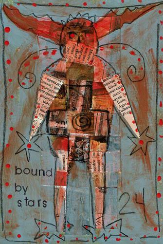
I cut our Crown Wearer out of another gift card bag (the skinny kind). The paper cutting where you fold in the middle and then freehand cut out a shape. In my mind was a verse such as “her tangled hair formed a constellation” which is good but her hair wasn’t very tangled. So I improvised. A lot of that happens in the studio because nearly nothing turns out the way I thought it would and that hour goes by fast, people.

But I liked our Cosmic Crown girl, so I riffed off a few constellation crown verses and came up with this one. Lots more words than I planned to use before, so I had to go into the bowels of the hoard to find a rubber stamp set that was small and legible enough to do this verse. Don’t you know I had one?

“Constellation” is a long word and I didn’t want to hyphenate it because I despise hyphens and will move heaven and earth not to use them. You think I am kidding but I am not. I don’t kid about hyphens. They are not funny, they are supremely annoying. Anyway, Hyphen Avoidance brought about the idea of making some of the words vertical, hugging the figure. That way I could start the first part of the verse higher in the image and bring the eye down the left side, eliminating the confusion readers have wanting to go left to right as the default habit. Killed two birds with one stone by refusing the hyphen. Of course, the word “falling” is perfect to make gestural so I did.

The heart is a piece of deli sheet that had black ink splotches on it. I watered down some orange/red paint (the same color I used on Starman yesterday because it was still on the desktop.) I free-cut the heart just like a valentine.

I put iridescent acrylic paint over the top of the Rives BFK printmaking paper as my first step. Scanners and monitors do not pick up iridescence but it is there. Then I took clear gesso and went over the stars and the words to try to put at least a small barrier over what I needed to keep iridescent. I decided I didn’t want to run the navy over the text, so I can’t say if it would have been a decent barrier, but you can make an experiment if you need to, keep it in mind. “They” say gesso can be used as a resist but I can’t say I have tried it much. It seems counter-intuitive to me, considering that gesso’s job is to prepare surfaces to TAKE paint well. But “they” likely know more than “me” so take what I say with a grain of salt and find out for yourself.

I needed another couple of pops with the orange. I never intended to do the stars with orange, nor all the stars, but I did the small one at the bottom and then the top ones needed it too. Then the word “burns” needed it and then the edge of the constellation block said “me, too”. Then the damn thing was done.

I like her very much and am glad I went in there. Now I am more pooped and I will talk with you tomorrow, likely.

Advertisement

bound by stars

This Daily Art practice took the full hour to make. I barely had time to frame it out and add the acrylic dots and stamp the text.

Most of the time was spent weaving the paper strips. It takes awhile to get them situated and then affixed with matte medium, then dried enough to continue. I bought matte medium today because I ran out of it…I tried to get along with just Mod Podge but some applications don’t work with it. If I don’t want the hard resistant coating on the surface (like here to glaze it with acrylic) I prefer matte medium. If you aren’t aware, matte medium is a glazing medium, sealer and adhesive (lightweight). Mod Podge is a sealer and adhesive (heavyweight). If you want stuff impenetrable and permanent and affixed until the Four Horsemen ride through, Mod Podge is your huckleberry. Anything else use matte medium.

My plan with the piece was to mask the weaving in a shape of some sort.  A mask is a reverse of a stencil; in fact, a mask is the piece you get when you cut a stencil. Not all stencils create great masks, because if the stencil is very detailed you can’t keep all the bitty pieces to use as a mask. A stencil prints over where it is put and a mask prints around the space it is put. Obviously you don’t have to create a mask to do a mask technique…you can freehand letter or draw, around what you want to keep and cover what you don’t want with color.  In this way you can make an expressive drawing with shapes, letters and focal images in a composition. It is a fun way to do stuff, sort of in reverse.

I’ve seen artists put layers of material on a substrate only to cover up most of it with black paint. Seems like a bunch of work gone to waste to me, but the results are spectacular. Also, if you scan the piece before covering it, you can use the work over and over by printing it, thereby making use of the time it took to make it.

Keep in mind that you can use any color as your outline/fill, not just black. Also, depending on what you are outlining, you could use white or a pale color. That could be cool. I haven’t done that yet.

I was going to cut a stencil for this basic figure with the antlers. I would use it and it seemed worth the time to do it; I’d have both a mask and a stencil to use. However, the stencil board I have was under a bunch of heavy paper and I couldn’t get a sheet out. I looked around and saw a greeting card kraft bag (you know, the slender kind) so I cut the figure out with scissors. This was the easiest, fastest way to get the job done. Then, I laid the mask over the weaving and outlined with my favorite Wolff’s Carbon drawing pencil. I selected grey as a background cover because I like grey, but had I not been so hasty, I might have selected navy. It would have been richer with the orange and since I texted “bound by stars” navy would have made sense. Ahhh, another day.

If you are in a hurry or have hand problems or patience problems or are afraid/unable to use an exacto knife, a pre-cut stencil is an inexpensive long-lasting tool (although they are quite pricey for what they are, I mean cheap plastic). Since stencils have become so popular, they are now very detailed laser cut available in diverse design styles. I have stencils that I would not in a million years consider cutting out myself. But, you can make a perfectly wonderful unique stencil yourself in less than an hour. You can use your own drawings, clip art, images from photos, etc. You can scan a photo into a basic photo altering program, many of which feature a “stencil” filter. Print the altered photo and  create a stencil. If your program doesn’t have a “stencil” feature, up the contrast and voila, a usable image. Build a library of favorite symbols, animals, etc. You get the point. Anything that gets more of your own hand into a piece makes it more satisfactory and interesting, IMHO.

Don’t forget to keep the cut out parts of your stencils and put them in a separate envy called “masks”, or file them with the stencil.  Once you start to mask, you will be glad to have them.

moon is our mother

This image is a collage with expressive drawing, my Daily Art practice. I pulled out a handful of the paper strips I talked about yesterday, and this one piece of old street map presented itself. It hadn’t been cut, most likely because it was already small and fragile. I laid the piece around the paper with different orientations and I thought this outline looked bear-ish. Like a bear climbing a tree. So I tried to draw it to look more like a bear than it did, resulting in it looking even less like a bear than it did. I decided instead that it needed to be an unspecified marsupial climbing a tree. That’s what I meant to do all along! That’s the ticket.

Earlier today I was reading a book on the alchemical Emerald Tablet which states that the Moon is our Mother. I stopped reading at that point because I wanted to think on that for awhile. It struck my fancy. Bears are associated with the feminine/moon energy.  I decided (pretty much unilaterally, since it is just me, the cats and a dog here right now) that marsupials are feminine/moon energy too. It is out climbing at night, after all. Even if it is on it’s way to bed, that counts.

Considering how it all ended up not being what I thought it would be, I’m very happy with it. It’s a friendly creature (no Stink Eye here), the moon is full, the tree is strong and I particularly like this map paper. There is a heaviness and fullness to the piece, I feel gravity and that is not an easy feeling to capture 2-D. At least for me, it isn’t.

I am all about doing these creatures these days. It started with those Dollar Tree “monster” stencils (I call them creatures, they are too cute to be scary). I love expressive drawing and I find more and more to be drawing quasi-realistic animals in blots and on collage compositions. This piece came together quickly which is usually true for me when I do expressive art. I had already made a small square canvas piece earlier in the day. This piece followed later in the day and I didn’t want to work very long. The first piece could be a breakthrough idea if I continue it to a series. I love the idea of making “themed” series(es?) and constantly dream up great ideas for them but I almost never follow up. I get bored or forget about them. A year later I clean the studio and run across the first piece of a proposed series and go, oh yeah, I was going to make that a series. Whoops.

Not much more to say about this and I want to get back to reading about the Emerald Tablet. ta ta.

lifeisatapestry

Well, guess what? The studio is tossed again.

Last week I put my big folding table into the middle of the living room and brought out the various and sundry boxes and bins of paper and images and sorted it into cool boxes I got at the Dollar Tree. The boxes are letter-sized and have a self-lid and hold a goodly amount of of paper. I was soon overwhelmed with the sorting but I did get through the bins It is so much easier now to keep it neat and find images by subject matter which is important to me. I wanted to do a page with an owl last week. I have 284 pictures of owls around here and couldn’t fine one. One. That’s what started this ball rolling.

I got overwhelmed, particularly with laser copies (lots of black and white) of my own photographs. In the good old days I had a color laser printer and I routinely printed contact sheets and reproduced my photos. Lots and lots of mannequin photos because I used them frequently in my work. I knew there were too many to go into the nifty boxes without there being 30 boxes of mannequin photos. So I started shoveling them into a separate pile. Before I knew it, that pile was teetering on the edge of calamity just like my sanity.

I had to put the big table away, and the stack took up home on the dining table. I filed the neat boxes away in the studio and that was a wonderful feeling. But then I’d walk through the center of the house and the stack that didn’t get filed away, mostly my OWN art, was taunting me. Plus, the dining room is smack in the middle of my feng shui Wealth area and that is not good. How many mannequin photos can your Wealth area overlook? If I know my Wealth area, and I do after many hours of studying it and moaning over it, there were about 6000 more mannequin faces than it could manage. My Wealth area couldn’t even with it and neither could I.

There were stacks of paper. Strangely, I’ve been obsessed with stacks for awhile. It started with caryatids about 18 months ago. They were fascinating to me. Then I saw pictures of cairns that my husband took in the Smokey Mountains last spring. There is an artist that works in several rivers up there making cairns (he’s around on the internet, Google him if you want to see his work. He is really good, a true Rock Whisperer). Then I ran into this cool Edward Gorey’ish fabric during Halloween that was so exciting to me. About that time the Alice in Wonderland stencils showed up at Dollar Tree. One day I couldn’t take it anymore and cut out a caryatid, the gothic fabric and created an Alice stack using illustrations and stencils. A reprieve but I returned to stacks again.

Stacks of paper. Obsession with stacks. What are stacks? They are layers on top of layers. Image on top of image. Strips on strips.

I couldn’t use all those faces, but I could use strips of paper. I could weave them, layer them, draw on them, use them as backgrounds, etc. I could make strips out of all that stuff, throw them into a box and haul a handful out and use them however I want to in the moment. If I found I didn’t like the process, or wasn’t using the strips, I could toss it all into the recycle bin with no guilt.

So yesterday I spent a few happy hours layering paper and cutting it with my paper cutter. All different widths. I find cutting or tearing paper stress relieving. I can honestly say I enjoyed it, and I thought about the strips most of last evening. I had the urge to get up and bring some in to draw on but I didn’t because we were relaxing watching Dexter. It’s one of the few programs I enjoy watching, but I was tempted and that is a good sign. I’m onto something.

So, my Daily Art practice rolled around and the first thing I did was grab a bunch of strips. I wanted to start by paper weaving. I took two wide strips, cut them into random pieces. One was a black and white photo of mine, the other text from a book. I glued those pieces randomly to a paper foundation. Then I selected several strips and cut them down to smaller widths. Surprisingly, all the strips I used are my own work. I did simple over/under weaving over top of the other images, shifting the colored strips to where I wanted them. I glued the ends down to make it permanent.

The process created leftovers and I tossed those strips back in the box to be used for another project. I decided to journal, and stamped out “life is a tapestry.” Then I wrote “weave it” in black pen randomly, and did some circles on the strip with the wording, to make it stand out more. This project was finished in an hour and I very much enjoyed it. I plan to do many of my Daily Practice pieces with these strips this month. Perhaps it will inspire you to try it.

I will soon post an update on my Mythos blog about how my 2016 Initiatives are going so far. If you have an interest check it out over the next few days. I will say here that I missed only 1 day in January. The day I missed I simply did not want to be in the studio. I was tired and not feeling particularly well. To go in would have defeated the purpose of the Initiative, which is to give myself time to do what I love. It’s not an obligation, it is a privilege.

I would urge you to get into your studio every day, even if just to paint a background or stamp a word on paper, or whatever you enjoy doing. Just for the fun of it.


who's the wolf

Another Daily Art challenge make. I am revisiting Red; I’m not alone, lots of people are seeing Red these days. There has to be a reason she is surfacing to consciousness right now. I’m not speaking for anybody else, but I feel two contrasting and contradictory energies at work currently. The illusion of black/white vs. ambiguity.  The middle road seems very narrow these days. Mulder is back with his “question everything” philosophy. I like that; my feeling these days is that the questions are more worthwhile than the answers.

I started with the Rives BFK® printmaking paper and dropped some water randomly onto the surface. I put some black Dr. Martin’s® Bombay ink into the plain water drops and let it spread. I blew it around with just my breath and let it wander, then set it aside to dry.

I wanted to use tube watercolors today, so I picked up an ultramarine tube and kneaded it gently to mix the pigment up. These tubes are old so I go easy, but today not easy enough. I was daydreaming and looked down to find ultramarine watercolor all over my fingers. Luckily I had torn up a bunch of lunch sacks yesterday so I wiped my hands all over those pages, and everything else that wasn’t nailed down. Then I took a big brush and swiped water all over the paper to move the paint. I don’t want to think about how that will turn out when it dries, but can you say “CRINKLE?”

Well, watercolors dropped way down the list. That’s how easily I am deterred from stuff. I thought I might try ink. I have a mess of Higgins inks and I like them very much but I never have drawn with ink. I bought them for the purpose of making blot papers for my Interactive Intuitive Readings™ but they didn’t end up working as well as the Bombay ink. Higgins® Dye-based Drawing Inks are much less expensive and highly pigmented. The back of the package says they can be used like liquid watercolors.

I really like the way these inks move, and I would definitely equate them to watercolor nature. **Be advised, I have no watercolor or inking skills. I am purely at a “coloring book” level. If you want to investigate the qualities of either medium, consult someone else with a far greater proficiency.**

The black ink blot was dry so I started looking at it, spinning it around to see if anything presented itself. Here’s how I work with blots and expressive art. Take a couple of breaths, close eyes, open eyes, soften eyes, turn the paper. Pause. Turn paper, pause. Do this all the way around. Subconsciously you likely already ruled one orientation out. Keep going. Don’t get scared. There will be a point when you feel panic and think, “I don’t see anything!” That’s good and natural because this is a trust issue. Expressive art is about developing trust in your creativity and your instincts. Just breath again and keep going.

I went around several times. There was one other orientation that was intriguing and likely would have been deeper expression for me, but I do keep in mind my time limitation. I am sticking to my one hour religiously and sometimes that means sacrificing an idea or technique. That’s ok, there are always other opportunities. Two of the other images were already no go’s. Like it or not, this was the one remaining. Suddenly (and I mean that, like a bolt of lightning) the wolf appeared, really well defined. The major work back into the wolf shape was adding teeth and ears (he had a nub of ear originally). At this point, all I had was white paper, black blot and the red teeth and eye.  As I was thinking and feeling what was left, I saw a curvy line that suggested Red’s Hood and Cape. You’ve got to be kidding me! So I colored that white space in with red. The image needed unity so I brushed on the dark blue for sky and green for ground. The other black blot is the silhouette of tree branch(es). I did see a snake head hanging down in mid-image so I outlined it lightly. It’s just a side note, but now we have three characters in our story.

So the image was nearly finished. There were the two white spots inside the wolf’s body, that is where the text could be. Text had to be short and handwritten. I got a toothpick and dipped it into the ink and scrawled it out.

I considered captioning it “Red’s Shadow.” That’s a black and white energy. I’m telling you the story. “Who’s the Wolf” is the ambiguous energy. Who is the wolf? Who is the innocent? Who is the onlooker? Who’s zoomin’ Who?

There was also the option to leave the space empty.  The highest expression is to let you ask your own questions or the freedom to not ask any and move along. As the maker I am forcing you to do it my way.


ask for help

Another Daily Art practice piece with a vintage photo as a focal point. The reason I went to a photo again is because I am (again) rearranging and sorting materials and tools in my studio. In my Daily practice I’ve gotten to the point where I simply reach in and pull out something to use.

When I was sorting through shelves of old journals and books I could alter, I ran across some Canson Manga kits. I don’t know if they are still available. They are a beginner set for artists trying the comic book style. There are paper stencils to prepare layouts and one stencil is a “thought bubble” or narrative block. I liked them back in the day to create easy quick grids. They were buried in the journal shelves and I was glad to run across them. This week’s art seems to be a “Hey friend, so glad to see you!” week.

The photo is an odd size and in the portrait orientation. I put it up in the left hand corner and liked the way it went 3/4’s onto the page. But the bottom right was just filler and there wasn’t a lot of room to do any text, which isn’t necessary but the picture warranted something. So I cut the bottom right off and decided to grid it out. Gridding it seemed to help the story. Frame 1, guy on ledge watching Frame 2, guy trying to climb to ledge. Frame 3, rest the eye, Frame 4, narration. I had a piece of brittle aged brown drawing paper laying on top of the work island so I used the Canson stencil to cut out the window frame. The frame breaks up a bunch of non-narrative space and helps the viewer grasp the story. At least I hope so.

In recovery we learn to ask for help, and also learn to be willing to receive it, the way it comes. The guy that’s climbing isn’t asking for help and the guy on the ledge isn’t offering any. Maybe in the next second something happened, but right now I’m looking at what IS preserved and it seemed a good time to remind myself to Ask for Help. I don’t need help right now, but one day when I’m looking back on my Daily practice papers I might and this will remind me.

The wash is walnut ink, the rubber stamp text is StazOn Saddle Brown. The handwriting is Sepia Pitt Pen. As I did yesterday, I doodled a bit outside the photo to extend lines. I added some flowers because they got cut off by the frame.

In the second frame running down the center you might be able to see a stitch line. A few years ago I got froggy and took a bunch of old photos out and stitched them together on the sewing machine. I used them to make fabric/paper hanging collages and some were left over when I got bored doing that. Old photos can be very fragile. They were often glued to scrapbooks and then get taken out and the force of removing them weakens the paper. As I was gelling this photo to the foundation paper, the bottom tore off. No big deal, just wanted to mention that they can get very delicate.

Talk to you tomorrow, I reckon.

good dog

I’ve been eyeballing this vintage picture for a few weeks because it’s been on top of a stack of pictures that keeps falling over. Or the cats are knocking them over which is more likely. It was going into my Daily Art practice sooner or later so I made it sooner.

One thing you should know about me, and will most likely admire, is that I am a SUCKER for old photos. Any old photos. Half developed, half out of focus, any kind of half-assed, really. Good ones hardly interest me any more then mediocre or damn bad ones do. It’s perverse, but secretly you know you feel the same as me. I mean, have you ever seen one of those old black and white pictures where there is literally NOTHING but a horizon? Like, you know it’s happened to you, too. There was some kind of awesome cloud or an amazing bird formation and absolutely nothing shows on the shot. Back in the day, some old duffer sees 86 birds way up there, spelling the word Geritol or something (it is 1950, after all). He’s all excited and can barely get the manual focus right and snaps that award winner, thinking, “that’ll show ole’ Howard back home.” Then the roll gets developed and the disappointment settles in. Where are the Geritol birds? And his wife Milly screams, “Wilford, what were you THINKING??” And Wil wonders as well. Photography can be a cruel, cruel game.

There is hardly a homeless photo in Pinellas County. Well, there might be now but not in my heyday. Boxes, people. I have adopted countless ancestors, it’s a wonder that I don’t have a bunch of haints up in here. But I don’t, because the departed are happy to be wanted.

Actually, if I might wax philosophical here, and I might, because if a tree falls in the forest does it make a noise? It’s like that here on the blog almost always except for a few stalwart readers, long-time friends and relatives that trip over and think, what fresh hell today? Anyway, looking at unknown ancestors and doing your own ancestry history can bring up many emotional and intellectual issues. My sister sprang for Ancestry.com a couple years ago and we got into researching our family history like nobody’s business.  It was just interesting. I have a relative on my paternal grandmother’s side by the name of Napoleon Bonaparte. I am not kidding. What kind of parents name their kid Napoleon Bonaparte? Well, the kind that I am related to. It explains a lot.

As a photographer myself and as a curious person, I wonder what provoked them to shoot the picture. Or to shoot it the way they did. Like sometimes, when the husband puts the wife in front of the pink flowering dogwood. Which does he want to shoot? Is he a proud arborist or devoted husband? Can he be both? I suppose, but that isn’t as interesting. Everyone ASSUMES he is shooting the wife. After she dies, the grandbaby, dandling on PaPa’s knee, thumbing through the scrapbook. Kiddie, “Ooohh, pwitty!” Thought bubble over PaPa’s head, “Yes, it was a fine pink dogwood…” I mean, really.

Anyway, I can think and talk about this for a long time and I almost have today. I started with the picture. I set it on the paper foundation in the spot it is now. I almost never center anything on a page. I use the Rule of Thirds which I have discussed on this blog elsewhere. The dog is small in the photo, it was shot wonky and tilted. It is odd which is likely why I’ve been attached to it. All those different planes intersecting at obtuse angles. Hmm. One of my favorite art practices is to draw a continuation of something on a page. Like in this case, extending the photo out with drawing. Sometimes I do it with a pattern (like a floral), and extend it beyond the border. I like the “realism” plus the “handmarked imagined”. It’s a fun way to take something you didn’t do, and make it your own art. It’s more than just putting the picture on the page.

I used Neocolor watercolor crayons to draw out my added content. The bottom was empty, so I added a strip of old text. Then I took a piece of drywall tape and rubbed PanPastels over the surface. The tape is pretty deep so it tore up the foam applicator but it had been used and those things don’t last forever. I liked the scale of the squares so I continued the stenciling further than I planned at first.

It needed text and I wasn’t sure what to add. I considered a short quote about dogs but it didn’t interest me. There wasn’t a lot of room, either. I tried thinking about dog names from the 30’s but hell, I ain’t that old. Spike. Lad. Spot. Fido. If this dog was any of those, it was Lad but I can’t even. Lad. A Dog. Now you do know how old I am.

I decided not to name the dog. Nobody calls their dog by their name, anyway.  You know you don’t. Sometimes they are just Dog, or Puppy. Around here, the animals get called “Mr.” or “Missy” or “Oh No You Didn’t” or a word with “-ster” after it. Our dog is named Junebug, but we call her Bugster, June-ster, Junie Bloom, Junie, etc. My late cat, Raven, we called Ravy, Wavy Gravy, Ravy Gravy, Scamp, Crazy Cat, Termite and Shit Foot, but I’m not talking about that.

I put myself in the shooter’s place. If I was trying to leave the porch, or if I walked up to shoot the dog, I’d say “Stay!”. Then, if the dog stayed, which I assume this one did from the general lack of interest on his face, I’d say “Good Dog.”

If I’d had more time than an hour, I might have explored the situation from the dog’s side. I like how he’s looking off to the side, all casual. Mr. Hollywood. Get my good side. He might be saying to himself, “look at this dufus.” Maybe there was a squirrel over there that needed watching. If this was my dog, he’d have a cool name, but we’d just call him Bat Ears most of the time.


meerimagic

I worked for the first time in this book, Fireside Children’s Songs illustrated by John Alcorn. I bought this book in a thrift; it had no dust jacket and a loose/torn spine. The illustrations were of the sort I grew up with. This book was printed in 1965 (I was ten that year). John Alcorn was an illustrator who was widely published in ads, posters, and books throughout the 60’s, 70’s and 80’s. He had several dominant “styles”: psychedelic, folk artsy and some realistic drawings. The illustrations in this particular book I would classify as a mix of folk art/circus/turn of the century style. There are only four colors used: harvest gold, hot pink, medium orange and black (all on white paper except a couple on black background).

Because I bought the book for the illustrations and subject matter (I love old children’s songs) I couldn’t bring myself to destroy his work. So I had to figure out how to work around it in each spread. Most pages in the book contain some sort of illustration; often a two-page spread has a relationship between the images. The song here was “There was a Crooked Man.” I decided not to use any of the existing text on these pages.

I gesso’d the pages both to strengthen them and cover up the text. The pages of this book are not slick so gessoing was not a problem and it dried quickly. Because I love border and edge work I started by drawing this bold geometric “flag” design. I ran color along the top smaller border but didn’t want to do that all the way around, so I filled the rest of it in with a permanent pen. I scraped a small amount of neon pink, black, yellow and orange paint onto the pages with a credit card. I used the neon for two reasons: I had it and it was the closest to the colors Alcorn used, and I wanted to update his colors to more current tastes.  I prefer brights and neons, so I went with it; I think they work with his colors. The black also helps unify them.

Two creatures appeared to me in the paint scrapes. On the right is a five-legged doggish sort of guy. On the left under Alcorn’s crooked cat is a fox-like animal. I enjoyed making the five-legged creatures feet–one of them looks like a toilet plunger. Good suction in a wind storm. The other feet look like giraffe and horse hooves and a duck’s foot.

After I penciled the outlines for the creatures I knew I needed a central focal point. Since the pages so far had a bunch of animals and a house, I figured the resident of the house was a good start. I am very fond of this stencil from Dina Wakeley. It has three faces, all about the same size, similar but with slightly different expressions. She had the sweetness and folksy look to complement Alcorn’s designs and my decision to create a story. I made her the heroine of my tale. Her body is an inkblot stencil pattern, which gives her a kind of creature-y look as well. Perhaps a shapeshifter?

The spread needed some filler and incidental color pops. I used a rubber stamp set of playing card suits. I stamped the diamond suite on her forehead in the “third eye” area and that cinched her magic qualities.

I don’t know where the name Meeri came from. No doubt there are people named that but I wanted something unusual with a sing-song quality. I stamped the text, “Meeri is legendary for her magic and the company she keeps.” I finished it off with three page reinforcements that I painted black. My very last addition was one of the little creatures I traced from the Dollar Tree Monster stencil set and I placed him in an empty area that needed him.

I love this piece and think my additions hold their own against John Alcorn’s wonderful work, at least in the story-telling department.

styro1-13-16

The carved styrofoam plate on left, my selected print on the right.

My Here’s my Daily Art practice for today. As one of my legions of fans, you are well  acquainted with my love of styrofoam printing, even though it is certainly among my top two on the list of Unpredictable Techniques I practice. Ink blotting is the first, if you are interested and I know you are. A pattern appears to be presenting itself; I am thrilled with the surprise and frustration of uncertainty. The surprise rather more than the uncertainty, but one has to take the chalk with the cheese.

So, I return to styrofoam printing after a long absence. And, of course, I’ve forgotten everything I knew about it. Seriously. Besides which, there has been one most Unfortunate Incident–I developed an allergy to, or at least a big physical aversion to tempera paint. This was a blow to me. I had developed quite a passion for, love of, and dependence on tempera paint for numerous techniques. I used it instead of gesso. I used it to do expressive finger painting. I used it to create paint blots (those were gorgeous). I used it to print styrofoam plates. It is quick drying, one of the most reasonably priced art materials and widely available.

After investing a goodly sum on tempera paints for a venture different from standard art making (preparing papers for my Interactive Intuitive Readings), and using them for about six months, I happened to leave town for a couple weeks and came back to my studio to notice a nauseating smell. And suddenly I had headaches and sinus problems. Bob did not smell the smell. Even the papers I had previously prepared became unusable. When opening the bottles I was literally assaulted by the stench and this was heartbreaking. I did some online research and there was a small mention of tempera turning moldy and developing odor, but I opened bottles and poured and I couldn’t see anything at all.

Not only had I spent money on the paint I couldn’t use, I had to scramble to find a media to replace it. That took a lot of effort and ended up costing me another goodly sum for Dr.Ph.Martins® Bombay India inks–which are beautiful and Dr. Martin has been making them since 1934, apparently with liquid gold if the price is any indication of the ingredients. But I digress.

I was thrown back into using gesso or acrylic paint for backgrounds. I stopped doing finger painting; I just don’t enjoy it with acrylic paint. Plus it is shiny and one thing I loved about tempera is its matte finish. (There is a good bit of raving about the wonders of tempera elsewhere on this blog.)

So, I took a break from styrofoam printing, except for a fling using ink pads. I either decided dye pads or pigment pads were the best and I can’t remember which it was. That’s a problem because mostly all ink pads are either dye or pigment ink. This is one problem with advancing age or being an artist. Or maybe both. I don’t make notes, or I do make notes and samples and then can’t find them.

Beginning ANEW today, and working with what I have, I cut a styrofoam plate to a good size to print on my 5×7 paper. I brought a stack of that Allstate found paper I spoke about recently to use as scrap practice printings. First, I used a pigment ink pad and that didn’t work one little bit. Feeling encouraged, I used a dye ink pad and that didn’t work either. Feeling desperate, I reached for my Staz-on® ink pad and, of course, that worked best, but not good enough. Just a note, there really isn’t any reason to have any ink pads except Staz-on®.

I next put a blob of black gesso on a piece of wax paper and spread it with a credit card. This is the same technique I used with tempera, back in the Good Old Days. I put the plate on and applied moderate pressure. The print was without definition. I took some paint off the wax paper and pressed the stamp again. Still too much paint. Took almost all the paint off and came up with the print I settled on. At some point I also scraped paint directly on the styrofoam, but that didn’t work, too much paint. Each time between experiment prints I had to wash the paint off the stamp. Luckily, this is quick and easy with styrofoam. Just blot the water off and have another run at it.

Luckily, I was truly happy with the print I got. Clock is ticking friends. I had just enough time to heat gun it dry, wipe the back with gel medium and mount it on my Rives BFK® printmaking paper. This print looks to me like a dark night, a window through which we are seeing the ghostly outline of a tree. Perhaps you see it differently and that is ok by me. Also, I show you the plate.  The plates can be used as elements on their own.

Here’s a picture of the “waste” prints. They are going into my journal. The print shown in landscape orientation has shapes that I will probably work back into to make a separate Daily Art. printpractices

Nothing goes to waste playing with styrofoam printing. If you have a a junk book to alter print into that for instant backgrounds. If you have junk mail or envies print on them. Sometimes an unsuccessful print is amazing. Actually, the print I loved has no relationship back to the plate. I was trying for the decorative border, not the interior of the plate.

Here’s the thing about styrofoam. It is slick as owl shit. Paint doesn’t really want to stick to it. I am facing the ugly fact that I am going to be pressured into pulling out a glass surface, a brayer and some printmaking ink and give that a go. I do not want to do this, that is why I have never done it. It’s too darn much effort and too darn much clean up. It just takes all the fun out of it and who knows if it will work, anyway?

P.S. After I boxed up some of my tempera papers and they sat for a while, Bob opened the box and nearly lost his lunch. Vindicated, but I still miss my dear ole temperas.


milton station whenHere’s my Daily Art piece. I began with the found photo and you can find out more about why I chose it at my Mythos blog.

I scanned the original photo and adjusted the contrast a bit. Evidently the day it was taken the weather was overcast. Old black and white photos tend to be very low contrast. I wasn’t sure it would even scan well, but it did. My first step was to laser print the photo.

The linear quality of the telephone poles attracted me, as well as the handwritten notations. I have used stenciled telephone poles before in a piece called Camera Shy. I painted the Rives BFK® printmaking paper with Golden® Acrylic Micaceous Iron Oxide. This paint is worth getting if you are a fan of grey. It includes specular hematite ore and has a warm grey color, slightly shimmery. It doesn’t look like any other paint and it’s a big favorite of mine. It is expensive, as all good things are. I watered down the acrylic and it was still too opaque, so I kept washing it. The paper got really wet. This is not watercolor paper and I pushed it close to it’s limit…but it is good paper, just took a while to dry. This was ok since I got into a confunction with my printers and I had to alter that photo, but the clock was ticking on this one.

By the time I got the print out, the acrylic was dry and I took the telephone pole stencil and applied black acrylic paint. That has a short drying time. I adhered the photo copy down. The piece wasn’t finished and I wasn’t sure what it needed. Then I remembered the quote by Edmund White that I read this morning over coffee. “When a person dies, a library is burned.” I liked it so much I jotted it into my journal so that I would have it. I thought, this old photo has endured past the photographer’s own burned library…his story carried beyond his life. With the extra telephone poles, I had indicated further communication. That led to me handwriting the words “communicate-tell your story.” The photographer told his story, I found his photo and told my story through this art and in the writing of my other blog post. I hope you will go there. If you like art journaling, journaling, photography or using found photos, I think you will enjoy that post. I hope, at least, that you enjoy this art.