Archive for the ‘Little Red Riding Hood’ Category

who's the wolf

Another Daily Art challenge make. I am revisiting Red; I’m not alone, lots of people are seeing Red these days. There has to be a reason she is surfacing to consciousness right now. I’m not speaking for anybody else, but I feel two contrasting and contradictory energies at work currently. The illusion of black/white vs. ambiguity.  The middle road seems very narrow these days. Mulder is back with his “question everything” philosophy. I like that; my feeling these days is that the questions are more worthwhile than the answers.

I started with the Rives BFK® printmaking paper and dropped some water randomly onto the surface. I put some black Dr. Martin’s® Bombay ink into the plain water drops and let it spread. I blew it around with just my breath and let it wander, then set it aside to dry.

I wanted to use tube watercolors today, so I picked up an ultramarine tube and kneaded it gently to mix the pigment up. These tubes are old so I go easy, but today not easy enough. I was daydreaming and looked down to find ultramarine watercolor all over my fingers. Luckily I had torn up a bunch of lunch sacks yesterday so I wiped my hands all over those pages, and everything else that wasn’t nailed down. Then I took a big brush and swiped water all over the paper to move the paint. I don’t want to think about how that will turn out when it dries, but can you say “CRINKLE?”

Well, watercolors dropped way down the list. That’s how easily I am deterred from stuff. I thought I might try ink. I have a mess of Higgins inks and I like them very much but I never have drawn with ink. I bought them for the purpose of making blot papers for my Interactive Intuitive Readings™ but they didn’t end up working as well as the Bombay ink. Higgins® Dye-based Drawing Inks are much less expensive and highly pigmented. The back of the package says they can be used like liquid watercolors.

I really like the way these inks move, and I would definitely equate them to watercolor nature. **Be advised, I have no watercolor or inking skills. I am purely at a “coloring book” level. If you want to investigate the qualities of either medium, consult someone else with a far greater proficiency.**

The black ink blot was dry so I started looking at it, spinning it around to see if anything presented itself. Here’s how I work with blots and expressive art. Take a couple of breaths, close eyes, open eyes, soften eyes, turn the paper. Pause. Turn paper, pause. Do this all the way around. Subconsciously you likely already ruled one orientation out. Keep going. Don’t get scared. There will be a point when you feel panic and think, “I don’t see anything!” That’s good and natural because this is a trust issue. Expressive art is about developing trust in your creativity and your instincts. Just breath again and keep going.

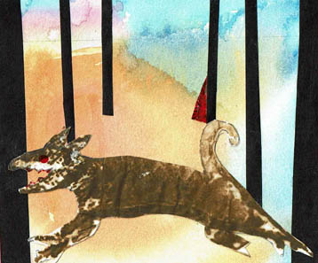
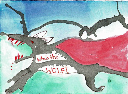
I went around several times. There was one other orientation that was intriguing and likely would have been deeper expression for me, but I do keep in mind my time limitation. I am sticking to my one hour religiously and sometimes that means sacrificing an idea or technique. That’s ok, there are always other opportunities. Two of the other images were already no go’s. Like it or not, this was the one remaining. Suddenly (and I mean that, like a bolt of lightning) the wolf appeared, really well defined. The major work back into the wolf shape was adding teeth and ears (he had a nub of ear originally). At this point, all I had was white paper, black blot and the red teeth and eye.  As I was thinking and feeling what was left, I saw a curvy line that suggested Red’s Hood and Cape. You’ve got to be kidding me! So I colored that white space in with red. The image needed unity so I brushed on the dark blue for sky and green for ground. The other black blot is the silhouette of tree branch(es). I did see a snake head hanging down in mid-image so I outlined it lightly. It’s just a side note, but now we have three characters in our story.

So the image was nearly finished. There were the two white spots inside the wolf’s body, that is where the text could be. Text had to be short and handwritten. I got a toothpick and dipped it into the ink and scrawled it out.

I considered captioning it “Red’s Shadow.” That’s a black and white energy. I’m telling you the story. “Who’s the Wolf” is the ambiguous energy. Who is the wolf? Who is the innocent? Who is the onlooker? Who’s zoomin’ Who?

There was also the option to leave the space empty.  The highest expression is to let you ask your own questions or the freedom to not ask any and move along. As the maker I am forcing you to do it my way.


dailywolfracesredweb

My Daily Art Initiative is detailed here. This post is to discuss the process of making the above pictured piece.

This image was made in one hour on a 5×7 sheet of damp Rives BFK printmaking paper. The background is Pelikan’s gouache paint. I used colors intuitively and when I was finished painting I held a small fan close to the paper to dry it. (Obviously the fan is completely enclosed in a heavy wire cage for safety).  It took longer to dry than I thought it would. Remember, I’m on a one hour clock.

If you’ve read previous posts you know I have been experimenting with walnut ink and ink crystals. I use a waxed paper sheet (like deli paper only more see through) underneath any inking projects; walnut ink stains everything. I keep the paper because, well, you know. Because it’s paper and it has walnut ink on it.

A cat, let’s say, Peter Pan, knocked one such walnut ink paper off my desktop. I can’t swear in a court of law that it was Peter Pan, but I have a strong feeling it was. In this case, and likely ONLY in this case, I should thank him for it, because as I was bending to pick the paper off the floor (in order to prevent a vaudeville-like slip resulting in a worker’s comp case AGAINST MYSELF) I distinctly saw a running wolf with it’s mouth open showing his teeth. It was the head and mouth that was the easiest for me to see…although the tail and back leg were also prominent. It was just the proper size for a 5×7. I copied it on my Brother All-In-One inkjet printer. I am going to pause here to discuss this printer.

After some discussion and research Bob and I decided to get the Brother Work Smart series model MFC-J885DW inkjet printer not too long ago. I have not had an inkjet printer for quite some time. Previously I had a Canon inkjet which printed very nicely when it would print. Which considering the print head failed after 10 hours of printing wasn’t very often. I was given the first one, and it printed nicely and so when the print head failed I figured it might have been used a lot before I was given it. Just a note: if your print head fails, it costs 2x as much to replace it as it does to get a new printer. So I bought a new Canon, and that print head failed as well, unfortunately after it couldn’t be returned. I gave up on inkjets after that. We all know why, but for the five of you out there that might not, I’ll go ahead and say why. It’s because that you can purchase an inkjet printer for $19.95 and it will print very nicely, and the print head might last longer than 10 hours, in which case you are grateful. But then the fun begins. Long about 10 copies in, the dinky starter cartridges of ink that came with the printer are all drained, then you have to replace them with full size cartridges, sometimes each color separately, but at LEAST two cartridges, one black and another tri-colored. Actually, it is better if the three colors ARE separate because at least then one doesn’t have to replace a tri-colored cartridge just because you got all into yellow for awhile and now there is no yellow left, just the other two colors that have to be tossed like the proverbial baby with the bathwater. Whether you have the tri-color refill or the individual refills hardly matters, because all of them are going to require a second mortgage to replace. You see, it’s the bait and switch deal. They pull you in with a cheap printer that’s head will fail right after the time you buy the refill inks.

So, we’ve struggled along with our most excellent laser all-in-one. Laser printing is most economical but, alas, just black and white copies. Actually, it is most economical but the toner cartridge, which will last well into the next Presidency, costs $80. Sigh.

It started to seem as if I wanted color copies. I considered scanning and sending to an office supply store; color copies have gotten less expensive than they used to be ($1). However, to do this I would have to scan each item. Meaning, if I had an inkjet all-in-one I could just photocopy which is more efficient. The Brother had great reviews and the ink tests and prices were decent. And it was a great decision because I seriously love this machine, for a bunch of reasons that I didn’t even anticipate. It is fast copying and printing. All good. It is wireless and it works. Very nice. It has a touchscreen that runs it. Wow. I don’t even need a computer on to use it. It saves right to a stick drive. I control everything it does on that touchscreen. And the scanning, oh the scanning. Perhaps it doesn’t have truly professional scanning options but who the hell cares? I can scan in about 15 seconds, with no computer. I. Can. Scan. In. 15. Seconds. And, because it’s Bluetooth wireless, I can go in the other room, use that computer, use Adobe and send it to the Brother.

In short, I am in Brother All-In-One Worksmart heaven. This could be the single, most revolutionary thing to hit my studio in a long time (besides me being in there). I am not kidding.

So back to the art. Blots on paper are odd. When you use the copy machine, sometimes the blots look different than IRL. Maybe it’s the difference in the paper texture, I don’t really know. I copied the blot but it didn’t clear up the image, it was almost the same. I did use the inkjet copy to trace the image of the wolf as I saw it and decided to use that tracing as my cut out. Remember, I’m on a one hour clock. If I wasn’t on the clock I might have taken the time to redraw on the original blot, but I didn’t have the time.

The wolf needed a context. With Little Red Riding Hood uppermost in my mind these days, he was placed in the woods. Just black paper strip trees. I found a tiny piece of red paper and I colored over it with a red Copic marker. I tried for some perspective by varying the depth of field of the trees. I finished with one minute to spare.

This piece could use more detail work. I might put some grass and stones under the wolf to get him further into the foreground. I would have to do something with where Red is. The watercolor background is not very suited to the woods, it is way too bright. Red actually looks like she’s standing on the edge of an orange cliff, not picking flowers for Grandma. One more step to the right and the least of Red’s  problems is that wolf. Yes, in it’s current state, all told, it is woefully inadequate. But it does have that urgency, not withstanding it’s flaws. And it got made, all by me, in one hour.

Ok, how did I get this image. Besides the inkjet and paper, I mean. A big part of the how is obviously the obsession and research into LRRH. Pursuing a search of LRRH in my local library’s catalog, I found a book called Picture This, Perception and Composition, by Molly Bang. I had no real grasp of what this book was about, but I requested it. Turns out, Ms. Bang had done some research of her own, into shapes and colors. I am talking extremely abstract shapes. Normally this wouldn’t interest me much, except that she used LRRH as an example of how to build a narrative illustration using ONLY simple shapes and minimal color.

Step by step, shape by shape and piece by piece she takes us through building an image. If the triangle leans in, it feels this way. If it’s smaller, it feels this way. What will make the wolf scarier? How can we put Red into more danger? She ends up using white teeth, mauve background, black trees and wolf shape. Red triangle for Red and red in the wolf’s eyes and a big lolling red tongue. OMG people. In a million years I would not have put this together, EVEN THOUGH, I’ve studied color and universal shape meanings for 30+ years. This is a book that demands re-visiting, re-reading and direct application over a period of time and many experiments.

BangLRRH

This photo copyright 1991 by Molly Bang, from the book “Picture This, Perception and Composition.

It is obvious that this author knows her subject. She has personal knowledge and has used the technique with students of all ages. The book is simple because she made it that way. The concepts are complex, her presentation is digestible. Look at what I did, after just exposure to her concepts. I simply do not believe I could have rendered this work before. I urge you to give yourself the gift of this book if you are interested in the emotional, psychological and perceptional aspects of shapes and colors.

Astonishingly, this book is available used on Amazon for .01 plus shipping. You know where I’m going.

Afterword: I receive no compensation from Brother, nor am I an affiliate for Amazon. Molly Bang is a prolific illustrator of children’s books. The illustration from the book Picture This is used as an example for education and review only.