Archive for the ‘expressive painting’ Category

atcdrawings

I used ATC sized watercolor paper, drawing supplies and a travel-sized Cotman watercolor paint set to create these two expressive drawings. I experimented with the w/c, dripping, tilting and scumbling paint around in many layers, getting a feel for it.

Creating my bear creature: it was a few marks in the face and ear that suggested the bear, plus, I am easily provoked to see bears. I had no idea what to do but I went with pen marks as inspired. He’s got black drawing pen and white Sharpie®paint pen, of course. Everything is better with anything Sharpie®. Just sayin’.

The other one screamed “Fish Face”. There was a gaping mouth and one eyeball. I put the mouth in and it looked like the inside of a vacuum hose. Not what I was going for; perhaps thinner lips would have been better. Perhaps this fish had botox lip injections? That could’ve been a story all to itself but I just thought of it now. I drew in eyes next, then drew what was meant to be fins alongside the mouth, but they looked like a mustache. Vacuum cleaner botox lips with a mustache. Where to go now? Not up, for sure; just downhill from here.

I outlined a forehead area because, what the hell? A mustachio’ed fish definitely needed eyeglasses, so I drew those and intensified the eyes a bit. He needed something under that mouth so I drew a teddy bear smile because, what the hell? I got the black and white Sharpie® paint pens, which make everything better, and added pointillism which always makes everything better as well. These are two tips you will thank me for if you follow up. I wrote the word ART on the forehead because, what the hell? I couldn’t think of another word and I was sick of the whole thing.

With some distance on the process I see that I like these drawings a great deal. I like the imaginative creatures. Mostly, I like that I pushed myself past my comfort level in drawing them. I had average ok drawings and didn’t know what to do to make them better. That’s where additional embellishment took them to another level. It’s hard for me to do that with drawing, I lack the confidence. I’m worried about ruining what I already got decently drawn. Practice pushing past comfort is what improves drawing skill. Remember, its only paper.


Advertisement

both named spot

I was at the Dollar Tree when I came upon this 6×9 Road Atlas of the United States. Lucky for us they lied about the United States part by including some parts of Canada at the end of the book. Just more drawing fun for us! Even more drawings for the $1! Such a deal!

I picked Alabama to work on. It was toward the front (duh, “A”) but mostly it was because I saw a frog, very rough, in the highways and byways of the map. I’m very fond of frogs and toads of all kinds. I love their eyeballs so I drew one in right away to give me hope. I sketched in arms, a leg and squishy feet–little splayed out toes and long fingers like E.T. It was all fun and games til I tried the mouth and drew it too high. Suddenly, the long snout and high mouth made the figure all doggish. So did that neck. I was in trouble. I shifted my attention to creating the spots in orange, teal, green and yellow. I was using Stabilo® water soluble pencils, so being too lazy to get up to get water, and likely with a 10# cat all cozy on the recliner, I wet the tips of my fingers to smoosh the color around to blend it a bit. I wanted the splotches to look like those brightly colored rain forest frogs.

No matter what I did, it still looked like a dog. So I drew a collar on it’s neck. I was PUSHED TO THE WALL, people. Out of spite, I gave the frog/dog a bumpety ass.

At this point, what we have is a frog/dog floating in the middle of an Alabama map. You can’t leave a frog/dog stranded in Alabama like that, its inhumane. So I gave him a bit of his own real estate and decided to make the boundary uneven and color some of it black. I used the shapes and spaces created by the highway intersections to decide where to put the black paint. Then I drew around the map itself with black and created black photo corners. I outlined the legend and drew another rectangle at the top right to even it up. Then I wrote “frog as dog”, “dog as frog” “Both named Spot” and called it finished.

I am happiest making expressive art. If I sit down to draw a frog out of my imagination it will look way worse than Spot. But the slightest suggestion, the merest hit of a blush of a rumor that a shape is there is all it takes for me to get rolling. It can be ink, highways, blobs or scribbles, anything that suggest a shape works.

As a maker, it’s important to figure out how you work effortlessly and with the greatest degree of satisfaction. If it isn’t fun, you won’t do it. While I continue to play around with techniques I haven’t tried, materials I haven’t used, ideas I’ve never taken into practice, mostly I return to the fun of spontaneity and going with whatever unfolds. I almost always like the result. When I don’t enjoy the end result, I very likely still had fun and learned something.

I’ve made a lot of bad drawings in my life and I will make many more. From my own experience I know that anyone can get better at drawing with practice. If you are not inherently skilled in drawing, you must practice if you want to improve. There are many techniques to improve your eye/hand, right brain/hand. Presently I am studying and practicing from Carla Sonheim’s Drawing Lab and Drawing Imaginary Animals books.

Carla Sonheim also believes in the value of silly. A fun part of expressive painting and drawing is that the maker is telling the story. It’s my story so it can be whatever I want it to be. You might think a house can’t lean sideways but in my world it can. Suddenly it is Crooked World and I’m thinking of grasshopper legs and Andy Rooney’s eyebrows.  In today’s world a dog is a frog and a frog is a dog and they are both named Spot.

constellation crown

Hello there. My Daily Art project almost did not get done. I deep cleaned several rooms of my house due to absolute necessity, which is the only thing that will get me to do it these days. Plainly put, I was plum tuckered. It was 3 pm and I so much did not want to do anything but shower and sit down. But I’m a trooper, you might say a pooped trooper, but a trooper nonetheless.

I cut our Crown Wearer out of another gift card bag (the skinny kind). The paper cutting where you fold in the middle and then freehand cut out a shape. In my mind was a verse such as “her tangled hair formed a constellation” which is good but her hair wasn’t very tangled. So I improvised. A lot of that happens in the studio because nearly nothing turns out the way I thought it would and that hour goes by fast, people.

But I liked our Cosmic Crown girl, so I riffed off a few constellation crown verses and came up with this one. Lots more words than I planned to use before, so I had to go into the bowels of the hoard to find a rubber stamp set that was small and legible enough to do this verse. Don’t you know I had one?

“Constellation” is a long word and I didn’t want to hyphenate it because I despise hyphens and will move heaven and earth not to use them. You think I am kidding but I am not. I don’t kid about hyphens. They are not funny, they are supremely annoying. Anyway, Hyphen Avoidance brought about the idea of making some of the words vertical, hugging the figure. That way I could start the first part of the verse higher in the image and bring the eye down the left side, eliminating the confusion readers have wanting to go left to right as the default habit. Killed two birds with one stone by refusing the hyphen. Of course, the word “falling” is perfect to make gestural so I did.

The heart is a piece of deli sheet that had black ink splotches on it. I watered down some orange/red paint (the same color I used on Starman yesterday because it was still on the desktop.) I free-cut the heart just like a valentine.

I put iridescent acrylic paint over the top of the Rives BFK printmaking paper as my first step. Scanners and monitors do not pick up iridescence but it is there. Then I took clear gesso and went over the stars and the words to try to put at least a small barrier over what I needed to keep iridescent. I decided I didn’t want to run the navy over the text, so I can’t say if it would have been a decent barrier, but you can make an experiment if you need to, keep it in mind. “They” say gesso can be used as a resist but I can’t say I have tried it much. It seems counter-intuitive to me, considering that gesso’s job is to prepare surfaces to TAKE paint well. But “they” likely know more than “me” so take what I say with a grain of salt and find out for yourself.

I needed another couple of pops with the orange. I never intended to do the stars with orange, nor all the stars, but I did the small one at the bottom and then the top ones needed it too. Then the word “burns” needed it and then the edge of the constellation block said “me, too”. Then the damn thing was done.

I like her very much and am glad I went in there. Now I am more pooped and I will talk with you tomorrow, likely.

bound by stars

This Daily Art practice took the full hour to make. I barely had time to frame it out and add the acrylic dots and stamp the text.

Most of the time was spent weaving the paper strips. It takes awhile to get them situated and then affixed with matte medium, then dried enough to continue. I bought matte medium today because I ran out of it…I tried to get along with just Mod Podge but some applications don’t work with it. If I don’t want the hard resistant coating on the surface (like here to glaze it with acrylic) I prefer matte medium. If you aren’t aware, matte medium is a glazing medium, sealer and adhesive (lightweight). Mod Podge is a sealer and adhesive (heavyweight). If you want stuff impenetrable and permanent and affixed until the Four Horsemen ride through, Mod Podge is your huckleberry. Anything else use matte medium.

My plan with the piece was to mask the weaving in a shape of some sort.  A mask is a reverse of a stencil; in fact, a mask is the piece you get when you cut a stencil. Not all stencils create great masks, because if the stencil is very detailed you can’t keep all the bitty pieces to use as a mask. A stencil prints over where it is put and a mask prints around the space it is put. Obviously you don’t have to create a mask to do a mask technique…you can freehand letter or draw, around what you want to keep and cover what you don’t want with color.  In this way you can make an expressive drawing with shapes, letters and focal images in a composition. It is a fun way to do stuff, sort of in reverse.

I’ve seen artists put layers of material on a substrate only to cover up most of it with black paint. Seems like a bunch of work gone to waste to me, but the results are spectacular. Also, if you scan the piece before covering it, you can use the work over and over by printing it, thereby making use of the time it took to make it.

Keep in mind that you can use any color as your outline/fill, not just black. Also, depending on what you are outlining, you could use white or a pale color. That could be cool. I haven’t done that yet.

I was going to cut a stencil for this basic figure with the antlers. I would use it and it seemed worth the time to do it; I’d have both a mask and a stencil to use. However, the stencil board I have was under a bunch of heavy paper and I couldn’t get a sheet out. I looked around and saw a greeting card kraft bag (you know, the slender kind) so I cut the figure out with scissors. This was the easiest, fastest way to get the job done. Then, I laid the mask over the weaving and outlined with my favorite Wolff’s Carbon drawing pencil. I selected grey as a background cover because I like grey, but had I not been so hasty, I might have selected navy. It would have been richer with the orange and since I texted “bound by stars” navy would have made sense. Ahhh, another day.

If you are in a hurry or have hand problems or patience problems or are afraid/unable to use an exacto knife, a pre-cut stencil is an inexpensive long-lasting tool (although they are quite pricey for what they are, I mean cheap plastic). Since stencils have become so popular, they are now very detailed laser cut available in diverse design styles. I have stencils that I would not in a million years consider cutting out myself. But, you can make a perfectly wonderful unique stencil yourself in less than an hour. You can use your own drawings, clip art, images from photos, etc. You can scan a photo into a basic photo altering program, many of which feature a “stencil” filter. Print the altered photo and  create a stencil. If your program doesn’t have a “stencil” feature, up the contrast and voila, a usable image. Build a library of favorite symbols, animals, etc. You get the point. Anything that gets more of your own hand into a piece makes it more satisfactory and interesting, IMHO.

Don’t forget to keep the cut out parts of your stencils and put them in a separate envy called “masks”, or file them with the stencil.  Once you start to mask, you will be glad to have them.

who's the wolf

Another Daily Art challenge make. I am revisiting Red; I’m not alone, lots of people are seeing Red these days. There has to be a reason she is surfacing to consciousness right now. I’m not speaking for anybody else, but I feel two contrasting and contradictory energies at work currently. The illusion of black/white vs. ambiguity.  The middle road seems very narrow these days. Mulder is back with his “question everything” philosophy. I like that; my feeling these days is that the questions are more worthwhile than the answers.

I started with the Rives BFK® printmaking paper and dropped some water randomly onto the surface. I put some black Dr. Martin’s® Bombay ink into the plain water drops and let it spread. I blew it around with just my breath and let it wander, then set it aside to dry.

I wanted to use tube watercolors today, so I picked up an ultramarine tube and kneaded it gently to mix the pigment up. These tubes are old so I go easy, but today not easy enough. I was daydreaming and looked down to find ultramarine watercolor all over my fingers. Luckily I had torn up a bunch of lunch sacks yesterday so I wiped my hands all over those pages, and everything else that wasn’t nailed down. Then I took a big brush and swiped water all over the paper to move the paint. I don’t want to think about how that will turn out when it dries, but can you say “CRINKLE?”

Well, watercolors dropped way down the list. That’s how easily I am deterred from stuff. I thought I might try ink. I have a mess of Higgins inks and I like them very much but I never have drawn with ink. I bought them for the purpose of making blot papers for my Interactive Intuitive Readings™ but they didn’t end up working as well as the Bombay ink. Higgins® Dye-based Drawing Inks are much less expensive and highly pigmented. The back of the package says they can be used like liquid watercolors.

I really like the way these inks move, and I would definitely equate them to watercolor nature. **Be advised, I have no watercolor or inking skills. I am purely at a “coloring book” level. If you want to investigate the qualities of either medium, consult someone else with a far greater proficiency.**

The black ink blot was dry so I started looking at it, spinning it around to see if anything presented itself. Here’s how I work with blots and expressive art. Take a couple of breaths, close eyes, open eyes, soften eyes, turn the paper. Pause. Turn paper, pause. Do this all the way around. Subconsciously you likely already ruled one orientation out. Keep going. Don’t get scared. There will be a point when you feel panic and think, “I don’t see anything!” That’s good and natural because this is a trust issue. Expressive art is about developing trust in your creativity and your instincts. Just breath again and keep going.

I went around several times. There was one other orientation that was intriguing and likely would have been deeper expression for me, but I do keep in mind my time limitation. I am sticking to my one hour religiously and sometimes that means sacrificing an idea or technique. That’s ok, there are always other opportunities. Two of the other images were already no go’s. Like it or not, this was the one remaining. Suddenly (and I mean that, like a bolt of lightning) the wolf appeared, really well defined. The major work back into the wolf shape was adding teeth and ears (he had a nub of ear originally). At this point, all I had was white paper, black blot and the red teeth and eye.  As I was thinking and feeling what was left, I saw a curvy line that suggested Red’s Hood and Cape. You’ve got to be kidding me! So I colored that white space in with red. The image needed unity so I brushed on the dark blue for sky and green for ground. The other black blot is the silhouette of tree branch(es). I did see a snake head hanging down in mid-image so I outlined it lightly. It’s just a side note, but now we have three characters in our story.

So the image was nearly finished. There were the two white spots inside the wolf’s body, that is where the text could be. Text had to be short and handwritten. I got a toothpick and dipped it into the ink and scrawled it out.

I considered captioning it “Red’s Shadow.” That’s a black and white energy. I’m telling you the story. “Who’s the Wolf” is the ambiguous energy. Who is the wolf? Who is the innocent? Who is the onlooker? Who’s zoomin’ Who?

There was also the option to leave the space empty.  The highest expression is to let you ask your own questions or the freedom to not ask any and move along. As the maker I am forcing you to do it my way.


dendritic duo

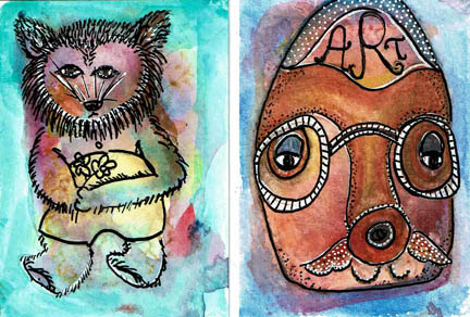
No, not new Superheros to keep track of, rather, two separate dentritic monoprints taken from the same blots.

I talked about the dentritic monoprint process I started playing with last week after seeing a video on Youtube by Shannon Green. On Thursday I pulled two prints, one from each glass plate, so they are both first prints. On the second plate I used a paintbrush end and did a swirly line through the main paint blot. Other than that, the prints were very similar, as similar as two monoprints can be. There are always differences of some kind caused by the pressure put on the paper, a slight shift in the paper or the type of paper used.

I also want to mention before I forget that what reads lavender-ish on the monitor is actually hot neon pink. The orange is bright neon orange. The prints are actually more interesting IRL than they appear here. Sorry about that.

The bird image was completed on Thursday. An urge to do a somewhat representative drawing predominated my mind that day.  Remember I said I was very afraid and had to hug Bunny-kins at the thought of working on this? The blots on these pages weren’t connected in anyway to each other. One huge blot, one smaller purple blot, one odd shaped grey blot and two teeny grey ones. It unnerved me.

I saw a parrot in the big blot and once I got the eyeball in it was easier to place a beak and outline the body. The way the neck was stretched out reminded me of a bird looking out of a hole in a tree so I drew some loose vertical lines in a fine pen. The grey egg-shaped blot needed to be contained. The idea of a baby bird hatching seemed a good story but I didn’t trust myself to be able to draw a baby bird. Plus there was that teeny grey blot above to deal with. I decided the egg was a body, turned the teeny blot to a face, drew a skinny creature neck between the two blots and had the beginning of a friendly guy with no limits on how kooky it could get. I gave him five deely-bobbers and suddenly he needed energy lines as well. I had that other teeny grey blot under the bird and decided he could have multi-fingered flower hands and drew him long squiggly arms. I think he’s trying to give the bird a hug but I don’t want to impose that on him. Perhaps he is measuring the bird’s head for a hat. Which couldn’t be easy because of all those fingers, but look how Edward Scissorhands adapted.

That purple blot at the bottom was worrisome. I turned it into an eye and it developed rapidly into the Stink Eye. I figure, in this odd world there is no rule that an eye has to be in a normal place, so I made a creature with three wimpy legs holding a substantial body with a Cyclops eye. EEEWWW.

I tried to balance the colors I added (yellow, orange). Now, I will admit that I have a major Neon Jones. Nobody was happier than I was when Neon came back. However, I do not like black with neon; it gives me a headache. I prefer to pair neon with grey and white. I love grey as a neutral. Grey and navy are my blacks. Sometimes I need the darkness of black but it isn’t my huckleberry.

Friday I wanted abstract expressionism. The bird drawing wore me out and the swirl on the second print was making me nervous. It dominated that blot and it didn’t form anything that I could work with. I didn’t want to add any colors, either. I started by drawing loose outlines around the shapes of the smaller blots. Of course they were all hanging in space individually, so I drew some bubbles and lines to connect them and that worked. Then I went back in and drew lines around the color in all the blots (except the faded grey at the left side). All the black outlines started to unify the drawing.

Now I want to talk about pointillism. Pointillism is drawing with dots. If I am in the mood to do it, I cannot get enough. I find it relaxing when I’m in the mood. If I’m not, it works my one nerve. In the past I actually did canvases in pointillism. Sometimes the medications I was taking gave me different energy and tolerances for certain methods. Right now doing a work of that size in dots seems like a fresh hell. But I haven’t used pointillism in so long, it was tons of fun last week.

The bird image was simple. The white part got extra fine black pen dots. The colored parts got white Sharpie® Paint Pen dots. The dots were small and lots of space between them. But the abstract was a different story. I knew after years of practice that creating different-sized dots adds movement, as does space between dots and solid dots vs. outlined dots. So I mixed them all up in this piece. I wanted to move the eye INTO the page, so I started with big dots on the left side,corner and top, then went to medium dots, then down to fine dots as I went toward the center. I used dots to outline the big blot, rather than lines. That set it apart from the other blots. Around the big dots at the left, I filled in with small dots. I left the colored and white pieces unmarked.

I like my use of white space in this image. For my eye, it’s just the right amount of resting room. The blots in this image have various possibilities. Is the large blot a bird? A tropical fish? I have no idea. I have no narrative for this piece. It’s beauty for me is the balance of color, size, detail, movement, line vs. dot.

So, now you have more ways to make and work into your dentritic monoprints. Expression vs. abstraction. Pointillism. Neons with grey. Go for it.

bunnykins

Ok people, listen up. This stuff can happen to you–fair warning!

I showed a dendritic monoprint yesterday and this is another, only I didn’t work off a direct print to my Rives BFK® printmaking paper. I worked direct print to a piece of scrapbook paper that I was hoping to see the end of. The marks presented a bunny to me. I would have liked something that wasn’t a bunny, believe me. But it was unmistakably a bunny; worse, it was a toy stuffed bunny.

Actually, and in fact, I did have a stuffed bunny when I was little. It was nifty as it held my pjs when I wasn’t wearing them. So I am no stranger to a stuffed bunny but at 60 years old I have other things on my mind. Or one would think. Evidently not.

Here’s what happened. I prepared a background on the paper by scraping and dabbing several colors (pink, rust, blue), mooshing them around. They had to dry so I cut out the bunny, using the dendrite patterns as my basic outline and snipping to further accentuate the shape. I had to free cut an ear, original bunny only had one laying down on it’s back. It seemed some of the dentritic marks could be stitch lines. I drew in his laying down ear, the outline of his foot, his tail and eye with an indigo Prismacolor® pencil.

My idea was to revisit the technique whereby one paints a background, creates lettering (say, block letters) or other shapes, then paints in a darker or lighter color around everything not outlined. This creates a terrific detailed look inside the lines. In other work, I’ve done a lot more detailing on the bottom layer before adding the over paint layer, but I only have one hour to get stuff dry. My initial thought was to do a light color over top, but I didn’t think the bunny would stand out enough. So I went with the watered down darker indigo. It makes it moodier, more like a foggy memory than the piece would have been all bright and cheerful. That was definitely a way to go too, but I went with the moodier, dreamier quality. It’s the way I rolled yesterday.

But I was mindful of getting too dark. This isn’t named Donnie Darko after all. We do not want to scare the pants off ourselves. Keep telling yourself, “It’s just Bunny-kins.” I had settled on that pet name, so I couldn’t go all Big Bad with it. Just moody and dreamy is good. So I added some hearts, and a white picket fence and some clouds. Now we are reminded of the happy Bunny-kins times of our carefree  youth. The way it should be.

The black outlines are Sharpie® black paint pen. I live and die by the Sharpie®. You know this, I should not have to repeat it, but I do, for your edification. Everything here is for you and don’t forget it.

Today’s work is still in progress. It is another dendritic print, a direct print, which is so frightening to me I need to hug Bunny-kins to get through it.

mushroomfairy

I spent most of yesterday morning playing with dendritic monoprinting on pieces of blank or previously painted Rives BFK® printmaking paper. Remember I am doing a Daily Art project and I have an hour to get it all done (or as done as it’s going to get). Even though the paper here was pre-painted, I was still pushed by the clock to get it finished.

As I’ve mentioned in previous posts, I particularly enjoy expressive art practice. I don’t draw well enough to plan and execute a design. Somehow when I start with a rough random pattern I do much better. If you can imagine the image before I outlined and worked into it you might see that there were three pieces of dentritic printing on the page. (The dendritic patterns are the indigo fern-ish marks). The first is the large focal point that I turned into a mushroom. It really did look mushroom-like from the get go. The second painted shape was the small circle at bottom left, and at top middle there was an oblong shape. Then there was the predominant rainbow striping to deal with. Before I worked into it, it was a hodge-podge-lodge of dramatic patterns. I actually despaired of it, thinking it was a hard challenge under any circumstances. But I persevered and started on the mushroom and it went pretty well. The I thought the smaller circle could be a less mature sprout; some mushrooms have that puff ball look when they are babies. I duplicated the colors except to make the yellow bolder with a tad of orange.

Now, I have two finished mushrooms on a striped rainbow with an obnoxious small oblong shape. It had all these little dentrites on the edges and the inside was empty. I decided to try a face shape around it and that meant I had to try and match a drawn eye to the painted one (or produce a Cyclops. EEEWW). This always fills me with horror; matching eyes is always problematic.  I am great with ONE eye (well, great might be an overstatement).  One looks good, and the other one that should match gets lumpy or squinty or looks like the subject is giving the Stink Eye. I braved through it with a colored pencil and actually got a pretty good match, if I do say so myself. And I just did. The nose and mouth weren’t much of anything to do, and I figured we’d carry that dentritic pattern up to the hair; looks like a root crown to me. Unless this is a self-portrait of me getting down on my belly to see a mushroom (and that does happen pretty frequently; there are photos involved to prove it) I figured she to be a fairy and gave her dragonfly wings or a reasonable facsimile of them. With all the detail and red up top, the bottom needed some red for balance so I did little tulips and added green and ochre around the base of the mushrooms to ground them. I then ran out of time.

I don’t know if I would have done more given the time. I very much like this piece. It was a challenge and I did some drawing which is always a good thing. I resist drawing most of the time but this was the perfect situation to do some expressive work. I do think the mushroom and face compete because of the details and size. Generally we conceive of fairies SITTING on a mushroom, not looming over them like Godzilla. But who are we to know what a nature spirit looks like? She looks benevolent enough, if a little pensive, as if she has a big “To Do” list today. Definitely not giving the dreaded Stink Eye.

You probably want to know how I came to do dendritic painting, or what it is. I don’t know what got me there, but I watched Shannon Green on YouTube University demonstrating it. She got it from somebody else which is how we all learn. Basically, it involves two pieces of strong glass, acrylic paint, pressure and lift, then two prints. You can sometimes get two prints off each plate, but the second prints are not great. Good for scrap paper, though.

I have way too much scrapbook paper for someone who doesn’t scrapbook. I probably have way too much scrapbook paper for someone who DOES scrapbook. And to be honest, I don’t know why I do because I have no interest in it. I think most of it was just there, like Mount Everest. I decided the dentritic monoprinting was going to feel very good on all that scrapbook paper. And it does. I made good use of it in today’s Daily project, but that is for later to show.

If you have a bunch of paper you want to make more attractive, get yourself the supplies I listed above and watch Shannon’s video. It’s easy, inexpensive and fun. No two patterns are the same. If you don’t like glass, or have kids involved, try it on sheet protectors or transparencies, or maybe use cut acrylic sheet. It is the stucked-ness and air bubbles and release of pressure (suction) that makes the dendrites.  I plan on trying transparencies because I hate glass and sharp stuff like grim death.

meerimagic

I worked for the first time in this book, Fireside Children’s Songs illustrated by John Alcorn. I bought this book in a thrift; it had no dust jacket and a loose/torn spine. The illustrations were of the sort I grew up with. This book was printed in 1965 (I was ten that year). John Alcorn was an illustrator who was widely published in ads, posters, and books throughout the 60’s, 70’s and 80’s. He had several dominant “styles”: psychedelic, folk artsy and some realistic drawings. The illustrations in this particular book I would classify as a mix of folk art/circus/turn of the century style. There are only four colors used: harvest gold, hot pink, medium orange and black (all on white paper except a couple on black background).

Because I bought the book for the illustrations and subject matter (I love old children’s songs) I couldn’t bring myself to destroy his work. So I had to figure out how to work around it in each spread. Most pages in the book contain some sort of illustration; often a two-page spread has a relationship between the images. The song here was “There was a Crooked Man.” I decided not to use any of the existing text on these pages.

I gesso’d the pages both to strengthen them and cover up the text. The pages of this book are not slick so gessoing was not a problem and it dried quickly. Because I love border and edge work I started by drawing this bold geometric “flag” design. I ran color along the top smaller border but didn’t want to do that all the way around, so I filled the rest of it in with a permanent pen. I scraped a small amount of neon pink, black, yellow and orange paint onto the pages with a credit card. I used the neon for two reasons: I had it and it was the closest to the colors Alcorn used, and I wanted to update his colors to more current tastes.  I prefer brights and neons, so I went with it; I think they work with his colors. The black also helps unify them.

Two creatures appeared to me in the paint scrapes. On the right is a five-legged doggish sort of guy. On the left under Alcorn’s crooked cat is a fox-like animal. I enjoyed making the five-legged creatures feet–one of them looks like a toilet plunger. Good suction in a wind storm. The other feet look like giraffe and horse hooves and a duck’s foot.

After I penciled the outlines for the creatures I knew I needed a central focal point. Since the pages so far had a bunch of animals and a house, I figured the resident of the house was a good start. I am very fond of this stencil from Dina Wakeley. It has three faces, all about the same size, similar but with slightly different expressions. She had the sweetness and folksy look to complement Alcorn’s designs and my decision to create a story. I made her the heroine of my tale. Her body is an inkblot stencil pattern, which gives her a kind of creature-y look as well. Perhaps a shapeshifter?

The spread needed some filler and incidental color pops. I used a rubber stamp set of playing card suits. I stamped the diamond suite on her forehead in the “third eye” area and that cinched her magic qualities.

I don’t know where the name Meeri came from. No doubt there are people named that but I wanted something unusual with a sing-song quality. I stamped the text, “Meeri is legendary for her magic and the company she keeps.” I finished it off with three page reinforcements that I painted black. My very last addition was one of the little creatures I traced from the Dollar Tree Monster stencil set and I placed him in an empty area that needed him.

I love this piece and think my additions hold their own against John Alcorn’s wonderful work, at least in the story-telling department.

begin to date

Here’s my Daily Art for the first day of 2016. Happy  New Year!

Today I started with the 5×7 Rives BFK printmaking paper. I worked with navy acrylic yesterday in different piece and I felt good about this color. It’s not been a favorite of mine in the past, even though it so represents the clear night sky. I wet the paper so that the acrylic would wash the paper and be less opaque. The fan helped to get it dried in time to meet my one hour time limit.

I have Sharpie Paint Pens™, both oil and water-based. The oil-based are transparent, the water-based are opaque. Usually I go for the water-based; they do a great job over acrylic paint and not all pens do. But I wanted to try the oil-based because it’s been a long time since I’d used them. As I thought, the paint went on looking somewhat opaque but it faded as it dried. I continued to write “Begin to Dare, Dare to Begin” over the navy and all that showed was the barest grey letter outlines. I then switched to the white water-based opaque pen and began adding viewable text.

If you are unfamiliar with asemic writing, it is writing that is without content. Asemic writing resembles mark-making; it compels one to look and look, trying to find words that can be made out, to construct a meaning. It’s handy for me to enjoy the look of asemic writing because my handwriting doesn’t enhance my artwork at the level I’d like it to, especially in this era of carefully and creatively hand lettered journal pages. When I do hand letter a piece, I’m not aiming for highly decorative or readable text; rather, I work to my weakness (strength?) of indecipherable messy lettering. But in contrast to asemic writing, rather than being without content, my content is simply unreadable. I have a Pinterest page where I collect asemic images, if you’d like to explore it.

I began to encircle the center image with white Sharpie™ water-based pen. At first the navy shape inside the white center looked like a long-haired female with an arm outstretched. But I also saw trails like a comet, so I went with that idea, which seemed more expressive. I didn’t want to write with black, so I found a Sharpie™ extra-fine pen in purple. I thought purple looked more like the cosmos. I wrote with it in a different size in order to create greater contrast to the white writing. At this point, the image looked as if it needed more gravity on the page, so I did imperfect circles around the center. The empty center and outer circles created a mandal; a Begin and Dare mandala. I signed and dated it which is another “rule” of the Daily Art Initiative.

The subject matter of “daring” relates to Lisa Sonora ‘s current 30 Day Journal Project that began today. The prompts today were about achievements and what had to be dared to accomplish them. My journaling was about commitment and beginnings, so I brought those ideas into this piece. It’s possible that this 30 day challenge will inform other Daily Art projects.