Archive for the ‘Stencil’ Category

bound by stars

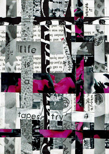
This Daily Art practice took the full hour to make. I barely had time to frame it out and add the acrylic dots and stamp the text.

Most of the time was spent weaving the paper strips. It takes awhile to get them situated and then affixed with matte medium, then dried enough to continue. I bought matte medium today because I ran out of it…I tried to get along with just Mod Podge but some applications don’t work with it. If I don’t want the hard resistant coating on the surface (like here to glaze it with acrylic) I prefer matte medium. If you aren’t aware, matte medium is a glazing medium, sealer and adhesive (lightweight). Mod Podge is a sealer and adhesive (heavyweight). If you want stuff impenetrable and permanent and affixed until the Four Horsemen ride through, Mod Podge is your huckleberry. Anything else use matte medium.

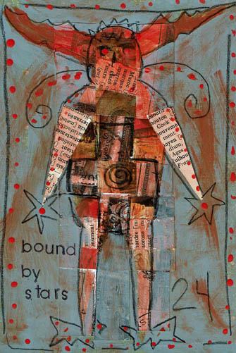
My plan with the piece was to mask the weaving in a shape of some sort.  A mask is a reverse of a stencil; in fact, a mask is the piece you get when you cut a stencil. Not all stencils create great masks, because if the stencil is very detailed you can’t keep all the bitty pieces to use as a mask. A stencil prints over where it is put and a mask prints around the space it is put. Obviously you don’t have to create a mask to do a mask technique…you can freehand letter or draw, around what you want to keep and cover what you don’t want with color.  In this way you can make an expressive drawing with shapes, letters and focal images in a composition. It is a fun way to do stuff, sort of in reverse.

I’ve seen artists put layers of material on a substrate only to cover up most of it with black paint. Seems like a bunch of work gone to waste to me, but the results are spectacular. Also, if you scan the piece before covering it, you can use the work over and over by printing it, thereby making use of the time it took to make it.

Keep in mind that you can use any color as your outline/fill, not just black. Also, depending on what you are outlining, you could use white or a pale color. That could be cool. I haven’t done that yet.

I was going to cut a stencil for this basic figure with the antlers. I would use it and it seemed worth the time to do it; I’d have both a mask and a stencil to use. However, the stencil board I have was under a bunch of heavy paper and I couldn’t get a sheet out. I looked around and saw a greeting card kraft bag (you know, the slender kind) so I cut the figure out with scissors. This was the easiest, fastest way to get the job done. Then, I laid the mask over the weaving and outlined with my favorite Wolff’s Carbon drawing pencil. I selected grey as a background cover because I like grey, but had I not been so hasty, I might have selected navy. It would have been richer with the orange and since I texted “bound by stars” navy would have made sense. Ahhh, another day.

If you are in a hurry or have hand problems or patience problems or are afraid/unable to use an exacto knife, a pre-cut stencil is an inexpensive long-lasting tool (although they are quite pricey for what they are, I mean cheap plastic). Since stencils have become so popular, they are now very detailed laser cut available in diverse design styles. I have stencils that I would not in a million years consider cutting out myself. But, you can make a perfectly wonderful unique stencil yourself in less than an hour. You can use your own drawings, clip art, images from photos, etc. You can scan a photo into a basic photo altering program, many of which feature a “stencil” filter. Print the altered photo and  create a stencil. If your program doesn’t have a “stencil” feature, up the contrast and voila, a usable image. Build a library of favorite symbols, animals, etc. You get the point. Anything that gets more of your own hand into a piece makes it more satisfactory and interesting, IMHO.

Don’t forget to keep the cut out parts of your stencils and put them in a separate envy called “masks”, or file them with the stencil.  Once you start to mask, you will be glad to have them.

Advertisement

lifeisatapestry

Well, guess what? The studio is tossed again.

Last week I put my big folding table into the middle of the living room and brought out the various and sundry boxes and bins of paper and images and sorted it into cool boxes I got at the Dollar Tree. The boxes are letter-sized and have a self-lid and hold a goodly amount of of paper. I was soon overwhelmed with the sorting but I did get through the bins It is so much easier now to keep it neat and find images by subject matter which is important to me. I wanted to do a page with an owl last week. I have 284 pictures of owls around here and couldn’t fine one. One. That’s what started this ball rolling.

I got overwhelmed, particularly with laser copies (lots of black and white) of my own photographs. In the good old days I had a color laser printer and I routinely printed contact sheets and reproduced my photos. Lots and lots of mannequin photos because I used them frequently in my work. I knew there were too many to go into the nifty boxes without there being 30 boxes of mannequin photos. So I started shoveling them into a separate pile. Before I knew it, that pile was teetering on the edge of calamity just like my sanity.

I had to put the big table away, and the stack took up home on the dining table. I filed the neat boxes away in the studio and that was a wonderful feeling. But then I’d walk through the center of the house and the stack that didn’t get filed away, mostly my OWN art, was taunting me. Plus, the dining room is smack in the middle of my feng shui Wealth area and that is not good. How many mannequin photos can your Wealth area overlook? If I know my Wealth area, and I do after many hours of studying it and moaning over it, there were about 6000 more mannequin faces than it could manage. My Wealth area couldn’t even with it and neither could I.

There were stacks of paper. Strangely, I’ve been obsessed with stacks for awhile. It started with caryatids about 18 months ago. They were fascinating to me. Then I saw pictures of cairns that my husband took in the Smokey Mountains last spring. There is an artist that works in several rivers up there making cairns (he’s around on the internet, Google him if you want to see his work. He is really good, a true Rock Whisperer). Then I ran into this cool Edward Gorey’ish fabric during Halloween that was so exciting to me. About that time the Alice in Wonderland stencils showed up at Dollar Tree. One day I couldn’t take it anymore and cut out a caryatid, the gothic fabric and created an Alice stack using illustrations and stencils. A reprieve but I returned to stacks again.

Stacks of paper. Obsession with stacks. What are stacks? They are layers on top of layers. Image on top of image. Strips on strips.

I couldn’t use all those faces, but I could use strips of paper. I could weave them, layer them, draw on them, use them as backgrounds, etc. I could make strips out of all that stuff, throw them into a box and haul a handful out and use them however I want to in the moment. If I found I didn’t like the process, or wasn’t using the strips, I could toss it all into the recycle bin with no guilt.

So yesterday I spent a few happy hours layering paper and cutting it with my paper cutter. All different widths. I find cutting or tearing paper stress relieving. I can honestly say I enjoyed it, and I thought about the strips most of last evening. I had the urge to get up and bring some in to draw on but I didn’t because we were relaxing watching Dexter. It’s one of the few programs I enjoy watching, but I was tempted and that is a good sign. I’m onto something.

So, my Daily Art practice rolled around and the first thing I did was grab a bunch of strips. I wanted to start by paper weaving. I took two wide strips, cut them into random pieces. One was a black and white photo of mine, the other text from a book. I glued those pieces randomly to a paper foundation. Then I selected several strips and cut them down to smaller widths. Surprisingly, all the strips I used are my own work. I did simple over/under weaving over top of the other images, shifting the colored strips to where I wanted them. I glued the ends down to make it permanent.

The process created leftovers and I tossed those strips back in the box to be used for another project. I decided to journal, and stamped out “life is a tapestry.” Then I wrote “weave it” in black pen randomly, and did some circles on the strip with the wording, to make it stand out more. This project was finished in an hour and I very much enjoyed it. I plan to do many of my Daily Practice pieces with these strips this month. Perhaps it will inspire you to try it.

I will soon post an update on my Mythos blog about how my 2016 Initiatives are going so far. If you have an interest check it out over the next few days. I will say here that I missed only 1 day in January. The day I missed I simply did not want to be in the studio. I was tired and not feeling particularly well. To go in would have defeated the purpose of the Initiative, which is to give myself time to do what I love. It’s not an obligation, it is a privilege.

I would urge you to get into your studio every day, even if just to paint a background or stamp a word on paper, or whatever you enjoy doing. Just for the fun of it.


ask for help

Another Daily Art practice piece with a vintage photo as a focal point. The reason I went to a photo again is because I am (again) rearranging and sorting materials and tools in my studio. In my Daily practice I’ve gotten to the point where I simply reach in and pull out something to use.

When I was sorting through shelves of old journals and books I could alter, I ran across some Canson Manga kits. I don’t know if they are still available. They are a beginner set for artists trying the comic book style. There are paper stencils to prepare layouts and one stencil is a “thought bubble” or narrative block. I liked them back in the day to create easy quick grids. They were buried in the journal shelves and I was glad to run across them. This week’s art seems to be a “Hey friend, so glad to see you!” week.

The photo is an odd size and in the portrait orientation. I put it up in the left hand corner and liked the way it went 3/4’s onto the page. But the bottom right was just filler and there wasn’t a lot of room to do any text, which isn’t necessary but the picture warranted something. So I cut the bottom right off and decided to grid it out. Gridding it seemed to help the story. Frame 1, guy on ledge watching Frame 2, guy trying to climb to ledge. Frame 3, rest the eye, Frame 4, narration. I had a piece of brittle aged brown drawing paper laying on top of the work island so I used the Canson stencil to cut out the window frame. The frame breaks up a bunch of non-narrative space and helps the viewer grasp the story. At least I hope so.

In recovery we learn to ask for help, and also learn to be willing to receive it, the way it comes. The guy that’s climbing isn’t asking for help and the guy on the ledge isn’t offering any. Maybe in the next second something happened, but right now I’m looking at what IS preserved and it seemed a good time to remind myself to Ask for Help. I don’t need help right now, but one day when I’m looking back on my Daily practice papers I might and this will remind me.

The wash is walnut ink, the rubber stamp text is StazOn Saddle Brown. The handwriting is Sepia Pitt Pen. As I did yesterday, I doodled a bit outside the photo to extend lines. I added some flowers because they got cut off by the frame.

In the second frame running down the center you might be able to see a stitch line. A few years ago I got froggy and took a bunch of old photos out and stitched them together on the sewing machine. I used them to make fabric/paper hanging collages and some were left over when I got bored doing that. Old photos can be very fragile. They were often glued to scrapbooks and then get taken out and the force of removing them weakens the paper. As I was gelling this photo to the foundation paper, the bottom tore off. No big deal, just wanted to mention that they can get very delicate.

Talk to you tomorrow, I reckon.

bunnykins

Ok people, listen up. This stuff can happen to you–fair warning!

I showed a dendritic monoprint yesterday and this is another, only I didn’t work off a direct print to my Rives BFK® printmaking paper. I worked direct print to a piece of scrapbook paper that I was hoping to see the end of. The marks presented a bunny to me. I would have liked something that wasn’t a bunny, believe me. But it was unmistakably a bunny; worse, it was a toy stuffed bunny.

Actually, and in fact, I did have a stuffed bunny when I was little. It was nifty as it held my pjs when I wasn’t wearing them. So I am no stranger to a stuffed bunny but at 60 years old I have other things on my mind. Or one would think. Evidently not.

Here’s what happened. I prepared a background on the paper by scraping and dabbing several colors (pink, rust, blue), mooshing them around. They had to dry so I cut out the bunny, using the dendrite patterns as my basic outline and snipping to further accentuate the shape. I had to free cut an ear, original bunny only had one laying down on it’s back. It seemed some of the dentritic marks could be stitch lines. I drew in his laying down ear, the outline of his foot, his tail and eye with an indigo Prismacolor® pencil.

My idea was to revisit the technique whereby one paints a background, creates lettering (say, block letters) or other shapes, then paints in a darker or lighter color around everything not outlined. This creates a terrific detailed look inside the lines. In other work, I’ve done a lot more detailing on the bottom layer before adding the over paint layer, but I only have one hour to get stuff dry. My initial thought was to do a light color over top, but I didn’t think the bunny would stand out enough. So I went with the watered down darker indigo. It makes it moodier, more like a foggy memory than the piece would have been all bright and cheerful. That was definitely a way to go too, but I went with the moodier, dreamier quality. It’s the way I rolled yesterday.

But I was mindful of getting too dark. This isn’t named Donnie Darko after all. We do not want to scare the pants off ourselves. Keep telling yourself, “It’s just Bunny-kins.” I had settled on that pet name, so I couldn’t go all Big Bad with it. Just moody and dreamy is good. So I added some hearts, and a white picket fence and some clouds. Now we are reminded of the happy Bunny-kins times of our carefree  youth. The way it should be.

The black outlines are Sharpie® black paint pen. I live and die by the Sharpie®. You know this, I should not have to repeat it, but I do, for your edification. Everything here is for you and don’t forget it.

Today’s work is still in progress. It is another dendritic print, a direct print, which is so frightening to me I need to hug Bunny-kins to get through it.

meerimagic

I worked for the first time in this book, Fireside Children’s Songs illustrated by John Alcorn. I bought this book in a thrift; it had no dust jacket and a loose/torn spine. The illustrations were of the sort I grew up with. This book was printed in 1965 (I was ten that year). John Alcorn was an illustrator who was widely published in ads, posters, and books throughout the 60’s, 70’s and 80’s. He had several dominant “styles”: psychedelic, folk artsy and some realistic drawings. The illustrations in this particular book I would classify as a mix of folk art/circus/turn of the century style. There are only four colors used: harvest gold, hot pink, medium orange and black (all on white paper except a couple on black background).

Because I bought the book for the illustrations and subject matter (I love old children’s songs) I couldn’t bring myself to destroy his work. So I had to figure out how to work around it in each spread. Most pages in the book contain some sort of illustration; often a two-page spread has a relationship between the images. The song here was “There was a Crooked Man.” I decided not to use any of the existing text on these pages.

I gesso’d the pages both to strengthen them and cover up the text. The pages of this book are not slick so gessoing was not a problem and it dried quickly. Because I love border and edge work I started by drawing this bold geometric “flag” design. I ran color along the top smaller border but didn’t want to do that all the way around, so I filled the rest of it in with a permanent pen. I scraped a small amount of neon pink, black, yellow and orange paint onto the pages with a credit card. I used the neon for two reasons: I had it and it was the closest to the colors Alcorn used, and I wanted to update his colors to more current tastes.  I prefer brights and neons, so I went with it; I think they work with his colors. The black also helps unify them.

Two creatures appeared to me in the paint scrapes. On the right is a five-legged doggish sort of guy. On the left under Alcorn’s crooked cat is a fox-like animal. I enjoyed making the five-legged creatures feet–one of them looks like a toilet plunger. Good suction in a wind storm. The other feet look like giraffe and horse hooves and a duck’s foot.

After I penciled the outlines for the creatures I knew I needed a central focal point. Since the pages so far had a bunch of animals and a house, I figured the resident of the house was a good start. I am very fond of this stencil from Dina Wakeley. It has three faces, all about the same size, similar but with slightly different expressions. She had the sweetness and folksy look to complement Alcorn’s designs and my decision to create a story. I made her the heroine of my tale. Her body is an inkblot stencil pattern, which gives her a kind of creature-y look as well. Perhaps a shapeshifter?

The spread needed some filler and incidental color pops. I used a rubber stamp set of playing card suits. I stamped the diamond suite on her forehead in the “third eye” area and that cinched her magic qualities.

I don’t know where the name Meeri came from. No doubt there are people named that but I wanted something unusual with a sing-song quality. I stamped the text, “Meeri is legendary for her magic and the company she keeps.” I finished it off with three page reinforcements that I painted black. My very last addition was one of the little creatures I traced from the Dollar Tree Monster stencil set and I placed him in an empty area that needed him.

I love this piece and think my additions hold their own against John Alcorn’s wonderful work, at least in the story-telling department.

story

Ok, this piece sure as Sam Hill doesn’t know what to be when it grows up.

It started Innocently Enough, as these things often do. I painted the paper with watercolor, dried it. Squiggled over the top with Sharpie™ fine line black pen. Then I stenciled (of course) with the alphabet set I’ve been bragging about for several months. The one that came from the  Dollar Tree. This set, as you can see, is not a “ransom note” style, but the letters fall into a few distinct styles. The simpler block style as you see in the “Stor” and the simpler, larger more cursive style as in the “Y”. Because I did not view the letters beforehand, the Y dips dangerously close to the bottom of the paper. After I penciled the letters in, I used my Stabilio® All Water Soluble pencils and wet it with my fingertips.

I cannot even describe to you what a hot mess this was. All those squiggles behind the letters were confusing; my eyeballs were jittering in their sockets. I thought about ways I know to make layers recede and pop forward. There were so many lines as compared to the amount of letters I decided that the lines needed to be subordinate. I embark upon a Doodling Journey. The important part of the process was not to doodle OVER the letters, but under and around them. This makes the letters appear to be the topmost layer. Developing some continuity in the pattern helped as well (following the thickness and “trail” of a pair of lines).

Early on I saw the “creature” represented by the spikes, a lizard/aardvark cross that I colored green and outlined a bit. It has absolutely nothing to do with the rest of the piece except, perhaps, confuse it and lend a tad of narrative. Is it the story of the creature? Or did the creature haplessly wander into The Story and couldn’t escape? Probably, there was a lot of that going around.

In some ways the image is successful but ultimately unsatisfactory. While the squiggles did help unify the image, they are still too much of a distraction. So is the green creature. But I wanted to use my Stabilo® All pencils and that alphabet stencil package, and I felt like doodling so it was satisfactory in that respect and that is the purpose of making art, right?

milton station when
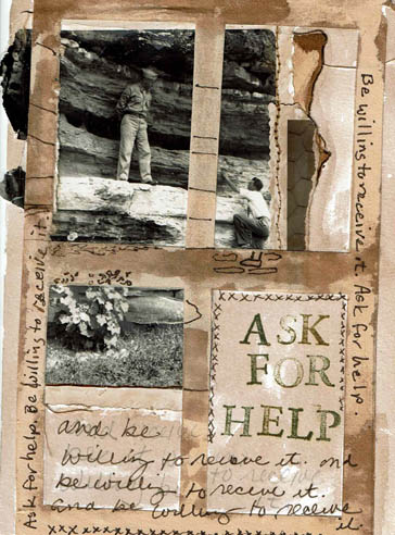
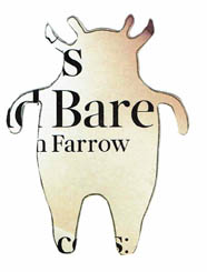
Here’s my Daily Art piece. I began with the found photo and you can find out more about why I chose it at my Mythos blog.

I scanned the original photo and adjusted the contrast a bit. Evidently the day it was taken the weather was overcast. Old black and white photos tend to be very low contrast. I wasn’t sure it would even scan well, but it did. My first step was to laser print the photo.

The linear quality of the telephone poles attracted me, as well as the handwritten notations. I have used stenciled telephone poles before in a piece called Camera Shy. I painted the Rives BFK® printmaking paper with Golden® Acrylic Micaceous Iron Oxide. This paint is worth getting if you are a fan of grey. It includes specular hematite ore and has a warm grey color, slightly shimmery. It doesn’t look like any other paint and it’s a big favorite of mine. It is expensive, as all good things are. I watered down the acrylic and it was still too opaque, so I kept washing it. The paper got really wet. This is not watercolor paper and I pushed it close to it’s limit…but it is good paper, just took a while to dry. This was ok since I got into a confunction with my printers and I had to alter that photo, but the clock was ticking on this one.

By the time I got the print out, the acrylic was dry and I took the telephone pole stencil and applied black acrylic paint. That has a short drying time. I adhered the photo copy down. The piece wasn’t finished and I wasn’t sure what it needed. Then I remembered the quote by Edmund White that I read this morning over coffee. “When a person dies, a library is burned.” I liked it so much I jotted it into my journal so that I would have it. I thought, this old photo has endured past the photographer’s own burned library…his story carried beyond his life. With the extra telephone poles, I had indicated further communication. That led to me handwriting the words “communicate-tell your story.” The photographer told his story, I found his photo and told my story through this art and in the writing of my other blog post. I hope you will go there. If you like art journaling, journaling, photography or using found photos, I think you will enjoy that post. I hope, at least, that you enjoy this art.

stencil overlayHi there. Lest you think I have turned into a Big Cheater, I haven’t. My Daily Art is drying. In the meantime I decided to show you this.

I was minding my own business after having applied light modeling paste to a piece of Rives BFK® printmaking paper. The experiment today was to use the modeling paste on a paper that could handle watercolor paint. Now, I’ve used spackling paste in the past to swipe over stencils to create texture. I have the light modeling paste which is better. It’s smoother and lighter and easier to spread, but it is also much more expensive. And I mean that from the bottom of my wallet.

I picked this fern stencil because I seriously love ferns. Ferns, to me, are the primary representation of endurance and survival of the fit. The fern family are some of the oldest life on this planet. It’s just science. Plus, there is the marvelous unfurling of the frond. Much is made of the rosebud opening to blossom, but what about those tightfisted fern buds?

When I applied the paste, I noticed some ink began to color the paste as I swiped. This was The Accidental Stencilists first Fortunate Event. It was fortunate because the color was very fern-y. Obviously, my lack of housekeeping the last time I used the stencil was paying off today. By the way, had I wanted to color the paste before coloring the background, I could have left the stencil in place, waited for the paste to dry, then spread acrylic over it or sprayed it with ink.

The modeling paste dries fast (so does spackling paste). Now for the next step. I wanted to use watercolors today. I have a bunch of tiny tubes of Cotman Water Colours® that I bought at a thrift for next to nothing. The good thing is that watercolor paint, even if it dries in the tube, is usable. You’ll have to destroy the tube to get at the paint, but it is doable. I’ve done it. Anyway, I put out Indian Red, Rose Madder, Sap Green and Cerulean Blue and went to it. I used a tiny brush to get into the fine fern branches and a medium sized brush to wash over the background. I am not happy with the background application of this piece. It is not as muted as I wanted. I tried to lift some paint but I didn’t have time. As the clock ran down, my final action was to throw some salt and dry rice on the page, which, hopefully, will diffuse the hard lines between colors.

I am not a proficient watercolor user. My love for it does not indicate any skill. For me, watercolor is a hard way to get good results; it  demands learning techniques and practice. Strangely, I am better with inks which are just as difficult but more predictable with spreading and blending. The ink is the same amount of wet, whereas, watercolor is different amounts of wet on any given brushstroke. There is likely a better descriptive word for this, but I don’t know it.

The Accidental Stencilist struck again by having a messy work island. A collaged canvas board has been loitering on my desktop for too long a time. I don’t know where to put it. As I was moving through the Daily piece, I cleaned the stencil and laid it on top of this other art. I glanced up and for a minute I didn’t know what I was looking at. In fact, I thought it might have been the wrapper for the stencil (as if it would still be in it’s original wrapper, silly girl!). It took a second for me to realize that I was seeing the other art beneath the stencil. It was real purdy. While I’ve talked about putting stencils over found papers, it never occurred to me to put it over my own art.This particular stencil would involve some severe fussy cutting, but other stencils wouldn’t. Just experiment laying stencils over your previous art, then lay them on the copy machine and voila! a custom collage element.

I thought the two accidents would be of more use to you than showing the Daily art today. I’ll forget the Accidents if I don’t share them now. I’ll show today’s art tomorrow–a twofer!

da1-5-16The Daily Art Challenge police would have no trouble spotting the crime here–1/4/16?? It’s 1-5-16–busted! Yes, after signing this today (in permanent Sharpie™ of course) I realized the correct date.

But, moving on to this odd fellow. The lettering is a stencil alphabet that I traced onto transparency in 8.5×11 size. Then I cut a light colored scrapbook paper to 8.5×11 size and copied the alphabet by running the paper through the printer tray. That way, instead of having to buy stickers or stamps, I can print any of my alphabet stencils into any paper. So, if you are following along with my Make Do Initiative, and I know you are, this is a creative way to make your supplies and tools more versatile and also you have stuff that nobody else has with no further financial investment. How cool is that?

For sure you remember the Dollar Tree stencil sets I’ve been bragging about. The big leaf gnome body is a stencil from the Sea Life set, cut out from an old map. The legs, arms and hat are cut from a botanical print. The tree and acorn were sketched in with a Stabilo-All®  Water Soluble Pencil (brown) and wet very delicately and smeared, which is where this pencil excels. I outlined the gnome and letters with Prismacolor® pencils. The face is from a stencil of four different cherubs.

I thought I was using Rives BFK Arches printmaking paper. During making, the paper was behaving UnBFK-ly; it was buckling. I held the paper to the light and discovered it had an Allstate watermark–it is half-sized paper I found at an estate sale and bought for it’s cotton rag content. This paper is not suitable as a collage foundation. Not sure how, but this piece was in with my pre-cut BFK supply. A tip and reminder: any foundation you use for collage has to be heavier than the paper you are applying.

I may have taken longer than an hour. It’s been a weird unpredictable day. Several business matters needed to be done during normal studio time. An installer is coming to put in some equipment. There’s been unusual unavoidable interruptions. My work was intermittent and I forgot the timer. The dog ate my homework.


barebear

Here is my creation today. It is expressive art mixed media that began with this image:

b4croppedweb

How did this image come to be? About six months ago I bought some stencils at the Dollar Tree. There were five sets available: Sea Life, Farm Life, Alice in Wonderland, Monsters and an alphabet. (I wrote about these at Mythos in an entry Idea Farm). I bought the Alice set and opened it about a week later and it was awesome. Yes, the stencils are on lightweight cardboard, but they were detailed and cut cleanly. The images they selected were not all mainstream. On my next trip in I decided to pick up each set.

For some reason, perhaps all the children’s books I’ve been looking at, the Monster set got appealing. Actually, it started further back than that now that I’m thinking about it. About a month ago I decided to do a mixed media piece using a black silhouette. I’ve done these before (some of them are shown on this blog). Basically, I find an evocative fashion magazine image, one that will translate to being blacked out. I cut it out, paint it with black gesso and create a background to put it on. It’s fun to do and cool to look at. In this instance, I found a couple good samples. I flipped them to the back, and one of them had an image I had not planned. I decided on a different image for the piece I was working on, but I wanted to remember to try this, although as I say, it was an accident. I was going for the boxy pose on the other side. I put the image in my process journal and made notes about why/how it had happened. I left my notes on there but not sure you can make them out.

accidentalcutoutweb

I think this was backburnering, then the children’s book thing happened. The Dollar Tree stencil sets are a good size for my 5×7 Daily Art Initiative projects. During TV time, I go through books and magazine pages and hold the stencils over the pages to find ones that utilize the images on the page.

Because the Monsters (I prefer Creatures, because, really, they are more cute than scary) were abstract I started with that set. Oh, the fun that I had. I tried to use all the Creatures, but found I was partial to several. This one seemed “bearish” to me, it also reminded me of a shaman cave drawing. When I saw the word “Bare” printed on a page I couldn’t resist myself.

All the little guys and gals got gelled down to a full size piece of paper, smack dab in the middle. I’m not sure this was necessary but it seemed like it was, so that’s what I did. The idea was to scan them, crop them and then be able to stick them all on a page(s) to print out to conserve paper. Seems counter-intuitive, doesn’t it? I do not want to use the originals.

I have about 30 0r so done. See my last post about how fast my new Brother inkjet scans. I sat down the other day and scanned them all, then I sat down yesterday and cropped them all and grouped them in files so I could do what I did today, quickly and efficiently. It was a lot of work to digitally resize them and organize them, but if I don’t do it right away, they will just get lost and not get used. Another important Initiative in 2016 is to develop the habit of Organization, but I digress.

I wanted to use Bear, so I picked this one because of the Bare fun factor. I am easily amused. As you can plainly see, the image RESEMBLES a bear, if you squint and tie your Imagination Hat firmly onto your Noggin. Colored pencils are a dry medium so I used my Prismacolor set. I adjusted his ears and they were way too big, which sure set the tone right off the bat. Then I drew the face. I swear to God, the first face made him look like a rat. I couldn’t even with it, so I erased and started again, making the face bigger and wider, and that got better. I messed about giving him paws and shading him in. But there was that awful “Farrow” word that had to go. What to do? I thought the best thing would be to cover it up with a dry, opaque something and decided on ledger paper. I wanted to write the word “Bear” out because I thought maybe the drawing wasn’t good enough to allow you to get the joke. And the paper was all lined like elementary school, so I wrote “Bear” in a childish sort of way.

About now, I have an ugly bear with a childish look and goofy word and a pretty elementary pun to boot. Then I read it. “Bare Bear.” It sounds like what a kid would name a favorite, cherished stuffed bear. This is no longer a bear, its a bear TOY. But it was standing up so tall, not like a stuffed bear. Then I thought, it’s a wind-up toy bear that walks. But how to show the winder thingy? They are called keys, and this is an old school toy, so I can just draw a key winder. I made it big to make sure you could see it and know it was a toy bear.

Man, I only had an hour and I was running out of time. That rat face put me way behind. This toy bear made no sense at all standing in the middle of space, he needed a room. A kid’s room. A boy kid’s room. So I drew some curtains and put on some sailboat wall paper and an out- of-perspective table with a sailboat set on it. I polka-dotted the curtains and was just putting the red fringed rug under Bare Bear when the timer went off.

Ok, we all know this is no Beatrix Potter but I don’t give no fiddely dee about that. I like this; I like everything about this. I especially like these things: I enjoy doing this during TV time because I don’t enjoy TV much; this is super cheap–.10 magazine, $1 for 20 or so stencil images; the process spurs on imagination; drawing practice. Mostly I like this cute little bear waiting for a little boy to wind him up and give him some animation. Good ‘ole Bare Bear, long may he bust a move.