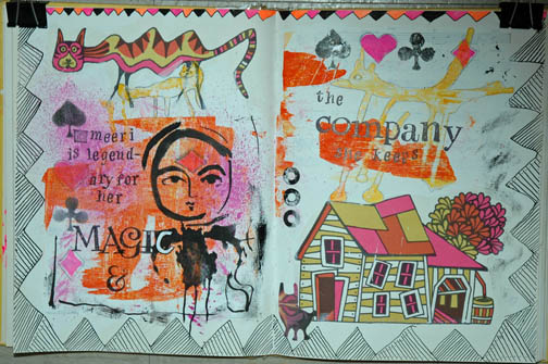
I worked for the first time in this book, Fireside Children’s Songs illustrated by John Alcorn. I bought this book in a thrift; it had no dust jacket and a loose/torn spine. The illustrations were of the sort I grew up with. This book was printed in 1965 (I was ten that year). John Alcorn was an illustrator who was widely published in ads, posters, and books throughout the 60’s, 70’s and 80’s. He had several dominant “styles”: psychedelic, folk artsy and some realistic drawings. The illustrations in this particular book I would classify as a mix of folk art/circus/turn of the century style. There are only four colors used: harvest gold, hot pink, medium orange and black (all on white paper except a couple on black background).
Because I bought the book for the illustrations and subject matter (I love old children’s songs) I couldn’t bring myself to destroy his work. So I had to figure out how to work around it in each spread. Most pages in the book contain some sort of illustration; often a two-page spread has a relationship between the images. The song here was “There was a Crooked Man.” I decided not to use any of the existing text on these pages.
I gesso’d the pages both to strengthen them and cover up the text. The pages of this book are not slick so gessoing was not a problem and it dried quickly. Because I love border and edge work I started by drawing this bold geometric “flag” design. I ran color along the top smaller border but didn’t want to do that all the way around, so I filled the rest of it in with a permanent pen. I scraped a small amount of neon pink, black, yellow and orange paint onto the pages with a credit card. I used the neon for two reasons: I had it and it was the closest to the colors Alcorn used, and I wanted to update his colors to more current tastes. I prefer brights and neons, so I went with it; I think they work with his colors. The black also helps unify them.
Two creatures appeared to me in the paint scrapes. On the right is a five-legged doggish sort of guy. On the left under Alcorn’s crooked cat is a fox-like animal. I enjoyed making the five-legged creatures feet–one of them looks like a toilet plunger. Good suction in a wind storm. The other feet look like giraffe and horse hooves and a duck’s foot.
After I penciled the outlines for the creatures I knew I needed a central focal point. Since the pages so far had a bunch of animals and a house, I figured the resident of the house was a good start. I am very fond of this stencil from Dina Wakeley. It has three faces, all about the same size, similar but with slightly different expressions. She had the sweetness and folksy look to complement Alcorn’s designs and my decision to create a story. I made her the heroine of my tale. Her body is an inkblot stencil pattern, which gives her a kind of creature-y look as well. Perhaps a shapeshifter?
The spread needed some filler and incidental color pops. I used a rubber stamp set of playing card suits. I stamped the diamond suite on her forehead in the “third eye” area and that cinched her magic qualities.
I don’t know where the name Meeri came from. No doubt there are people named that but I wanted something unusual with a sing-song quality. I stamped the text, “Meeri is legendary for her magic and the company she keeps.” I finished it off with three page reinforcements that I painted black. My very last addition was one of the little creatures I traced from the Dollar Tree Monster stencil set and I placed him in an empty area that needed him.
I love this piece and think my additions hold their own against John Alcorn’s wonderful work, at least in the story-telling department.