I miss my mind the most.

Some of you are no doubt too young to remember that saying that made the rounds in the ’80’s. I wish I was, for a number of reasons. Mostly I wonder what goes on in my mind these days, because it sure isn’t keeping track of stuff.

My friend Deborah Weber and I had a lively and spirited discussion about where time goes and how it seems as we age it goes by faster. We volleyed that ball around the court for a few days until we both had more pressing business to attend to. Unfortunately, it seems as if my pressing business has to do with thoroughly and completely losing things. If I was really maintaining things in proportion to how much TIME I spend maintaining things, it would be like the Library of Congress up in here. Or at least the way I envision what the Library of Congress would be doing to store all that stuff. Who knows? Maybe it’s all for show on the first floor and then you go up on the elevator and it gets worse and worse until it finally ends up looking like my garage on any given day. Librarians are wandering around with their high buns coming undone swearing that they just SAW that copy of Tom Sawyer.

So, a few weeks ago I wrangled the man Bob to the Adobe Elements program I use to adjust my images. I’m good at doing it in theory, but it’s the little technical details that continue to elude me. It’s the same as working the remote. There is so much going on, so many balls to keep in the air to get the channels right. Elements is really very simple to use but my problem is that if I don’t use it every week or, these days probably daily, I forgot everything I know about it. Or might have known, it is so bad that I don’t even remember if I did know it, or I thought I knew it, or I was bullshitting and said I knew it to impress you when I really didn’t know shit from apple butter about it. On any given day I can handle taking a scan for you, cropping it so that it is not ginormously-sized, changing the dpi so that it isn’t a decade to load.

The trouble came when I wanted to make color copies of my work at the copy shop by sending them digital files. I believe I mentioned last post that I’m ready to use my art as a jumping ground for new work. I might have misled you into thinking that I am much too much of The Artiste to reuse work, I must sully forth into uncharted waters each time. If you bought that I am as good as I thought I was. Really, I’ve meant and wanted to do this for a long time, but I wasn’t up to par on the technicalities. What size? DPI, physical, inches, pixels? How can I get it to print 6 times on a page, or one time, or for that matter, anytime? Was it going to get all blurry, or was the copy person going to have a birthday before it would load? Was I going to get a call in the middle of the night from the Office Depot manager saying I was responsible for the copy techs quitting en masse?

In some ways Bob is not much more skilled in Elements than I am. He likes to do filters primarily. He can play for hours on a shot he took at the Grand Prix, fiddling around with filters and color saturation. I have no patience for it and I lose track of what I applied, what I didn’t. Then I end up with a terrific photo that I have no idea how I made it. Then I roll the rock up the hill the next time.

It was the blind leading the blind, let me tell you. The copy center prefers PDFs so we got that settled. Then there was the figuring out how to get it to print multiple times on a page. We had to go into a separate program to do that, because Elements is a mystery we have not cracked the code on when it comes to printing. Then we went over to the copy shop software and uploaded it. I only did one image in various sizes using up the page so as not to be wasteful. I got 1, 2 and 4 images on a single page and that was cause for celebration.

I recorded, in minute detail, six ways from Sunday, each exact step. I made him do the process several times so I could be sure I had it all written down. The idea is that I can do this in the future without manly help. The man works about 12 hours each day on a computer and it isn’t his favorite thing to tutor me over and over. (I cannot even describe how it goes with the remote. The eye rolling, the sighs, the extreme exasperation. It’s like teaching a puppy to sit. You want to pull your hair out, but at the same time you are filled with pity).  It was all so perfect and clear and I was able to take a scan and resize and such very quickly. The copies turned out great and we were happy. By and large at .59 each it is economical and as you know, laser copies are waterproof.

So, imagine the excitement I had this morning with my plan to scan about 20 pieces of art and get an order going. I got concerned when I couldn’t find my notes on the desk but the desk was messy. I was sure the notes were there. I tidied the desk while I was at it and 20 minutes later I discovered my notes weren’t there.

In my cubby where I keep my camera cards organized, I recently put a reference book with assorted papers stuck all anyhow in it. The reference book is on grammar and punctuation, in an effort to keep you less irritated. There are about 15 notes on its, it’s and its’, which probably surprises you! ha! When I saw that book, I was sure that the note was in there, because it is right next to where I was sitting with the man. I went all through that about a dozen times, reviewing it’s its and its’, and also how to properly punctuate with parentheses and whether to underline or italicize a book title. I bet you are both surprised and horrified that I have notated such things, considering the state of my writing most of the time. But I digress.

The dining table was directly behind me when we were working so I was sure I must have put the note on the table. The table was messy so while I was there, I tidied the table as best I could and discovered the note was not there. I went through the small amount of paperwork on the kitchen counter, thinking it might be under the Joann’s sale book or my calendar. No go. It was not on top of the scanner. It was not in the notebook I started keeping around that time. It Was Not Anywhere.

I am constantly cleaning and organizing yet I can find nothing and there is always a mess to clean up. I am seriously considering a neurological workup, as I imagine you are hoping for me. Paper.Paper.Paper. It is a digital age, and I do digital work. I do nearly everything on-line, but there is paper. There are notebooks. There are mysterious scrawled notes, quotes and numbers all over the place. I put them in places I am sure are smart but they are never there. We need astrophysicists here stat.

Now, I have to go to the husband and do it all over again. Because there is no way I Can Remember. There were too many steps. I know this because if he leaves the room to take a nap I have to watch the one TV channel the whole time because I can’t get the channel to change. I end up turning off the TV or have no sound. Pity me.

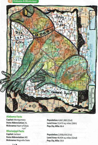
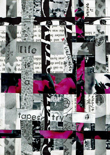
There isn’t any art today because I can’t even with it.

Advertisement

wall of faces

Here’s a bonus post, since you missed me so badly last week. It is a piece of printer paper with a paper doll upper body shape  traced on it. Not all the faces are female, some are male and some are cross/transgender, gender neutral, with a couple animals thrown in. Basically I sat down with the blank face/neck shapes and a Artline black pen and drew. I experimented with different sized/placed eyes, hairstyles, mouths and noses. Once I got warmed up and engrossed in whatever we were watching on TV, I found myself drawing without any plan or thought. The results are loose, simple expressive and low pressure. If one doesn’t satisfy, move onto the next.

The biggest problem I have with drawing is never being able to duplicate stuff that I like. It’s so hit and miss. If I draw a cool chick, I’m never going to see her again. I admire artists that create a character, say, a comic character, and they can draw her in every expression, emotion and situation. My comic character would need to be a shapeshifter, because she’s never going to look the same, one drawing to the next. You could not pick her out in a lineup.

Get yourself a piece of paper and draw egg shapes, rectangles, circles or squares. Draw robots and animals and kids and adults. Or, do like I did and trace around a doll pattern, paper doll or animal silhouette. Use fun stencils and doodle inside or around the outlines. Just go for it. Who cares what they look like?


tibetbeads

Back in the studio working on my mixed media Tibetan-inspired bead project as it was well along and I didn’t want to lose steam. I got them painted, gilded and sanded, put a couple of glazes on and then sanded again. Finally I sealed them with Matte Medium and applied 4 coats of Renaissance Wax. The bead at center front was my inspiration bead. It is an authentic glazed and gilded terracotta Tibetan prayer bead. I do not know it’s age.  I was not trying to replicate the bead…just want to make some Tibet-inspired jewelry and cannot now afford to buy Tibet beads. The processes involved in making these beads are fiddly, messy and extremely time consuming. The four I finished have at least 20 hours in them.

The two beads in front are completely different. I liked the way the yarn ridges looked with several coats of Mod Podge and dressmaking paper, therefore I did not paint or gild them. They were waxed. Unfortunately, I do not have any more of these odd shaped beads to work with. They remind me of pods and then the words/marks on them adds a quirky kick.


atcdrawings

I used ATC sized watercolor paper, drawing supplies and a travel-sized Cotman watercolor paint set to create these two expressive drawings. I experimented with the w/c, dripping, tilting and scumbling paint around in many layers, getting a feel for it.

Creating my bear creature: it was a few marks in the face and ear that suggested the bear, plus, I am easily provoked to see bears. I had no idea what to do but I went with pen marks as inspired. He’s got black drawing pen and white Sharpie®paint pen, of course. Everything is better with anything Sharpie®. Just sayin’.

The other one screamed “Fish Face”. There was a gaping mouth and one eyeball. I put the mouth in and it looked like the inside of a vacuum hose. Not what I was going for; perhaps thinner lips would have been better. Perhaps this fish had botox lip injections? That could’ve been a story all to itself but I just thought of it now. I drew in eyes next, then drew what was meant to be fins alongside the mouth, but they looked like a mustache. Vacuum cleaner botox lips with a mustache. Where to go now? Not up, for sure; just downhill from here.

I outlined a forehead area because, what the hell? A mustachio’ed fish definitely needed eyeglasses, so I drew those and intensified the eyes a bit. He needed something under that mouth so I drew a teddy bear smile because, what the hell? I got the black and white Sharpie® paint pens, which make everything better, and added pointillism which always makes everything better as well. These are two tips you will thank me for if you follow up. I wrote the word ART on the forehead because, what the hell? I couldn’t think of another word and I was sick of the whole thing.

With some distance on the process I see that I like these drawings a great deal. I like the imaginative creatures. Mostly, I like that I pushed myself past my comfort level in drawing them. I had average ok drawings and didn’t know what to do to make them better. That’s where additional embellishment took them to another level. It’s hard for me to do that with drawing, I lack the confidence. I’m worried about ruining what I already got decently drawn. Practice pushing past comfort is what improves drawing skill. Remember, its only paper.


both named spot

I was at the Dollar Tree when I came upon this 6×9 Road Atlas of the United States. Lucky for us they lied about the United States part by including some parts of Canada at the end of the book. Just more drawing fun for us! Even more drawings for the $1! Such a deal!

I picked Alabama to work on. It was toward the front (duh, “A”) but mostly it was because I saw a frog, very rough, in the highways and byways of the map. I’m very fond of frogs and toads of all kinds. I love their eyeballs so I drew one in right away to give me hope. I sketched in arms, a leg and squishy feet–little splayed out toes and long fingers like E.T. It was all fun and games til I tried the mouth and drew it too high. Suddenly, the long snout and high mouth made the figure all doggish. So did that neck. I was in trouble. I shifted my attention to creating the spots in orange, teal, green and yellow. I was using Stabilo® water soluble pencils, so being too lazy to get up to get water, and likely with a 10# cat all cozy on the recliner, I wet the tips of my fingers to smoosh the color around to blend it a bit. I wanted the splotches to look like those brightly colored rain forest frogs.

No matter what I did, it still looked like a dog. So I drew a collar on it’s neck. I was PUSHED TO THE WALL, people. Out of spite, I gave the frog/dog a bumpety ass.

At this point, what we have is a frog/dog floating in the middle of an Alabama map. You can’t leave a frog/dog stranded in Alabama like that, its inhumane. So I gave him a bit of his own real estate and decided to make the boundary uneven and color some of it black. I used the shapes and spaces created by the highway intersections to decide where to put the black paint. Then I drew around the map itself with black and created black photo corners. I outlined the legend and drew another rectangle at the top right to even it up. Then I wrote “frog as dog”, “dog as frog” “Both named Spot” and called it finished.

I am happiest making expressive art. If I sit down to draw a frog out of my imagination it will look way worse than Spot. But the slightest suggestion, the merest hit of a blush of a rumor that a shape is there is all it takes for me to get rolling. It can be ink, highways, blobs or scribbles, anything that suggest a shape works.

As a maker, it’s important to figure out how you work effortlessly and with the greatest degree of satisfaction. If it isn’t fun, you won’t do it. While I continue to play around with techniques I haven’t tried, materials I haven’t used, ideas I’ve never taken into practice, mostly I return to the fun of spontaneity and going with whatever unfolds. I almost always like the result. When I don’t enjoy the end result, I very likely still had fun and learned something.

I’ve made a lot of bad drawings in my life and I will make many more. From my own experience I know that anyone can get better at drawing with practice. If you are not inherently skilled in drawing, you must practice if you want to improve. There are many techniques to improve your eye/hand, right brain/hand. Presently I am studying and practicing from Carla Sonheim’s Drawing Lab and Drawing Imaginary Animals books.

Carla Sonheim also believes in the value of silly. A fun part of expressive painting and drawing is that the maker is telling the story. It’s my story so it can be whatever I want it to be. You might think a house can’t lean sideways but in my world it can. Suddenly it is Crooked World and I’m thinking of grasshopper legs and Andy Rooney’s eyebrows.  In today’s world a dog is a frog and a frog is a dog and they are both named Spot.

constellation crown

Hello there. My Daily Art project almost did not get done. I deep cleaned several rooms of my house due to absolute necessity, which is the only thing that will get me to do it these days. Plainly put, I was plum tuckered. It was 3 pm and I so much did not want to do anything but shower and sit down. But I’m a trooper, you might say a pooped trooper, but a trooper nonetheless.

I cut our Crown Wearer out of another gift card bag (the skinny kind). The paper cutting where you fold in the middle and then freehand cut out a shape. In my mind was a verse such as “her tangled hair formed a constellation” which is good but her hair wasn’t very tangled. So I improvised. A lot of that happens in the studio because nearly nothing turns out the way I thought it would and that hour goes by fast, people.

But I liked our Cosmic Crown girl, so I riffed off a few constellation crown verses and came up with this one. Lots more words than I planned to use before, so I had to go into the bowels of the hoard to find a rubber stamp set that was small and legible enough to do this verse. Don’t you know I had one?

“Constellation” is a long word and I didn’t want to hyphenate it because I despise hyphens and will move heaven and earth not to use them. You think I am kidding but I am not. I don’t kid about hyphens. They are not funny, they are supremely annoying. Anyway, Hyphen Avoidance brought about the idea of making some of the words vertical, hugging the figure. That way I could start the first part of the verse higher in the image and bring the eye down the left side, eliminating the confusion readers have wanting to go left to right as the default habit. Killed two birds with one stone by refusing the hyphen. Of course, the word “falling” is perfect to make gestural so I did.

The heart is a piece of deli sheet that had black ink splotches on it. I watered down some orange/red paint (the same color I used on Starman yesterday because it was still on the desktop.) I free-cut the heart just like a valentine.

I put iridescent acrylic paint over the top of the Rives BFK printmaking paper as my first step. Scanners and monitors do not pick up iridescence but it is there. Then I took clear gesso and went over the stars and the words to try to put at least a small barrier over what I needed to keep iridescent. I decided I didn’t want to run the navy over the text, so I can’t say if it would have been a decent barrier, but you can make an experiment if you need to, keep it in mind. “They” say gesso can be used as a resist but I can’t say I have tried it much. It seems counter-intuitive to me, considering that gesso’s job is to prepare surfaces to TAKE paint well. But “they” likely know more than “me” so take what I say with a grain of salt and find out for yourself.

I needed another couple of pops with the orange. I never intended to do the stars with orange, nor all the stars, but I did the small one at the bottom and then the top ones needed it too. Then the word “burns” needed it and then the edge of the constellation block said “me, too”. Then the damn thing was done.

I like her very much and am glad I went in there. Now I am more pooped and I will talk with you tomorrow, likely.

bound by stars

This Daily Art practice took the full hour to make. I barely had time to frame it out and add the acrylic dots and stamp the text.

Most of the time was spent weaving the paper strips. It takes awhile to get them situated and then affixed with matte medium, then dried enough to continue. I bought matte medium today because I ran out of it…I tried to get along with just Mod Podge but some applications don’t work with it. If I don’t want the hard resistant coating on the surface (like here to glaze it with acrylic) I prefer matte medium. If you aren’t aware, matte medium is a glazing medium, sealer and adhesive (lightweight). Mod Podge is a sealer and adhesive (heavyweight). If you want stuff impenetrable and permanent and affixed until the Four Horsemen ride through, Mod Podge is your huckleberry. Anything else use matte medium.

My plan with the piece was to mask the weaving in a shape of some sort.  A mask is a reverse of a stencil; in fact, a mask is the piece you get when you cut a stencil. Not all stencils create great masks, because if the stencil is very detailed you can’t keep all the bitty pieces to use as a mask. A stencil prints over where it is put and a mask prints around the space it is put. Obviously you don’t have to create a mask to do a mask technique…you can freehand letter or draw, around what you want to keep and cover what you don’t want with color.  In this way you can make an expressive drawing with shapes, letters and focal images in a composition. It is a fun way to do stuff, sort of in reverse.

I’ve seen artists put layers of material on a substrate only to cover up most of it with black paint. Seems like a bunch of work gone to waste to me, but the results are spectacular. Also, if you scan the piece before covering it, you can use the work over and over by printing it, thereby making use of the time it took to make it.

Keep in mind that you can use any color as your outline/fill, not just black. Also, depending on what you are outlining, you could use white or a pale color. That could be cool. I haven’t done that yet.

I was going to cut a stencil for this basic figure with the antlers. I would use it and it seemed worth the time to do it; I’d have both a mask and a stencil to use. However, the stencil board I have was under a bunch of heavy paper and I couldn’t get a sheet out. I looked around and saw a greeting card kraft bag (you know, the slender kind) so I cut the figure out with scissors. This was the easiest, fastest way to get the job done. Then, I laid the mask over the weaving and outlined with my favorite Wolff’s Carbon drawing pencil. I selected grey as a background cover because I like grey, but had I not been so hasty, I might have selected navy. It would have been richer with the orange and since I texted “bound by stars” navy would have made sense. Ahhh, another day.

If you are in a hurry or have hand problems or patience problems or are afraid/unable to use an exacto knife, a pre-cut stencil is an inexpensive long-lasting tool (although they are quite pricey for what they are, I mean cheap plastic). Since stencils have become so popular, they are now very detailed laser cut available in diverse design styles. I have stencils that I would not in a million years consider cutting out myself. But, you can make a perfectly wonderful unique stencil yourself in less than an hour. You can use your own drawings, clip art, images from photos, etc. You can scan a photo into a basic photo altering program, many of which feature a “stencil” filter. Print the altered photo and  create a stencil. If your program doesn’t have a “stencil” feature, up the contrast and voila, a usable image. Build a library of favorite symbols, animals, etc. You get the point. Anything that gets more of your own hand into a piece makes it more satisfactory and interesting, IMHO.

Don’t forget to keep the cut out parts of your stencils and put them in a separate envy called “masks”, or file them with the stencil.  Once you start to mask, you will be glad to have them.

moon is our mother

This image is a collage with expressive drawing, my Daily Art practice. I pulled out a handful of the paper strips I talked about yesterday, and this one piece of old street map presented itself. It hadn’t been cut, most likely because it was already small and fragile. I laid the piece around the paper with different orientations and I thought this outline looked bear-ish. Like a bear climbing a tree. So I tried to draw it to look more like a bear than it did, resulting in it looking even less like a bear than it did. I decided instead that it needed to be an unspecified marsupial climbing a tree. That’s what I meant to do all along! That’s the ticket.

Earlier today I was reading a book on the alchemical Emerald Tablet which states that the Moon is our Mother. I stopped reading at that point because I wanted to think on that for awhile. It struck my fancy. Bears are associated with the feminine/moon energy.  I decided (pretty much unilaterally, since it is just me, the cats and a dog here right now) that marsupials are feminine/moon energy too. It is out climbing at night, after all. Even if it is on it’s way to bed, that counts.

Considering how it all ended up not being what I thought it would be, I’m very happy with it. It’s a friendly creature (no Stink Eye here), the moon is full, the tree is strong and I particularly like this map paper. There is a heaviness and fullness to the piece, I feel gravity and that is not an easy feeling to capture 2-D. At least for me, it isn’t.

I am all about doing these creatures these days. It started with those Dollar Tree “monster” stencils (I call them creatures, they are too cute to be scary). I love expressive drawing and I find more and more to be drawing quasi-realistic animals in blots and on collage compositions. This piece came together quickly which is usually true for me when I do expressive art. I had already made a small square canvas piece earlier in the day. This piece followed later in the day and I didn’t want to work very long. The first piece could be a breakthrough idea if I continue it to a series. I love the idea of making “themed” series(es?) and constantly dream up great ideas for them but I almost never follow up. I get bored or forget about them. A year later I clean the studio and run across the first piece of a proposed series and go, oh yeah, I was going to make that a series. Whoops.

Not much more to say about this and I want to get back to reading about the Emerald Tablet. ta ta.

lifeisatapestry

Well, guess what? The studio is tossed again.

Last week I put my big folding table into the middle of the living room and brought out the various and sundry boxes and bins of paper and images and sorted it into cool boxes I got at the Dollar Tree. The boxes are letter-sized and have a self-lid and hold a goodly amount of of paper. I was soon overwhelmed with the sorting but I did get through the bins It is so much easier now to keep it neat and find images by subject matter which is important to me. I wanted to do a page with an owl last week. I have 284 pictures of owls around here and couldn’t fine one. One. That’s what started this ball rolling.

I got overwhelmed, particularly with laser copies (lots of black and white) of my own photographs. In the good old days I had a color laser printer and I routinely printed contact sheets and reproduced my photos. Lots and lots of mannequin photos because I used them frequently in my work. I knew there were too many to go into the nifty boxes without there being 30 boxes of mannequin photos. So I started shoveling them into a separate pile. Before I knew it, that pile was teetering on the edge of calamity just like my sanity.

I had to put the big table away, and the stack took up home on the dining table. I filed the neat boxes away in the studio and that was a wonderful feeling. But then I’d walk through the center of the house and the stack that didn’t get filed away, mostly my OWN art, was taunting me. Plus, the dining room is smack in the middle of my feng shui Wealth area and that is not good. How many mannequin photos can your Wealth area overlook? If I know my Wealth area, and I do after many hours of studying it and moaning over it, there were about 6000 more mannequin faces than it could manage. My Wealth area couldn’t even with it and neither could I.

There were stacks of paper. Strangely, I’ve been obsessed with stacks for awhile. It started with caryatids about 18 months ago. They were fascinating to me. Then I saw pictures of cairns that my husband took in the Smokey Mountains last spring. There is an artist that works in several rivers up there making cairns (he’s around on the internet, Google him if you want to see his work. He is really good, a true Rock Whisperer). Then I ran into this cool Edward Gorey’ish fabric during Halloween that was so exciting to me. About that time the Alice in Wonderland stencils showed up at Dollar Tree. One day I couldn’t take it anymore and cut out a caryatid, the gothic fabric and created an Alice stack using illustrations and stencils. A reprieve but I returned to stacks again.

Stacks of paper. Obsession with stacks. What are stacks? They are layers on top of layers. Image on top of image. Strips on strips.

I couldn’t use all those faces, but I could use strips of paper. I could weave them, layer them, draw on them, use them as backgrounds, etc. I could make strips out of all that stuff, throw them into a box and haul a handful out and use them however I want to in the moment. If I found I didn’t like the process, or wasn’t using the strips, I could toss it all into the recycle bin with no guilt.

So yesterday I spent a few happy hours layering paper and cutting it with my paper cutter. All different widths. I find cutting or tearing paper stress relieving. I can honestly say I enjoyed it, and I thought about the strips most of last evening. I had the urge to get up and bring some in to draw on but I didn’t because we were relaxing watching Dexter. It’s one of the few programs I enjoy watching, but I was tempted and that is a good sign. I’m onto something.

So, my Daily Art practice rolled around and the first thing I did was grab a bunch of strips. I wanted to start by paper weaving. I took two wide strips, cut them into random pieces. One was a black and white photo of mine, the other text from a book. I glued those pieces randomly to a paper foundation. Then I selected several strips and cut them down to smaller widths. Surprisingly, all the strips I used are my own work. I did simple over/under weaving over top of the other images, shifting the colored strips to where I wanted them. I glued the ends down to make it permanent.

The process created leftovers and I tossed those strips back in the box to be used for another project. I decided to journal, and stamped out “life is a tapestry.” Then I wrote “weave it” in black pen randomly, and did some circles on the strip with the wording, to make it stand out more. This project was finished in an hour and I very much enjoyed it. I plan to do many of my Daily Practice pieces with these strips this month. Perhaps it will inspire you to try it.

I will soon post an update on my Mythos blog about how my 2016 Initiatives are going so far. If you have an interest check it out over the next few days. I will say here that I missed only 1 day in January. The day I missed I simply did not want to be in the studio. I was tired and not feeling particularly well. To go in would have defeated the purpose of the Initiative, which is to give myself time to do what I love. It’s not an obligation, it is a privilege.

I would urge you to get into your studio every day, even if just to paint a background or stamp a word on paper, or whatever you enjoy doing. Just for the fun of it.


who's the wolf

Another Daily Art challenge make. I am revisiting Red; I’m not alone, lots of people are seeing Red these days. There has to be a reason she is surfacing to consciousness right now. I’m not speaking for anybody else, but I feel two contrasting and contradictory energies at work currently. The illusion of black/white vs. ambiguity.  The middle road seems very narrow these days. Mulder is back with his “question everything” philosophy. I like that; my feeling these days is that the questions are more worthwhile than the answers.

I started with the Rives BFK® printmaking paper and dropped some water randomly onto the surface. I put some black Dr. Martin’s® Bombay ink into the plain water drops and let it spread. I blew it around with just my breath and let it wander, then set it aside to dry.

I wanted to use tube watercolors today, so I picked up an ultramarine tube and kneaded it gently to mix the pigment up. These tubes are old so I go easy, but today not easy enough. I was daydreaming and looked down to find ultramarine watercolor all over my fingers. Luckily I had torn up a bunch of lunch sacks yesterday so I wiped my hands all over those pages, and everything else that wasn’t nailed down. Then I took a big brush and swiped water all over the paper to move the paint. I don’t want to think about how that will turn out when it dries, but can you say “CRINKLE?”

Well, watercolors dropped way down the list. That’s how easily I am deterred from stuff. I thought I might try ink. I have a mess of Higgins inks and I like them very much but I never have drawn with ink. I bought them for the purpose of making blot papers for my Interactive Intuitive Readings™ but they didn’t end up working as well as the Bombay ink. Higgins® Dye-based Drawing Inks are much less expensive and highly pigmented. The back of the package says they can be used like liquid watercolors.

I really like the way these inks move, and I would definitely equate them to watercolor nature. **Be advised, I have no watercolor or inking skills. I am purely at a “coloring book” level. If you want to investigate the qualities of either medium, consult someone else with a far greater proficiency.**

The black ink blot was dry so I started looking at it, spinning it around to see if anything presented itself. Here’s how I work with blots and expressive art. Take a couple of breaths, close eyes, open eyes, soften eyes, turn the paper. Pause. Turn paper, pause. Do this all the way around. Subconsciously you likely already ruled one orientation out. Keep going. Don’t get scared. There will be a point when you feel panic and think, “I don’t see anything!” That’s good and natural because this is a trust issue. Expressive art is about developing trust in your creativity and your instincts. Just breath again and keep going.

I went around several times. There was one other orientation that was intriguing and likely would have been deeper expression for me, but I do keep in mind my time limitation. I am sticking to my one hour religiously and sometimes that means sacrificing an idea or technique. That’s ok, there are always other opportunities. Two of the other images were already no go’s. Like it or not, this was the one remaining. Suddenly (and I mean that, like a bolt of lightning) the wolf appeared, really well defined. The major work back into the wolf shape was adding teeth and ears (he had a nub of ear originally). At this point, all I had was white paper, black blot and the red teeth and eye.  As I was thinking and feeling what was left, I saw a curvy line that suggested Red’s Hood and Cape. You’ve got to be kidding me! So I colored that white space in with red. The image needed unity so I brushed on the dark blue for sky and green for ground. The other black blot is the silhouette of tree branch(es). I did see a snake head hanging down in mid-image so I outlined it lightly. It’s just a side note, but now we have three characters in our story.

So the image was nearly finished. There were the two white spots inside the wolf’s body, that is where the text could be. Text had to be short and handwritten. I got a toothpick and dipped it into the ink and scrawled it out.

I considered captioning it “Red’s Shadow.” That’s a black and white energy. I’m telling you the story. “Who’s the Wolf” is the ambiguous energy. Who is the wolf? Who is the innocent? Who is the onlooker? Who’s zoomin’ Who?

There was also the option to leave the space empty.  The highest expression is to let you ask your own questions or the freedom to not ask any and move along. As the maker I am forcing you to do it my way.