Archive for the ‘Rubber stamping’ Category

lifeisatapestry

Well, guess what? The studio is tossed again.

Last week I put my big folding table into the middle of the living room and brought out the various and sundry boxes and bins of paper and images and sorted it into cool boxes I got at the Dollar Tree. The boxes are letter-sized and have a self-lid and hold a goodly amount of of paper. I was soon overwhelmed with the sorting but I did get through the bins It is so much easier now to keep it neat and find images by subject matter which is important to me. I wanted to do a page with an owl last week. I have 284 pictures of owls around here and couldn’t fine one. One. That’s what started this ball rolling.

I got overwhelmed, particularly with laser copies (lots of black and white) of my own photographs. In the good old days I had a color laser printer and I routinely printed contact sheets and reproduced my photos. Lots and lots of mannequin photos because I used them frequently in my work. I knew there were too many to go into the nifty boxes without there being 30 boxes of mannequin photos. So I started shoveling them into a separate pile. Before I knew it, that pile was teetering on the edge of calamity just like my sanity.

I had to put the big table away, and the stack took up home on the dining table. I filed the neat boxes away in the studio and that was a wonderful feeling. But then I’d walk through the center of the house and the stack that didn’t get filed away, mostly my OWN art, was taunting me. Plus, the dining room is smack in the middle of my feng shui Wealth area and that is not good. How many mannequin photos can your Wealth area overlook? If I know my Wealth area, and I do after many hours of studying it and moaning over it, there were about 6000 more mannequin faces than it could manage. My Wealth area couldn’t even with it and neither could I.

There were stacks of paper. Strangely, I’ve been obsessed with stacks for awhile. It started with caryatids about 18 months ago. They were fascinating to me. Then I saw pictures of cairns that my husband took in the Smokey Mountains last spring. There is an artist that works in several rivers up there making cairns (he’s around on the internet, Google him if you want to see his work. He is really good, a true Rock Whisperer). Then I ran into this cool Edward Gorey’ish fabric during Halloween that was so exciting to me. About that time the Alice in Wonderland stencils showed up at Dollar Tree. One day I couldn’t take it anymore and cut out a caryatid, the gothic fabric and created an Alice stack using illustrations and stencils. A reprieve but I returned to stacks again.

Stacks of paper. Obsession with stacks. What are stacks? They are layers on top of layers. Image on top of image. Strips on strips.

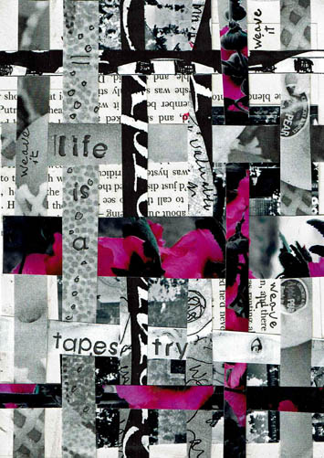
I couldn’t use all those faces, but I could use strips of paper. I could weave them, layer them, draw on them, use them as backgrounds, etc. I could make strips out of all that stuff, throw them into a box and haul a handful out and use them however I want to in the moment. If I found I didn’t like the process, or wasn’t using the strips, I could toss it all into the recycle bin with no guilt.

So yesterday I spent a few happy hours layering paper and cutting it with my paper cutter. All different widths. I find cutting or tearing paper stress relieving. I can honestly say I enjoyed it, and I thought about the strips most of last evening. I had the urge to get up and bring some in to draw on but I didn’t because we were relaxing watching Dexter. It’s one of the few programs I enjoy watching, but I was tempted and that is a good sign. I’m onto something.

So, my Daily Art practice rolled around and the first thing I did was grab a bunch of strips. I wanted to start by paper weaving. I took two wide strips, cut them into random pieces. One was a black and white photo of mine, the other text from a book. I glued those pieces randomly to a paper foundation. Then I selected several strips and cut them down to smaller widths. Surprisingly, all the strips I used are my own work. I did simple over/under weaving over top of the other images, shifting the colored strips to where I wanted them. I glued the ends down to make it permanent.

The process created leftovers and I tossed those strips back in the box to be used for another project. I decided to journal, and stamped out “life is a tapestry.” Then I wrote “weave it” in black pen randomly, and did some circles on the strip with the wording, to make it stand out more. This project was finished in an hour and I very much enjoyed it. I plan to do many of my Daily Practice pieces with these strips this month. Perhaps it will inspire you to try it.

I will soon post an update on my Mythos blog about how my 2016 Initiatives are going so far. If you have an interest check it out over the next few days. I will say here that I missed only 1 day in January. The day I missed I simply did not want to be in the studio. I was tired and not feeling particularly well. To go in would have defeated the purpose of the Initiative, which is to give myself time to do what I love. It’s not an obligation, it is a privilege.

I would urge you to get into your studio every day, even if just to paint a background or stamp a word on paper, or whatever you enjoy doing. Just for the fun of it.
 

Advertisement

ask for help

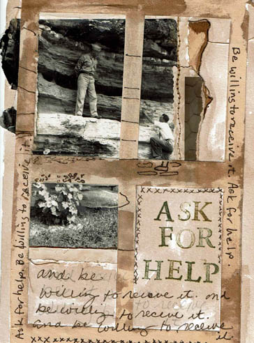
Another Daily Art practice piece with a vintage photo as a focal point. The reason I went to a photo again is because I am (again) rearranging and sorting materials and tools in my studio. In my Daily practice I’ve gotten to the point where I simply reach in and pull out something to use.

When I was sorting through shelves of old journals and books I could alter, I ran across some Canson Manga kits. I don’t know if they are still available. They are a beginner set for artists trying the comic book style. There are paper stencils to prepare layouts and one stencil is a “thought bubble” or narrative block. I liked them back in the day to create easy quick grids. They were buried in the journal shelves and I was glad to run across them. This week’s art seems to be a “Hey friend, so glad to see you!” week.

The photo is an odd size and in the portrait orientation. I put it up in the left hand corner and liked the way it went 3/4’s onto the page. But the bottom right was just filler and there wasn’t a lot of room to do any text, which isn’t necessary but the picture warranted something. So I cut the bottom right off and decided to grid it out. Gridding it seemed to help the story. Frame 1, guy on ledge watching Frame 2, guy trying to climb to ledge. Frame 3, rest the eye, Frame 4, narration. I had a piece of brittle aged brown drawing paper laying on top of the work island so I used the Canson stencil to cut out the window frame. The frame breaks up a bunch of non-narrative space and helps the viewer grasp the story. At least I hope so.

In recovery we learn to ask for help, and also learn to be willing to receive it, the way it comes. The guy that’s climbing isn’t asking for help and the guy on the ledge isn’t offering any. Maybe in the next second something happened, but right now I’m looking at what IS preserved and it seemed a good time to remind myself to Ask for Help. I don’t need help right now, but one day when I’m looking back on my Daily practice papers I might and this will remind me.

The wash is walnut ink, the rubber stamp text is StazOn Saddle Brown. The handwriting is Sepia Pitt Pen. As I did yesterday, I doodled a bit outside the photo to extend lines. I added some flowers because they got cut off by the frame.

In the second frame running down the center you might be able to see a stitch line. A few years ago I got froggy and took a bunch of old photos out and stitched them together on the sewing machine. I used them to make fabric/paper hanging collages and some were left over when I got bored doing that. Old photos can be very fragile. They were often glued to scrapbooks and then get taken out and the force of removing them weakens the paper. As I was gelling this photo to the foundation paper, the bottom tore off. No big deal, just wanted to mention that they can get very delicate.

Talk to you tomorrow, I reckon.

good dog

I’ve been eyeballing this vintage picture for a few weeks because it’s been on top of a stack of pictures that keeps falling over. Or the cats are knocking them over which is more likely. It was going into my Daily Art practice sooner or later so I made it sooner.

One thing you should know about me, and will most likely admire, is that I am a SUCKER for old photos. Any old photos. Half developed, half out of focus, any kind of half-assed, really. Good ones hardly interest me any more then mediocre or damn bad ones do. It’s perverse, but secretly you know you feel the same as me. I mean, have you ever seen one of those old black and white pictures where there is literally NOTHING but a horizon? Like, you know it’s happened to you, too. There was some kind of awesome cloud or an amazing bird formation and absolutely nothing shows on the shot. Back in the day, some old duffer sees 86 birds way up there, spelling the word Geritol or something (it is 1950, after all). He’s all excited and can barely get the manual focus right and snaps that award winner, thinking, “that’ll show ole’ Howard back home.” Then the roll gets developed and the disappointment settles in. Where are the Geritol birds? And his wife Milly screams, “Wilford, what were you THINKING??” And Wil wonders as well. Photography can be a cruel, cruel game.

There is hardly a homeless photo in Pinellas County. Well, there might be now but not in my heyday. Boxes, people. I have adopted countless ancestors, it’s a wonder that I don’t have a bunch of haints up in here. But I don’t, because the departed are happy to be wanted.

Actually, if I might wax philosophical here, and I might, because if a tree falls in the forest does it make a noise? It’s like that here on the blog almost always except for a few stalwart readers, long-time friends and relatives that trip over and think, what fresh hell today? Anyway, looking at unknown ancestors and doing your own ancestry history can bring up many emotional and intellectual issues. My sister sprang for Ancestry.com a couple years ago and we got into researching our family history like nobody’s business.  It was just interesting. I have a relative on my paternal grandmother’s side by the name of Napoleon Bonaparte. I am not kidding. What kind of parents name their kid Napoleon Bonaparte? Well, the kind that I am related to. It explains a lot.

As a photographer myself and as a curious person, I wonder what provoked them to shoot the picture. Or to shoot it the way they did. Like sometimes, when the husband puts the wife in front of the pink flowering dogwood. Which does he want to shoot? Is he a proud arborist or devoted husband? Can he be both? I suppose, but that isn’t as interesting. Everyone ASSUMES he is shooting the wife. After she dies, the grandbaby, dandling on PaPa’s knee, thumbing through the scrapbook. Kiddie, “Ooohh, pwitty!” Thought bubble over PaPa’s head, “Yes, it was a fine pink dogwood…” I mean, really.

Anyway, I can think and talk about this for a long time and I almost have today. I started with the picture. I set it on the paper foundation in the spot it is now. I almost never center anything on a page. I use the Rule of Thirds which I have discussed on this blog elsewhere. The dog is small in the photo, it was shot wonky and tilted. It is odd which is likely why I’ve been attached to it. All those different planes intersecting at obtuse angles. Hmm. One of my favorite art practices is to draw a continuation of something on a page. Like in this case, extending the photo out with drawing. Sometimes I do it with a pattern (like a floral), and extend it beyond the border. I like the “realism” plus the “handmarked imagined”. It’s a fun way to take something you didn’t do, and make it your own art. It’s more than just putting the picture on the page.

I used Neocolor watercolor crayons to draw out my added content. The bottom was empty, so I added a strip of old text. Then I took a piece of drywall tape and rubbed PanPastels over the surface. The tape is pretty deep so it tore up the foam applicator but it had been used and those things don’t last forever. I liked the scale of the squares so I continued the stenciling further than I planned at first.

It needed text and I wasn’t sure what to add. I considered a short quote about dogs but it didn’t interest me. There wasn’t a lot of room, either. I tried thinking about dog names from the 30’s but hell, I ain’t that old. Spike. Lad. Spot. Fido. If this dog was any of those, it was Lad but I can’t even. Lad. A Dog. Now you do know how old I am.

I decided not to name the dog. Nobody calls their dog by their name, anyway.  You know you don’t. Sometimes they are just Dog, or Puppy. Around here, the animals get called “Mr.” or “Missy” or “Oh No You Didn’t” or a word with “-ster” after it. Our dog is named Junebug, but we call her Bugster, June-ster, Junie Bloom, Junie, etc. My late cat, Raven, we called Ravy, Wavy Gravy, Ravy Gravy, Scamp, Crazy Cat, Termite and Shit Foot, but I’m not talking about that.

I put myself in the shooter’s place. If I was trying to leave the porch, or if I walked up to shoot the dog, I’d say “Stay!”. Then, if the dog stayed, which I assume this one did from the general lack of interest on his face, I’d say “Good Dog.”

If I’d had more time than an hour, I might have explored the situation from the dog’s side. I like how he’s looking off to the side, all casual. Mr. Hollywood. Get my good side. He might be saying to himself, “look at this dufus.” Maybe there was a squirrel over there that needed watching. If this was my dog, he’d have a cool name, but we’d just call him Bat Ears most of the time.


meerimagic

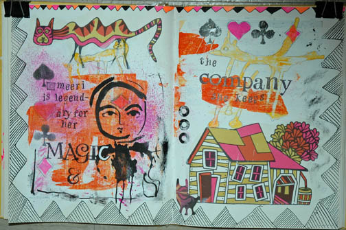
I worked for the first time in this book, Fireside Children’s Songs illustrated by John Alcorn. I bought this book in a thrift; it had no dust jacket and a loose/torn spine. The illustrations were of the sort I grew up with. This book was printed in 1965 (I was ten that year). John Alcorn was an illustrator who was widely published in ads, posters, and books throughout the 60’s, 70’s and 80’s. He had several dominant “styles”: psychedelic, folk artsy and some realistic drawings. The illustrations in this particular book I would classify as a mix of folk art/circus/turn of the century style. There are only four colors used: harvest gold, hot pink, medium orange and black (all on white paper except a couple on black background).

Because I bought the book for the illustrations and subject matter (I love old children’s songs) I couldn’t bring myself to destroy his work. So I had to figure out how to work around it in each spread. Most pages in the book contain some sort of illustration; often a two-page spread has a relationship between the images. The song here was “There was a Crooked Man.” I decided not to use any of the existing text on these pages.

I gesso’d the pages both to strengthen them and cover up the text. The pages of this book are not slick so gessoing was not a problem and it dried quickly. Because I love border and edge work I started by drawing this bold geometric “flag” design. I ran color along the top smaller border but didn’t want to do that all the way around, so I filled the rest of it in with a permanent pen. I scraped a small amount of neon pink, black, yellow and orange paint onto the pages with a credit card. I used the neon for two reasons: I had it and it was the closest to the colors Alcorn used, and I wanted to update his colors to more current tastes.  I prefer brights and neons, so I went with it; I think they work with his colors. The black also helps unify them.

Two creatures appeared to me in the paint scrapes. On the right is a five-legged doggish sort of guy. On the left under Alcorn’s crooked cat is a fox-like animal. I enjoyed making the five-legged creatures feet–one of them looks like a toilet plunger. Good suction in a wind storm. The other feet look like giraffe and horse hooves and a duck’s foot.

After I penciled the outlines for the creatures I knew I needed a central focal point. Since the pages so far had a bunch of animals and a house, I figured the resident of the house was a good start. I am very fond of this stencil from Dina Wakeley. It has three faces, all about the same size, similar but with slightly different expressions. She had the sweetness and folksy look to complement Alcorn’s designs and my decision to create a story. I made her the heroine of my tale. Her body is an inkblot stencil pattern, which gives her a kind of creature-y look as well. Perhaps a shapeshifter?

The spread needed some filler and incidental color pops. I used a rubber stamp set of playing card suits. I stamped the diamond suite on her forehead in the “third eye” area and that cinched her magic qualities.

I don’t know where the name Meeri came from. No doubt there are people named that but I wanted something unusual with a sing-song quality. I stamped the text, “Meeri is legendary for her magic and the company she keeps.” I finished it off with three page reinforcements that I painted black. My very last addition was one of the little creatures I traced from the Dollar Tree Monster stencil set and I placed him in an empty area that needed him.

I love this piece and think my additions hold their own against John Alcorn’s wonderful work, at least in the story-telling department.

da1-4-16Time passes, and to prove it, I now have a new folder entitled Terry Work 2016. Today’s Daily Art offering is a stamped feather image made by an eraser I carved. The foundation is cardboard. Somewhere on the Internet I described soaking cardboard for a few minutes and separating the layers. Well there you are, I just did it again. It’s really that simple. Poof–free paper. Ever since I saw the work of Hanne Matthiesen I wanted to use cardboard but I was sure it wasn’t as easy as she described. It is, just do it once and you’ll be hooked.

My Daily Art Initiative involves making a 5×7 paper foundation piece in one hour. I did this one in about 45 minutes and most of the time was spent trying to find some weird text to use. I had already carved the stamp several months ago. I was trying to carve a simple feather shape and do not ask me why, I have no idea. It was very important at the time, important enough to hand carve this stamp. As I said, I started out for a simple feather and got really carried away. This is sort of a quill-y affair, like Edgar A. would use. I think I used one of those I MADE A BIG MISTAKE erasers from Dollar Tree.  I like the I MADE A BIG MISTAKE eraser because they can be cut up easily for a high yield.

I do find carving stamps to be meditative. Developing good working habits is a must. It is easy to cut yourself badly, no matter what implement you are using. If you can, brace the block so that you don’t have to hold it. If you hold it, hold the bottom and always cut away from yourself. The implement will slip or jump, it is just a matter of time. Learn to be careful when you start to learn.

Most carvers move the block more than they move the cutter. This develops a good rhythm and brings you into that meditation. There are plenty of videos and articles on the web to show you how to carve. Just basic stuff and you can start. Practice makes perfect. In fact, you don’t have to do it much before you are good at it, if you have good eye-to-hand skills, and you are able to firmly grip the cutter.

If you had an idea to get into carving, a Daily Carving challenge would be very advised. Think of the benefits! You’d be an expert carver in a month, and have hundreds of unique stamps after a year. It’s very doable.

Back to this piece. Cardboard, stamped feather. A book on European birds listed a picture of each bird (too big to use), a physical description of the bird, nesting habits, habitats, food choices and vocals. The way the author described the vocals was delicious. It was hard to decide which one to use. One bird with an audacious name like Wood Hunting Worm Hole Jelly Breasted Nuthatch or something had a vocal “like a raucous crow ending with a harsh guttural explosion.” I am not making that up. Well, actually I AM making that up, but it was very close to that–too close. I made a harsh guttural explosion when I read it, I am not making THAT up.

The blue border was a piece of nifty paper that I get for free, the source to be nameless lest it get someone into a fix. It is WASTE paper, stuff that gets pitched in a place that does not even recycle. Don’t get me started. What would go in the trash gets given to me and I am grateful because it is very nice paper. Sort of like cotton rag old school typing paper, back when manual typewriters came with a special eraser that looked like a pencil and had a nasty bristle brush on the end of it to brush away the eraser crumbs. Only the bristle brush would get ink on it from brushing away inky crumbs, then you ended up with nice rag white typewriter paper with black inky streaks on it and had to RETYPE THE PAGE. My, how I long for the good old days. Oh, the fun we had, waving our inky pencil erasers over clean paper and scrubbing away inky streaks until we put a hole in the paper and had to retype the entire page. We did this, youngsters. And we liked it, we liked it just FINE, because it beat writing with the quill-y type pen like E.A. Poe was stuck with. Him, a fine author whose mind went, no doubt, a million miles an hour while his poor clenched hand scribbled, dipped, scribbled, dipped, scribbled, dipped all the way through the Masque of the Red Death.

Just in the 60 years I have been alive, information processing has changed in astonishing ways. Here I sit, ranting and raving like poor mad E.A. on a blog nobody reads, with spell correcting and digital images illustrating, neatly left aligned. Now a crumbly pencil eraser sells for $75 on Etsy. Oh, the things I have seen.

Well, the paper was painted with navy acrylic. The top border with the red was added at the last minute just because the red popped it a bit. Then I clipped out the vocal description and glued it down, strangely, it kept coming up. I wonder if it was the clear gesso I put onto the cardboard? The paper was very old and porous, it surprised me the text kept lifting, in fact, you can see where it lifted and some letters escaped. I had to write them in. With a pencil.

I used a permanent fine tip marker to write the bird call on the border, signed it and done. I like it, I like it just fine.