Archive for the ‘photography’ Category

lifeisatapestry

Well, guess what? The studio is tossed again.

Last week I put my big folding table into the middle of the living room and brought out the various and sundry boxes and bins of paper and images and sorted it into cool boxes I got at the Dollar Tree. The boxes are letter-sized and have a self-lid and hold a goodly amount of of paper. I was soon overwhelmed with the sorting but I did get through the bins It is so much easier now to keep it neat and find images by subject matter which is important to me. I wanted to do a page with an owl last week. I have 284 pictures of owls around here and couldn’t fine one. One. That’s what started this ball rolling.

I got overwhelmed, particularly with laser copies (lots of black and white) of my own photographs. In the good old days I had a color laser printer and I routinely printed contact sheets and reproduced my photos. Lots and lots of mannequin photos because I used them frequently in my work. I knew there were too many to go into the nifty boxes without there being 30 boxes of mannequin photos. So I started shoveling them into a separate pile. Before I knew it, that pile was teetering on the edge of calamity just like my sanity.

I had to put the big table away, and the stack took up home on the dining table. I filed the neat boxes away in the studio and that was a wonderful feeling. But then I’d walk through the center of the house and the stack that didn’t get filed away, mostly my OWN art, was taunting me. Plus, the dining room is smack in the middle of my feng shui Wealth area and that is not good. How many mannequin photos can your Wealth area overlook? If I know my Wealth area, and I do after many hours of studying it and moaning over it, there were about 6000 more mannequin faces than it could manage. My Wealth area couldn’t even with it and neither could I.

There were stacks of paper. Strangely, I’ve been obsessed with stacks for awhile. It started with caryatids about 18 months ago. They were fascinating to me. Then I saw pictures of cairns that my husband took in the Smokey Mountains last spring. There is an artist that works in several rivers up there making cairns (he’s around on the internet, Google him if you want to see his work. He is really good, a true Rock Whisperer). Then I ran into this cool Edward Gorey’ish fabric during Halloween that was so exciting to me. About that time the Alice in Wonderland stencils showed up at Dollar Tree. One day I couldn’t take it anymore and cut out a caryatid, the gothic fabric and created an Alice stack using illustrations and stencils. A reprieve but I returned to stacks again.

Stacks of paper. Obsession with stacks. What are stacks? They are layers on top of layers. Image on top of image. Strips on strips.

I couldn’t use all those faces, but I could use strips of paper. I could weave them, layer them, draw on them, use them as backgrounds, etc. I could make strips out of all that stuff, throw them into a box and haul a handful out and use them however I want to in the moment. If I found I didn’t like the process, or wasn’t using the strips, I could toss it all into the recycle bin with no guilt.

So yesterday I spent a few happy hours layering paper and cutting it with my paper cutter. All different widths. I find cutting or tearing paper stress relieving. I can honestly say I enjoyed it, and I thought about the strips most of last evening. I had the urge to get up and bring some in to draw on but I didn’t because we were relaxing watching Dexter. It’s one of the few programs I enjoy watching, but I was tempted and that is a good sign. I’m onto something.

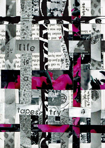
So, my Daily Art practice rolled around and the first thing I did was grab a bunch of strips. I wanted to start by paper weaving. I took two wide strips, cut them into random pieces. One was a black and white photo of mine, the other text from a book. I glued those pieces randomly to a paper foundation. Then I selected several strips and cut them down to smaller widths. Surprisingly, all the strips I used are my own work. I did simple over/under weaving over top of the other images, shifting the colored strips to where I wanted them. I glued the ends down to make it permanent.

The process created leftovers and I tossed those strips back in the box to be used for another project. I decided to journal, and stamped out “life is a tapestry.” Then I wrote “weave it” in black pen randomly, and did some circles on the strip with the wording, to make it stand out more. This project was finished in an hour and I very much enjoyed it. I plan to do many of my Daily Practice pieces with these strips this month. Perhaps it will inspire you to try it.

I will soon post an update on my Mythos blog about how my 2016 Initiatives are going so far. If you have an interest check it out over the next few days. I will say here that I missed only 1 day in January. The day I missed I simply did not want to be in the studio. I was tired and not feeling particularly well. To go in would have defeated the purpose of the Initiative, which is to give myself time to do what I love. It’s not an obligation, it is a privilege.

I would urge you to get into your studio every day, even if just to paint a background or stamp a word on paper, or whatever you enjoy doing. Just for the fun of it.


Advertisement

ask for help

Another Daily Art practice piece with a vintage photo as a focal point. The reason I went to a photo again is because I am (again) rearranging and sorting materials and tools in my studio. In my Daily practice I’ve gotten to the point where I simply reach in and pull out something to use.

When I was sorting through shelves of old journals and books I could alter, I ran across some Canson Manga kits. I don’t know if they are still available. They are a beginner set for artists trying the comic book style. There are paper stencils to prepare layouts and one stencil is a “thought bubble” or narrative block. I liked them back in the day to create easy quick grids. They were buried in the journal shelves and I was glad to run across them. This week’s art seems to be a “Hey friend, so glad to see you!” week.

The photo is an odd size and in the portrait orientation. I put it up in the left hand corner and liked the way it went 3/4’s onto the page. But the bottom right was just filler and there wasn’t a lot of room to do any text, which isn’t necessary but the picture warranted something. So I cut the bottom right off and decided to grid it out. Gridding it seemed to help the story. Frame 1, guy on ledge watching Frame 2, guy trying to climb to ledge. Frame 3, rest the eye, Frame 4, narration. I had a piece of brittle aged brown drawing paper laying on top of the work island so I used the Canson stencil to cut out the window frame. The frame breaks up a bunch of non-narrative space and helps the viewer grasp the story. At least I hope so.

In recovery we learn to ask for help, and also learn to be willing to receive it, the way it comes. The guy that’s climbing isn’t asking for help and the guy on the ledge isn’t offering any. Maybe in the next second something happened, but right now I’m looking at what IS preserved and it seemed a good time to remind myself to Ask for Help. I don’t need help right now, but one day when I’m looking back on my Daily practice papers I might and this will remind me.

The wash is walnut ink, the rubber stamp text is StazOn Saddle Brown. The handwriting is Sepia Pitt Pen. As I did yesterday, I doodled a bit outside the photo to extend lines. I added some flowers because they got cut off by the frame.

In the second frame running down the center you might be able to see a stitch line. A few years ago I got froggy and took a bunch of old photos out and stitched them together on the sewing machine. I used them to make fabric/paper hanging collages and some were left over when I got bored doing that. Old photos can be very fragile. They were often glued to scrapbooks and then get taken out and the force of removing them weakens the paper. As I was gelling this photo to the foundation paper, the bottom tore off. No big deal, just wanted to mention that they can get very delicate.

Talk to you tomorrow, I reckon.

good dog

I’ve been eyeballing this vintage picture for a few weeks because it’s been on top of a stack of pictures that keeps falling over. Or the cats are knocking them over which is more likely. It was going into my Daily Art practice sooner or later so I made it sooner.

One thing you should know about me, and will most likely admire, is that I am a SUCKER for old photos. Any old photos. Half developed, half out of focus, any kind of half-assed, really. Good ones hardly interest me any more then mediocre or damn bad ones do. It’s perverse, but secretly you know you feel the same as me. I mean, have you ever seen one of those old black and white pictures where there is literally NOTHING but a horizon? Like, you know it’s happened to you, too. There was some kind of awesome cloud or an amazing bird formation and absolutely nothing shows on the shot. Back in the day, some old duffer sees 86 birds way up there, spelling the word Geritol or something (it is 1950, after all). He’s all excited and can barely get the manual focus right and snaps that award winner, thinking, “that’ll show ole’ Howard back home.” Then the roll gets developed and the disappointment settles in. Where are the Geritol birds? And his wife Milly screams, “Wilford, what were you THINKING??” And Wil wonders as well. Photography can be a cruel, cruel game.

There is hardly a homeless photo in Pinellas County. Well, there might be now but not in my heyday. Boxes, people. I have adopted countless ancestors, it’s a wonder that I don’t have a bunch of haints up in here. But I don’t, because the departed are happy to be wanted.

Actually, if I might wax philosophical here, and I might, because if a tree falls in the forest does it make a noise? It’s like that here on the blog almost always except for a few stalwart readers, long-time friends and relatives that trip over and think, what fresh hell today? Anyway, looking at unknown ancestors and doing your own ancestry history can bring up many emotional and intellectual issues. My sister sprang for Ancestry.com a couple years ago and we got into researching our family history like nobody’s business.  It was just interesting. I have a relative on my paternal grandmother’s side by the name of Napoleon Bonaparte. I am not kidding. What kind of parents name their kid Napoleon Bonaparte? Well, the kind that I am related to. It explains a lot.

As a photographer myself and as a curious person, I wonder what provoked them to shoot the picture. Or to shoot it the way they did. Like sometimes, when the husband puts the wife in front of the pink flowering dogwood. Which does he want to shoot? Is he a proud arborist or devoted husband? Can he be both? I suppose, but that isn’t as interesting. Everyone ASSUMES he is shooting the wife. After she dies, the grandbaby, dandling on PaPa’s knee, thumbing through the scrapbook. Kiddie, “Ooohh, pwitty!” Thought bubble over PaPa’s head, “Yes, it was a fine pink dogwood…” I mean, really.

Anyway, I can think and talk about this for a long time and I almost have today. I started with the picture. I set it on the paper foundation in the spot it is now. I almost never center anything on a page. I use the Rule of Thirds which I have discussed on this blog elsewhere. The dog is small in the photo, it was shot wonky and tilted. It is odd which is likely why I’ve been attached to it. All those different planes intersecting at obtuse angles. Hmm. One of my favorite art practices is to draw a continuation of something on a page. Like in this case, extending the photo out with drawing. Sometimes I do it with a pattern (like a floral), and extend it beyond the border. I like the “realism” plus the “handmarked imagined”. It’s a fun way to take something you didn’t do, and make it your own art. It’s more than just putting the picture on the page.

I used Neocolor watercolor crayons to draw out my added content. The bottom was empty, so I added a strip of old text. Then I took a piece of drywall tape and rubbed PanPastels over the surface. The tape is pretty deep so it tore up the foam applicator but it had been used and those things don’t last forever. I liked the scale of the squares so I continued the stenciling further than I planned at first.

It needed text and I wasn’t sure what to add. I considered a short quote about dogs but it didn’t interest me. There wasn’t a lot of room, either. I tried thinking about dog names from the 30’s but hell, I ain’t that old. Spike. Lad. Spot. Fido. If this dog was any of those, it was Lad but I can’t even. Lad. A Dog. Now you do know how old I am.

I decided not to name the dog. Nobody calls their dog by their name, anyway.  You know you don’t. Sometimes they are just Dog, or Puppy. Around here, the animals get called “Mr.” or “Missy” or “Oh No You Didn’t” or a word with “-ster” after it. Our dog is named Junebug, but we call her Bugster, June-ster, Junie Bloom, Junie, etc. My late cat, Raven, we called Ravy, Wavy Gravy, Ravy Gravy, Scamp, Crazy Cat, Termite and Shit Foot, but I’m not talking about that.

I put myself in the shooter’s place. If I was trying to leave the porch, or if I walked up to shoot the dog, I’d say “Stay!”. Then, if the dog stayed, which I assume this one did from the general lack of interest on his face, I’d say “Good Dog.”

If I’d had more time than an hour, I might have explored the situation from the dog’s side. I like how he’s looking off to the side, all casual. Mr. Hollywood. Get my good side. He might be saying to himself, “look at this dufus.” Maybe there was a squirrel over there that needed watching. If this was my dog, he’d have a cool name, but we’d just call him Bat Ears most of the time.


bwstencilgirl1-11-16Hi! We’re back to Monday it appears. I am now behind showing you two pieces of the Daily Art Challenge. The first one was still wet when I had the chance to blog, and the second one was lucky to get done at all. I’ve had a series of home services around here necessitating workers in the house and prep to have them in. Today an expected half hour job turned into 2 hours of pet management (or wrangling)?

I wanted to laser print one of my photos onto the Rives BFK® Printmaking paper and experiment with various watercolor media I pulled out yesterday. I vaguely thought of something moderately detailed that could use a range of colors, sort of like a coloring book page. As usual the huge archive of photos I have, most of which suck for numerous reasons, took me forever to look through. The clock, people. One jumped out at me. It is a photo of a painting I did in 2008 that appears in a separate blog entry. I had cropped just the uppermost of the painting and altered it with Stencil filter. Like I need another stencil image. Of course, it wasn’t suitable at all for what I had intended to do, but I decided to give it a go. It’s been so darn long since I’ve done any alternative sized paper printing that I couldn’t get the image to print properly. All I could get to was one side of the pix on the edge of the page. I messed with that for too long (clock, people) and had the brainstorm, or braincramp (which fits better) to create a reverse of the side that did print. Like a harlequin outfit.

I was stuck on using the water media idea. I thoughtfully prepared a sample palette of all my Derwent® and Prismacolor® watercolor pencils and my Caran d’Ache® watercolor crayons last evening. The Prismacolor® pencil set seemed to have the darkest black in my collection but it wasn’t black enough. No matter what white media I tried it would not get truly white over the black. Suffice it to say that I went through a series of gyrations that are too troubling to detail here. I’m glad it’s over. Clock, people (works both ways).

If you recall, the rules of the Daily Art Challenge are that the image has to be finished (or quit) in one hour and it has to be 5×7 with a paper foundation. My time machine is broken, but if it wasn’t, I’d start again and make a Photoshop® digital image. Crop the one I started with in half. Apply  “Invert Color” to it, save it. Open a blank document, move the b/w copy up to the w/b copy, save as a new file, print it on 5×7. Then I’d doodle or stencil or something over the top of that. Much easier to work with paint/marker on top of the laser toner as opposed to black paint. It would have been more creative, less frustrating and better looking by far. Of course, I still haven’t solved the inability to print it correctly, that is for Bob or another day.

I did not know about David Bowie’s illness and was sorry to hear of his death today. I’ve enjoyed his music for decades–he was an amazing multimedia creative talent. One of my favorite songs is his “Putting Out Fire,” the theme from the movie Cat People.

milton station when
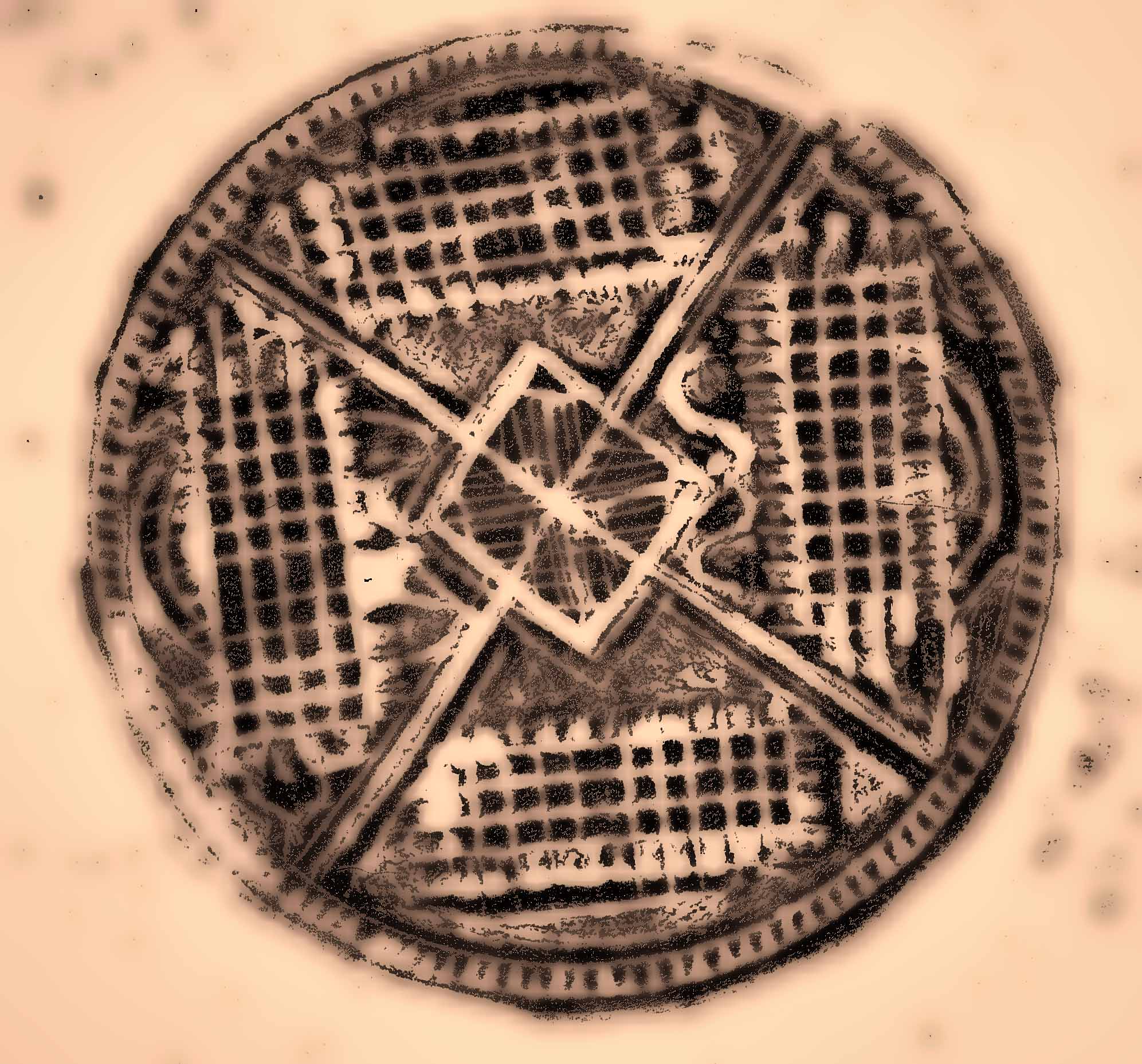
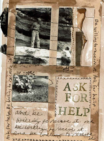
Here’s my Daily Art piece. I began with the found photo and you can find out more about why I chose it at my Mythos blog.

I scanned the original photo and adjusted the contrast a bit. Evidently the day it was taken the weather was overcast. Old black and white photos tend to be very low contrast. I wasn’t sure it would even scan well, but it did. My first step was to laser print the photo.

The linear quality of the telephone poles attracted me, as well as the handwritten notations. I have used stenciled telephone poles before in a piece called Camera Shy. I painted the Rives BFK® printmaking paper with Golden® Acrylic Micaceous Iron Oxide. This paint is worth getting if you are a fan of grey. It includes specular hematite ore and has a warm grey color, slightly shimmery. It doesn’t look like any other paint and it’s a big favorite of mine. It is expensive, as all good things are. I watered down the acrylic and it was still too opaque, so I kept washing it. The paper got really wet. This is not watercolor paper and I pushed it close to it’s limit…but it is good paper, just took a while to dry. This was ok since I got into a confunction with my printers and I had to alter that photo, but the clock was ticking on this one.

By the time I got the print out, the acrylic was dry and I took the telephone pole stencil and applied black acrylic paint. That has a short drying time. I adhered the photo copy down. The piece wasn’t finished and I wasn’t sure what it needed. Then I remembered the quote by Edmund White that I read this morning over coffee. “When a person dies, a library is burned.” I liked it so much I jotted it into my journal so that I would have it. I thought, this old photo has endured past the photographer’s own burned library…his story carried beyond his life. With the extra telephone poles, I had indicated further communication. That led to me handwriting the words “communicate-tell your story.” The photographer told his story, I found his photo and told my story through this art and in the writing of my other blog post. I hope you will go there. If you like art journaling, journaling, photography or using found photos, I think you will enjoy that post. I hope, at least, that you enjoy this art.

mandala1topazedweb mandala1webHi all,

I’ve been carving styrofoam again, got re-inspired to do so by Coralette Damme’s awesome lino cuts.  I’ve also been drawn (ha ha, pun) to create some mandalas, so I decided to combine the two interests.  The downside is that I am having a hard time pulling a crisp print. Styrofoam is not the easiest material to carve for detail work. It is also really hard to find a combination of paper, ink and pressure to get any kind of print at all. I’m taking a scientific approach to the research, since I have so many paper options (we won’t discuss that) and so many ink options (we won’t discuss that, either), and you can’t put pressure on the plate with extreme prejudice like is tempting, or you’ll obliterate the design. After all, folks, take out food containers weren’t really manufactured as an art material.

So I think to myself, what good is all this carving if I can’t get a good print? Then I thought, why not scan in the print I CAN get, and see what happens in my favorite photo editing program, Topaz?  So, the top picture is the altered one, and the bottom one is the hand-pulled print.

The hand-pulled print is black ink on white paper, so when scanned all you see is the circle itself.  I cropped that original scan, leaving a white border. This is not a problem if you are going to print on white paper, the background is white. I think we’ve covered this before in a blog post back in the Day. However, since I did not remove the mandala from it’s scanned background, when I altered the photo it alters it all. And since one of the filters I chose has a fancy-schmancy toning process, it toned the entire scan. Now, I could have lassoed out the mandala in Photoshop Elements before or after Topazing, except I really stink at lassoing. It requires waaayyyy more patience than I generally have, especially since this is research. Altering photos is a lot more fun than lasso practice. And I’ve already been in the studio all morning, documenting about 6,000 pulled prints. Enough is enough. You can quote me.

There are several filters applied to this image. The first thing I did is push the contrast all the way up. I wanted the black as dark as I could get it to enhance details. Then I applied multiple Topaz filters on top of each other.  I can truthfully say that I had at least a dozen filter options that were hard to pass up. Not to mention color combos, line styles, flattening, etc.  Try photo editing on a sketch or other image you’ve created, in whatever photo program you have. It’s addictive and makes one image so versatile.

Madonna

Posted: December 15, 2013 in photography

shell madonna72I guess I disappeared for a little while there. Lots of various stuff to get done last week. I’ve begun working with my foam stamp making and I’ll share some of those images when I can figure out how to get a better print.

Yesterday I set up this shot. I found both these items at thrift shops. I have no idea what the original shell container was for, except perhaps as a candle holder. The Madonna is a Lefton in remarkably good shape for a thrift find. She is missing small pieces from two fingers, otherwise she’s relatively mark free and of high quality. I put these two together and have them sitting on my dresser. I’ve always meant to shoot them but never got around to it.

I positioned them on my kitchen counter by the window, experimenting with angles for light and orientation. I am not able to get very close up in camera, so most of the original shots are of the full length with a good bit of background stuff. As usual, I cropped mercilessly. When I say that, I mean that I wanted to put the scallops of the shell container in the top of the image, but that desire didn’t serve best design. So I had to give up my idea of the outcome in favor of what worked best. The result is a much better image and usually that is the case. Less is more.

After that, I used Topaz Lab filters, one was the Split Tone option and I can’t remember the other one. I saturated the color a bit and called it finished.madonnashellorig72Play around with things you love in your own house, and the light you have naturally coming into different windows at different times of the day. There is something about shooting everyday items that you might not give much attention to that ends up elevating their interest level and importance. Use the set up as a mini meditation. Combine items for likeness or difference, harmony or conflict.  Take your time with the shapes and colors, even though you can change the colors in your photo editor. The set up is not simply a means to the end image, just as retail window dressing is not merely to sell clothing.

Have fun!

Mannequins are back!

Posted: December 2, 2013 in photography

blondebigeyemannyalter172 blondebigeyemanny72Hi

Hope everybody had a good holiday weekend. Last Saturday Bob and I took in the local sites, including a trip to Artpool to catch up. I wanted to shoot the Christmas window and it provided many opportunities for some special shots. It’s a surprise! You’ll just have to be patient and wait. In the meantime, I shot two of my perennially favorite subjects-reflections in shop windows and mannequins. I think I found a few new girls. I haven’t named any of them yet which is a good sign of any remaining sanity I might have.

Bob and I don’t do holiday shopping but he ran across a Black Friday special at Topaz Labs. I’ve mentioned Topaz before in the blog. It is a powerful, wonderfully cool and simple (ha!) set of filters to use in conjunction with Photoshop or Elements (they are now offering a stand alone platform for their filters). Buy Topaz products once and get all upgrades free. We LIKE THAT! Topaz really is simple to use, but there are so many absolutely incredible effects that it takes a long time to remember what I like. Also, not every filter I like enhances every kind of image. However, if you like to make the most of your photos, or play around with them, take a look at their products. (Note: have no affiliation, just been usin’ ’em for a long time). WARNING: This is extremely addictive. You will give up most other activities for a long period of time.

Anyhoo, I am crazy about this girlie. There were some filter effects that made her so realistic that, were it not for the bad wig, I might have been able to fool you into thinking she was a real person. There is also a tad of “Grandma, what big EYES you have” going that needs ignoring, but I say SQUINT and call her real.

The first image alter I make on the girls is to prettify them. Later I go in and do a heavy graphics effect or a lens effect. With the big eyes, this girl really rocks the graphics, so I might go there tomorrow. I usually start at ground zero for each alter.

Remember, Photoshop Elements has good filters, too, if that is what you have to work with. And crop, crop, crop. Edit. That way you are working with the essentials only when you alter. Actually, working like this with photos is good practice for any composition, collage, painting or drawing. It develops the eye and works your POV. It also gets me out of color ruts.

Bob and I watched a very creative, funny and bittersweet story this weekend. It is called Robot & Frank with Frank Langella, Susan Sarandon and other favorites. I can’t imagine a more creative plot than this story. On the serious. HIGHLY RECOMMENDED!

Sometimes when you are out there shooting a subject comes along that is just plain hard to shoot. Shop windows tend to be difficult in general. There is usually a glare on top of the reflection, then the reflection, then what is in the foreground, the subject itself, and a background. Imagine being a camera lens with one or more focusing points trying to figure out what to focus on? I don’t know about you, but i only have one brain and it is hard enough to focus that. It is not unusual when trying to shoot shop windows to have to not only move the camera around to somewhat realign the focus centers, but also move your body to different positions and angles. Sometimes if you can remove one or two layers by doing this you can get a focus on what you want. Sometimes you can’t. The last time I was at ARTpool shooting the big storefront windows I had a great deal of trouble with focus. No matter what I did, the camera preferred to focus on the reflection, not the contents of the window. I finally decided to just go with it and see what happened later. While I prefer to remove color from my photos this one is all about that yellow popping off the blue, and to change this to grayscale would be a muddy mess. I like the moodiness…she looks almost like a ghost from the past. Not every photo taken under these conditions would work. You need a bold out of focus subject and a focused subject that doesn’t compete too terribly much with it. If you are shooting something you really love, and the focusing is off, try everything you know to do and if it doesn’t correct, try going with it. The results could surprise you.

I love the face on this mannaquin. She has lovely features and I think the feather hat sets off her look perfectly. The fringe earrings are the creation of Marina Williams of ARTpool Gallery. I particularly like the way the smaller side of the face is highlighted, although the window from the other side is blown out. I was surprised that the shot came out as it did, considering the camera had three completely different levels of light to meter. Got lucky. This girl will probably be featured in upcoming artwork.