Here’s my Daily Art for the first day of 2016. Happy New Year!
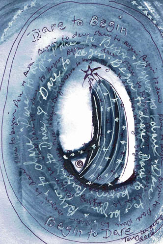
Today I started with the 5×7 Rives BFK printmaking paper. I worked with navy acrylic yesterday in different piece and I felt good about this color. It’s not been a favorite of mine in the past, even though it so represents the clear night sky. I wet the paper so that the acrylic would wash the paper and be less opaque. The fan helped to get it dried in time to meet my one hour time limit.
I have Sharpie Paint Pens™, both oil and water-based. The oil-based are transparent, the water-based are opaque. Usually I go for the water-based; they do a great job over acrylic paint and not all pens do. But I wanted to try the oil-based because it’s been a long time since I’d used them. As I thought, the paint went on looking somewhat opaque but it faded as it dried. I continued to write “Begin to Dare, Dare to Begin” over the navy and all that showed was the barest grey letter outlines. I then switched to the white water-based opaque pen and began adding viewable text.
If you are unfamiliar with asemic writing, it is writing that is without content. Asemic writing resembles mark-making; it compels one to look and look, trying to find words that can be made out, to construct a meaning. It’s handy for me to enjoy the look of asemic writing because my handwriting doesn’t enhance my artwork at the level I’d like it to, especially in this era of carefully and creatively hand lettered journal pages. When I do hand letter a piece, I’m not aiming for highly decorative or readable text; rather, I work to my weakness (strength?) of indecipherable messy lettering. But in contrast to asemic writing, rather than being without content, my content is simply unreadable. I have a Pinterest page where I collect asemic images, if you’d like to explore it.
I began to encircle the center image with white Sharpie™ water-based pen. At first the navy shape inside the white center looked like a long-haired female with an arm outstretched. But I also saw trails like a comet, so I went with that idea, which seemed more expressive. I didn’t want to write with black, so I found a Sharpie™ extra-fine pen in purple. I thought purple looked more like the cosmos. I wrote with it in a different size in order to create greater contrast to the white writing. At this point, the image looked as if it needed more gravity on the page, so I did imperfect circles around the center. The empty center and outer circles created a mandal; a Begin and Dare mandala. I signed and dated it which is another “rule” of the Daily Art Initiative.
The subject matter of “daring” relates to Lisa Sonora ‘s current 30 Day Journal Project that began today. The prompts today were about achievements and what had to be dared to accomplish them. My journaling was about commitment and beginnings, so I brought those ideas into this piece. It’s possible that this 30 day challenge will inform other Daily Art projects.
