organization notebooksI’ve been spending some time looking at videos of artists and how they work, the clues they give off about their organization, product preferences, etc. I’m not so much concerned about whether I like the artist’s style or the products they do use, but perhaps their reasons for what they do or what works best for them. There is a lot that can be gleaned from this, even if I look across medias.

One thing I’ve learned about myself is that action carries change. If I do not take action, or I do not have an orientation to accomplish some type of change, it just won’t happen for me. So while it has been informative to watch videos and learn, unless I put some concrete steps in the development of new habits, it’s just a waste of time ultimately, or at least a pleasurable activity that could be more satisfying spent elsewhere. Like on my own art or education or recovery.

But there are certain artists that interest me enough to keep watching. The artists that intrigue me are those that have done, as a practice, only the work they find satisfying. They are the artists that fill their own well by doing and experimenting. These are the artists that would (or do) work for the pleasure of it and would likely do the same stuff if they didn’t get paid. Most of them are getting paid, but I can tell pretty quickly which are participating in art as a lifestyle and which are earning a living.

Don’t get me wrong. There is absolutely nothing wrong about making money as an artist on artistic work. But I am more interested, as a matter of study, in those artists that simply mind their own business and do what they want, as a practice.  They teach for the fun of it, because they want to. They publish because they have something to say, even if there is hardly anyone reading. They self-publish for experimentation or to refine ideas. They make art for themselves and the world catches up with them.

There may be ambition, or planning, or networking at work. I’m not suggesting that successful artists go willy-nilly along the path. If a book is in the offing, they consider whether they want to write a book now. If a gallery showing is offered, they consider if it is something they want to do. Perhaps it is not a good time to pursue such activities. The work is not a means to an end.

Anyway, as I said in yesterday’s post I am a member of Teesha Moore’s Artstronauts Club™. This is a forum that Teesha wanted to explore and considered for some time before pursuing it. (I am quoting Teesha from her own writing and videos). I’ve admired Teesha and supported her various publications for more than a decade, starting with her Studio zine, Play zine, stamps, etc. Her style is very much her own and she’s evolved it over the years, sought compatible materials, hand-makes her own journals, etc. She develops her own ideas, her own projects and she just keeps doing what she wants. She takes risks. (This is my observation). She’s fine with making money, but she’s also generous in truly sharing how she does what she does. Her Club is reasonably priced and there is good value in membership. And no, I am not in any way affiliated with her. I am a customer and while she published me in the Studio zine years ago, it is not likely she remembers me and I have nothing to gain by speaking of her.

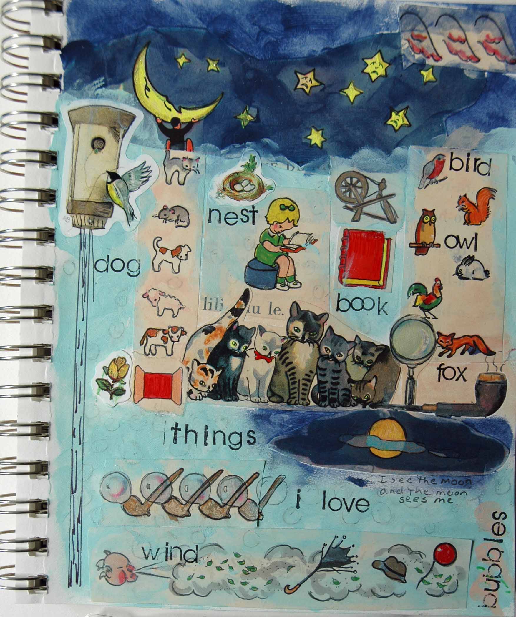
I began to think how I could record and organize these observations of successful artists, so that I could assess whether a habit is worth adopting. Is it compatible with my way of working? Will it improve my life or evolve my art? I took one of Teesha’s routine practices: she constantly recycles her art. She does so by making scans and color copies of her art journal pages and cuts them up, incorporating them in a new design. It is one part of her process, not the entire process.

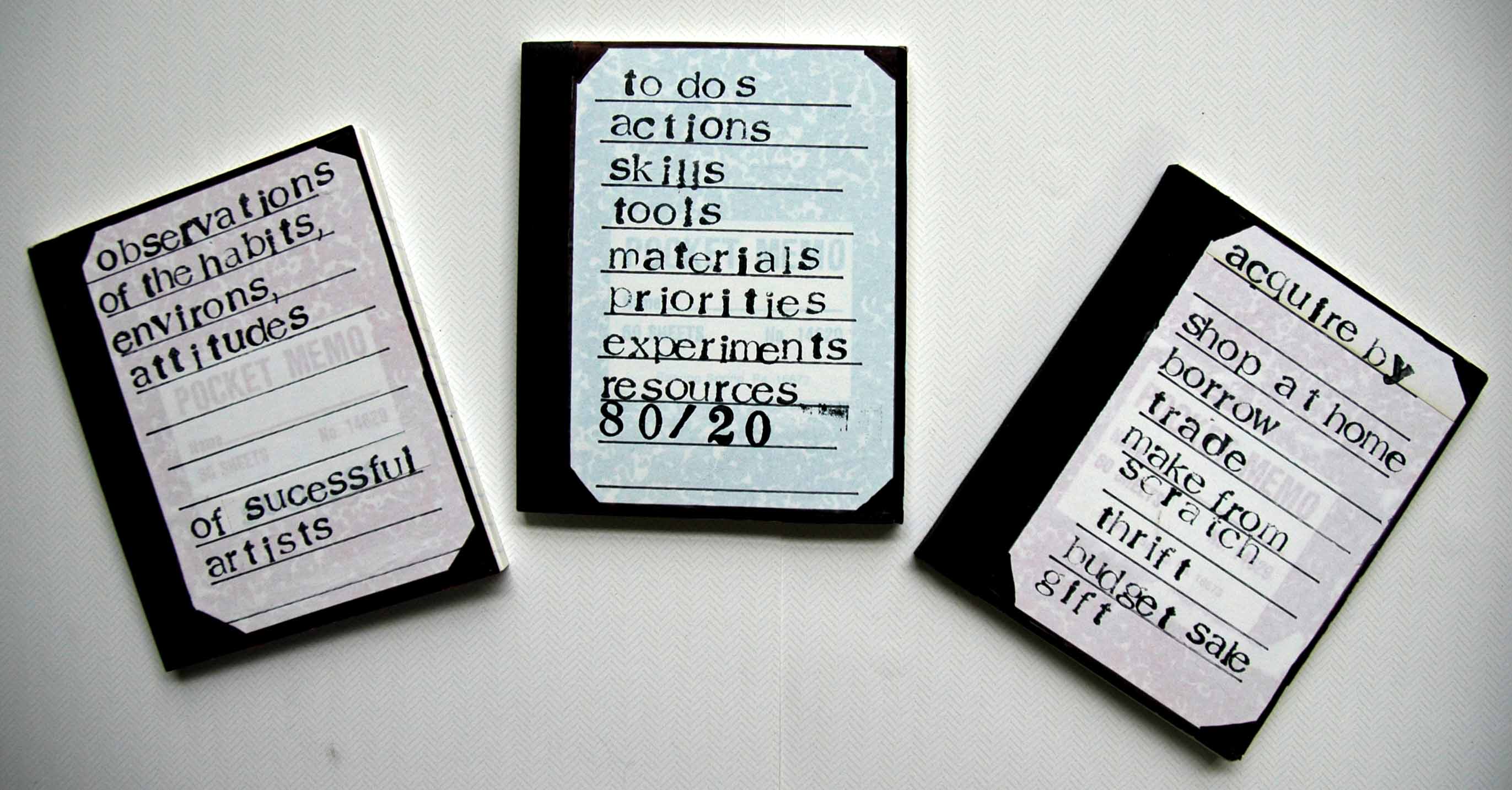
I got three mini composition notebooks from my inventory. One book is dedicated to my Observations. I approach them “scientifically” and list them in detail. Today’s focus was on the above, recycling finished art, or partially finished art, to be used in future projects in any way possible. I have already done work with my own photos, and I have already created original journal pages and canvases. I almost never take the next step to reproduce these works and use them again in some manner. For years I’ve thought about this, wanted to do this, but I haven’t. Watching Teesha do it on videos keeps bringing it into my awareness. I’m ready to take action.

The second book is for Action steps. To-do lists, broken down activity by activity.  Education needed, skills to develop, setting priorities. This is the how-to part of the habit. It’s not just going to happen and become a habit. There is always room for refinement, but I am building a foundation here, not a house.

The last (or next?) book is the Acquire aspect. How or where do I get the education? skills? experience? What about materials and tools? How or where do I get them? What resources will it take? I have a set of re-minders on the cover as to various means of acquisition.

If you’ve looked closely at the mini books, you will see the pattern and printing through the label. These are workbooks and I don’t care about that kind of stuff. Also, I picked the mini comp books because they can be held together with a rubber band and taken in my purse. While I am waiting at the doctor’s office I can review my progress or make new notes. It’s a matter of convenience and utility with me, not making a masterpiece.

Which brings me to today’s experience. I wanted to reinforce the composition book bindings. I like the black tape and wanted to put another layer of black masking tape on. I was sure I had a roll of black masking tape, and I was just at the store buying colored masking tape and I know they didn’t have any black, and it’s been wicked hard to find the colored. I’ve just done a total studio reorganization and if it’s not in the “adhesives” bins I don’t have it. Guess what? I don’t have any. I was going to put it on my “to buy” list but that didn’t help me this morning. I wondered, where will I find it? Then I remembered the last time I saw some at Michael’s™ it was in the drafting section and it was about $9.99 a roll. I don’t want to pay that. I looked at my Acquire list. I had already tried to Shop at Home. Borrow: nobody here in the hood would likely have black masking tape and I’d rather not go door to door. Ditto with Trade. Then I hit Make From Scratch.  I had watched a video about making your own custom washi tape, which included both painting and stamping plain masking tape. So I pulled out a roll of blank masking tape and a bottle of black gesso and I placed the piece of tape on waste backing from Contact Paper™ I had used (it’s a paper that nothing sticks to, similar to a Teflon™ pad but way free). Gesso’d it, let it dry, cut it and applied it, not even five minutes of effort.

Result: 1) I didn’t spend too much money on a roll of black tape; 2) I wished I had remembered all this before I paid almost $5 a roll for the neons I found last week (although I am a masking tape fiend and it is something I use over and over, but still); 3) no time and gas trying to find it in a store; 4) able to finish project immediately. A side note: Sam’s Club™ sells 6 rolls or so of regular masking tape for about $12. That’s a lot of masking tape. Make your own washi tape, you already have stamps and paint and ink pads. Have you priced washi tape? Half of it doesn’t even stick properly and the designs aren’t to my liking (unless they are even more expensive Japanese designs). Keep pieces of masking tape on freezer paper handy. Next time you have leftover acrylic paint, or your spray bottles out, go to town. Same with stamps.

Give it some thought. Decide on a successful person you admire. (Doesn’t have to be an artist, either). Learn about them. Write down the habits you feel drawn to, make a detailed action plan, figure out how to do it. Put it into practice. Remember, just because it works one way for a person, doesn’t mean it will work for you. Customize it or leave it be. What’s the worst that can happen?

thingsilove72I seriously love this page.

I found this small journal I bought at a local art supply store. It was made for kids, with an insert on how to make a visual journal, some decorative paper bound in and some heavy colored cardstock. I think it must be about 5×8″.  Since it started out being for kids and it is of a small size I decided to use it for my Little Kid journal. This is a place where I go into my Victorian stickers, Japanese stuff, pencils, crayons, gel pens and vintage elementary school readers and picture books. I took blank pages and just filled them up with stuff that I’ve bought but might never find a place to use for whatever reason.

Today I started with a page of isolated individual vintage kid’s pictures. There are a few stickers, too. I believe I used a glue stick to apply the images. (If I had one, I would have used that old-style-plastic-pot-paste-thing-with-the-brush-that-went-down-into-the-lid that they gave us in grade school. The paste was always dried up at the top of the pot and you had to stab and plunge around blindly in the pot to get some good glue on the brush, because in a fit of engineering genius, the brush was imbedded into the lid of the pot, therefore, you couldn’t swab around and see at the same time. This is why it took us 2.5 months to make a foot-long construction paper garland. Plus, remember that smell)?? They were just stuck on with lots of white space around them. They needed unification so I dabbed on my new litho-inspired bottle acrylics (see yesterday’s post). In true kid fashion I used my fingers to dab and smoosh the paint around.

I hauled out all my gel pens that I thought might still write. Most of what I used today were Sakura Gelly Rolls™ of one type or another, for sure Glaze and Glitter.  I’ve been watching Teesha Moore videos on her Artstronauts Club™ and she uses gel pens a lot (she calls her Sakuras™ “Moonlight”). I thought I might try them again, but in doing so I reacquainted myself as to why I avoid them and haven’t bought any for a long time. The Sakuras™ are ok, but some of them make you write the way they write best, which is not how I mark-make. Some of them only write if you go verrryyyy slllloooowwwlllyyy. On the serious. Some of them are very blobby and some of them are very dry. I’d like to say some of them are “juusstt rriigghht” but that would be a lie. They pretty much aren’t just right for me. Or just write, either. And some of them wouldn’t write although they are the same age and nicely capped like the ones that did still write. They do have beautiful colors and were producing neon and florescent before that was cool, but still, pens need to be de-pen-dable. And they are not cheap pens, they are an investment.

Speaking of cheap pens, I got sucked into a Sam’s Club™ dealie about a thousand years ago, a set of 800 gel pens for $20, packaged in a nice stadium-type case that makes it easy to see the colors. (I think maybe there are two of each color-double the tragedy). They are fun to look at, quite inspiring but they never worked and I think it is possible they were dry before they got shipped. Every now and then I feel froggy with several days to spare and I take them out and scratch around on a scrap paper to no avail. (They deboss paper wonderfully, but then, what dead pen doesn’t)? I refuse to give up on them because they are PRETTY and I BOUGHT them, but I am almost there, folks. I will at least take a picture of them scattered on my studio table before they hit the circular file, in a last ditch effort to get some use out of them.

And then there are my Dollar Tree™ pens. A little package (perfect for on-the-go journaling) of NEON pens for $1. It’s a zip lock package so they won’t roll around in your bag. They are teeny tiny. By nature, they could only hold half the ink of a regular pen, but that doesn’t matter, does it, when the expensive full-size pens only put half a barrel of ink in there to begin with? So, we have a half-sized barrel half-full of ink, which ain’t much ink, peeps. But you know what? THEY ALL WRITE! They are about 3 years old, and I even lost the TOP for the yellow one, and they all write. And the colors are gorgeous. What do I care if I only get half a dozen pages out of them?

gelpens72 I can’t remember if I’ve seen these recently at Dollar Tree™ but they will probably show up again at some point. And since they appear to have longevity, and they write, I’d get a few packs next time. Great little gift for journaling friends and kids, they are so cute.

Back to the page. I worked back into the original colored illustrations, outlining and filling the shapes. I didn’t care if it was glitter or not, what with being so grateful when a pen wrote. I drew extra bubbles in soft pencil on the page where there was empty space, but it was too much. I took an eraser and lightened them up, knocking them way into the background. If you look carefully you can see them in the picture. Then I outlined all the black lines with an Ultra Fine Sharpie™ to bring out the colors and pop out the illustrations from the backgrounds. I took my $1.50 Studio G™ alphabet set and printed my words.

Speaking of Sharpie™, I don’t know where I would be without Sharpie™ everything. As disappointing as I find some brands, and some products, I have never been disappointed with Sharpie™. The pens last forever (if you keep them capped), the blacks are black, the fines are fine, the colored markers are fabulous, and they are truly permanent to water. The paint pens are too-die-for.  I just bought a set of the new gel highlighters (neon, need I say) but I haven’t used them yet. Plan on shading with them, I’ll let you know.

Color inspiration

Posted: March 22, 2014 in art journal, color study, opinion

paintswatchWell, this is no Degas.

What can you expect? Just when Bob and I go outside to blow the stink off after getting air conditioning installed for 2 days, to do some yard work, we got robbed. Once again, there was an uninvited idiot in my house. He/She/It stole Bob’s brand new phone, my laptop and kindle. I’ve been recuperating.

About a week ago I grabbed a handful of random old postcards and I sectioned out the nice vintage lithographed ones from the ubiquitous pictures of old motels and swimming pools. A couple of the things that I like about the old lithos is the paper, which is heavily textured and a linen-ish color, and the colors they used. I inspected a few and it seemed to me that the color palettes are limited and consistent from card to card. I set them aside and thought it would be cool to try and match those colors and do some work using that limited palette. Of course, when I went to Joann’s earlier this week I forgot the cards and I was in the paint aisle when I remembered I didn’t have them. But it was ok, because paint was not on sale.

It’s not that bottle craft paint is all that expensive, but it is more than it used to be (dirt cheap) back when I did tole painting in the ’80s and we used it for our base coats. The normal price was 4 for $1.00 then and it frosts my canastas to pay upwards to $2 a bottle for it now. So I went over to Michael’s today with coupons and a mission, WITH the cards in my purse, thanks very much. Sometimes the neurons ACTUALLY FIRE! Imagine my delight when I saw that the Craftsmart bottle acrylics were 4 for $2 on sale, and I had a 25% coupon for my whole order. I went to town matching the colors. It took a while and pesky customers got in my way but I persevered, and returned with awesome colors. Most are good matches and I can mix to perfect a few that are off.

The last time I bought craft paint I got current with extreme brights and some neons and glows. I had not bought bottle paints for so long that I was stunned by the gorgeous saturated colors available. I have been using them to exclusion in my journals. It seems like a waste to use expensive heavy bodied Golden acrylics as backgrounds in journals. I think my art making is worth Golden and I already own it, but I almost always scrape on my backgrounds and WANT the map or white underneath to show. I’ve been using a selection of Apple Barrel, FolkArt and Americana brands. Mostly I got extreme acids because I like my yellows and greens to make your eyes bulge out, your gums bleed and your back teeth hurt. Seems sadistic now that I write it but you know I’m right about this. I found this out about myself when I bought beads. I’d buy the ones that were left in the acid yellows that nobody else could imagine using. My gain, their loss, but I’m getting sidetracked.

Here’s what I like to do with paint to keep track of what I buy. I make separate catalog sheets by brand name and then write down the colors and put a small fingertip dot for a sample. This is helpful not only in the store to make sure I don’t double buy (if I like it ONCE, I’ll like it AGAIN) but also when I’m at the art table trying to match something. It’s just easier to do off a page for me, maybe not for you. Obviously, I open them because that plastic wrap around the top is made in hell and there is nothing worse than wanting to paint and having to find scissors to get that plastic off. Make sure you TIGHTLY close the bottle and that the flip lid is secure, and store them upside down. This is good when you are just fiddling around painting backgrounds or if you are trying to find a specific color in 40 bottles. If you don’t use them for a while, pull them out and give each bottle a shake while you are waiting for something to dry.

Now, I know there are prejudices against bottle craft paint. I’ve heard all the opinions over the years. A main draw back seems to be that peeps think the pigment load is too low. True, the pigment load is lower than more expensive paints. If I were painting canvases to sell, I ‘d use my Golden paint. Personally, I like the finish on bottle paints, especially on paper. They have a matte finish, a smoothness, that heavy bodied acrylics don’t have. Some peeps don’t like them because some pens and markers won’t write over acrylics. Copic markers always do and Sharpies do if the paint is completely dry and smooth.

Personally, I like the color choices. If I am careful to stay within limits, premixed paints work for me. I do not like re-inventing the wheel in the studio. I’d rather pull an awesome color out of a bottle and have it look like what it looks like. It doesn’t waste paint. I’ve wasted a LOT of Golden paint trying to remember how to get a good flesh tone and I just bought a gorgeous flesh tone today for less than .50. For me it saves time and money and my frustration level is manageable. Yes, I may have to put on a couple of coats, but I often do with more expensive paint as well.  Your mileage may vary but I’m 58 years old and the clock is ticking. And moths flutter out of my wallet when I open it these days.

On a totally different topic, here’s some stuff to check out:

Foster the People’s brand new release Supermodel. Oh my goodness, what a sophomore release, couldn’t be better. Hear this band evolve right before your ears.

Documentaries I saw on Netflix:

The Woodmans, the story of Francesca Woodman, photographer. Outstanding work, way before her time. If you like b/w photography, a must see. She specialized in set ups and nude self-portraits, very inspiring. You will not believe the variety of textures  in her pictures.

Gregory Crewdson, photographer, I believe it’s called Beyond the Limits. He does very elaborate set ups, in collaboration with lighting and set designers from the movie industry. Every single detail is planned and the images are extraordinary.

Don’t miss the Christopher Walken mash-up that Huffington Post made the other day. His dancing and some short vocals and gestures from a bunch of his films. I adore him and it is delightful watching him move over about 4 (can it be?) decades.

Nothing but crackle

Posted: February 24, 2014 in New Mixed Media art

journal crackTeeheehee I made you say “butt crack.”

This is what I’m talking about. I put a serious coat of FolkArt Crackle Medium on this painted map page. It was very thick and I had to put the mini fan on it. I brushed one of the new bright blue acrylics that I bought and it started to crack right away. I’m assuming that FolkArt still sells this medium if you want to pick up some.

We are getting air conditioning and my Holy Grail of the perfect mix of installer + equipment is achieved.

I wanted to tell about a short film we saw this weekend on Netflix. It is a series called Moving Art and we watched the “Flowers” episode. Great googly wooglies. AWESOME! Then we found out there are a few others on Netflix, “Deserts”, “Forests” “Oceans” but we haven’t watched them yet. A MUST SEE! Grab the sides of your chair because you are likely to vault out of it.

Snap, crackle? No pop.

Posted: February 23, 2014 in New Mixed Media art

cracklejournal72Ok, so at some point today I got all up in the idea that I wanted to crackle a journal page. Crackle finish has always been attractive to me. The last time I got fascinated I bought several brands and kinds of crackle products. A couple were actually paints that were supposed to crackle on their own, I believe one was Martha Stewart decorative paint and another was Ranger Crackle paint. It’s been a while since I tried them, I will admit that. But I also think if they worked well I would have been crackling everything that couldn’t get away, including the cat. And I have no crackle to show, so that’s my story and I’m sticking with it. Then I also bought a few crackle mediums, one by Folk Art brand which I believe I used in the past and did work, but not necessarily all the time. I’m not sure what the other brand(s) might have been because I just did a studio sweep since my last tragic post and it’s possible some stuff may have dried up and gotten pitched. Today I found a very exhaustive post on line that used Elmer’s glue, just normal, not the “new improved formula” or the “strong” or the “wood” glue. Just school glue. And the nice person had actually put about a dozen photos up, with exactly the paint colors, thinned or not thinned, glazed or not glazed. I mean, she went to town. I love her for that. But I think I am correct that all the normal Elmer’s glue I might have had before the studio sweep is likely not there anymore. I might be correct that I was too lazy to look. My laziness has been addressed on this blog before, but perhaps you were not paying attention. Anyway, I got it in my HEAD that I have Mod Podge by the gallon and it is ALWAYS fresh and available. That is because I believe that Mod Podge is holding the multiverse together and I don’t want to get caught without it. I really wanted to crackle with Mod Podge and some person on-line indicated it might be possible, so I immediately went and got my “junk” map journal and smeared a whole lot of Mod Podge on there. I put a fan on it and let it dry while I went back to the Internet to find out numerous other stuff. I returned and put an out of the bottle light to moderate coat of the nearly flourescent colored paint I cannot seem to leave alone lately. Normal bottle craft paint, and I put the fan on that too and it dried. The suspense is killing you, isn’t it?

My hope was that the detailed map print on the page would be visible under the orange paint cracks. I may have put too thin a paint layer on there, or maybe it just doesn’t work to crackle with Mod Podge. But I do not see any crackles. I see texture, from the heavy layer of Podge, but not crackles in the paint. My disappointment is palpable.

But, it’s better to not crackle after trying than to not try crackle at all.

Here’s a follow up. I did overpaint the canvas I was moaning about in the last post. Not entirely but most of what I hated the most. I also did a complete studio clean out, moved out a storage rack and moved in another work table so that I do have tabletop that I can sit at for smaller tight work. I moved all my rubber stamps out (a big collection) and I actually have real estate in there now. Eureka! I was shocked to see that the last post I did was more than a month ago. In addition to the studio clean out, which was more than a full time week to do, I also got 5 bids on a new roof, dealt with roof noise for 3 days, and have just in the last week gotten 7 bids on central air conditioning which will be done in the next week or so, hopefully. Before the hell days of summer arrive here, which is about 3 weeks from now. On the serious. For those of you clawing your eyes out with the horrible winter you’ve had, the unrelenting brutal tundra, I have sympathy. You are probably thinking, “oh how horrible, she’s in FLORIDA, feeling HOT. Oh, the HUMANITY.” But believe me, the summer here is long. In fact, we have had our air conditioning on non-stop til after Christmas, and back on in mid-January. That’s hot.

Sorry to stick you with a non-crackled plain orange page but that’s the way it is. Later.

Hare Moon

Posted: January 7, 2014 in expressive painting, New Mixed Media art

haremoonOk, here’s the kind of day it’s been. I’ve been working on a website since 7am and I have not managed to load even one page. I’ve MADE pages, but they refuse to publish. I’m using Weebly, which I used to create the Pisces Rising website a few years ago. I had that site built with pages, subpages and about 300 images in the same time I’ve spent today getting nada. Hopefully Bob can figure something out when he gets home. For now, I’m about over-frazzled trying to figure it out. (BTW, those of you who have looked for the Pisces Rising site, it is gone. They put the domain name in jail and we could not afford to bail it out. Someone in Japan owns it now).

I finished this painting yesterday. I do not know any more about it than you do. It started out much more literal but design and early execution problems made the original drawing impossible to render. So  I added a bonfire, made the rabbit peek around the central figure and the entire grove was added. Really all that came from the original was the figures and moon. As you can easily see, I’ve forgotten just about everything I knew about painting.

Much of the work is paper collage–the dresses, bonfire and trees, then over-painted or washed with acrylic. I had the idea for poppy seeds as inspiration for heads, the masks appeared later in the drawing. I think it is mostly an over-spill of all the fairy tales I’ve been reading, listening to Dr. Pinkola-Estes CD’s while painting and some sort of dream. Keep warm!

mandala1topazedweb mandala1webHi all,

I’ve been carving styrofoam again, got re-inspired to do so by Coralette Damme’s awesome lino cuts.  I’ve also been drawn (ha ha, pun) to create some mandalas, so I decided to combine the two interests.  The downside is that I am having a hard time pulling a crisp print. Styrofoam is not the easiest material to carve for detail work. It is also really hard to find a combination of paper, ink and pressure to get any kind of print at all. I’m taking a scientific approach to the research, since I have so many paper options (we won’t discuss that) and so many ink options (we won’t discuss that, either), and you can’t put pressure on the plate with extreme prejudice like is tempting, or you’ll obliterate the design. After all, folks, take out food containers weren’t really manufactured as an art material.

So I think to myself, what good is all this carving if I can’t get a good print? Then I thought, why not scan in the print I CAN get, and see what happens in my favorite photo editing program, Topaz?  So, the top picture is the altered one, and the bottom one is the hand-pulled print.

The hand-pulled print is black ink on white paper, so when scanned all you see is the circle itself.  I cropped that original scan, leaving a white border. This is not a problem if you are going to print on white paper, the background is white. I think we’ve covered this before in a blog post back in the Day. However, since I did not remove the mandala from it’s scanned background, when I altered the photo it alters it all. And since one of the filters I chose has a fancy-schmancy toning process, it toned the entire scan. Now, I could have lassoed out the mandala in Photoshop Elements before or after Topazing, except I really stink at lassoing. It requires waaayyyy more patience than I generally have, especially since this is research. Altering photos is a lot more fun than lasso practice. And I’ve already been in the studio all morning, documenting about 6,000 pulled prints. Enough is enough. You can quote me.

There are several filters applied to this image. The first thing I did is push the contrast all the way up. I wanted the black as dark as I could get it to enhance details. Then I applied multiple Topaz filters on top of each other.  I can truthfully say that I had at least a dozen filter options that were hard to pass up. Not to mention color combos, line styles, flattening, etc.  Try photo editing on a sketch or other image you’ve created, in whatever photo program you have. It’s addictive and makes one image so versatile.

madonnapereiraMerry Christmas!

I received this gorgeous Madonna and Child image from my friend, the artist Pereira. I love the Madonna image, and no more so than at this time of year. In this image, I see similarities to two distinct styles, with a mixture that is a refreshing and intriguing POV. These styles are two of my very favorites.

My initial thought was to the illuminated manuscripts of the Medieval ages. Obviously the Madonna/Child iconography was common during the Medieval times, but it is more the detailed, botanical renderings of this painting that evoked my response. The illuminated manuscripts illustrated gorgeous flowers, vines, animals and usually the inclusion of insects, notably bees. The detail in the leaves and flowers are characteristic of the period. These elements in combination suggested to me those most reverential religious artworks.

The other stylistic reference I see is one of Latin culture and folkloric Mother images. Perhaps the full bloom flora and vibrant colors remind me of Guadeloupe. Maybe it is the invocation of holistic connection between Mother, Child and the natural world that re-minds me of milk from the breast, honey from the hive and the sweet fragrance of flowers.

But, the best thing about this piece of art, in my opinion, is the elegant merging of two disparate styles into a distinctive new vision. It is evocative and lush, and it delights me. Brava!

Madonna

Posted: December 15, 2013 in photography

shell madonna72I guess I disappeared for a little while there. Lots of various stuff to get done last week. I’ve begun working with my foam stamp making and I’ll share some of those images when I can figure out how to get a better print.

Yesterday I set up this shot. I found both these items at thrift shops. I have no idea what the original shell container was for, except perhaps as a candle holder. The Madonna is a Lefton in remarkably good shape for a thrift find. She is missing small pieces from two fingers, otherwise she’s relatively mark free and of high quality. I put these two together and have them sitting on my dresser. I’ve always meant to shoot them but never got around to it.

I positioned them on my kitchen counter by the window, experimenting with angles for light and orientation. I am not able to get very close up in camera, so most of the original shots are of the full length with a good bit of background stuff. As usual, I cropped mercilessly. When I say that, I mean that I wanted to put the scallops of the shell container in the top of the image, but that desire didn’t serve best design. So I had to give up my idea of the outcome in favor of what worked best. The result is a much better image and usually that is the case. Less is more.

After that, I used Topaz Lab filters, one was the Split Tone option and I can’t remember the other one. I saturated the color a bit and called it finished.madonnashellorig72Play around with things you love in your own house, and the light you have naturally coming into different windows at different times of the day. There is something about shooting everyday items that you might not give much attention to that ends up elevating their interest level and importance. Use the set up as a mini meditation. Combine items for likeness or difference, harmony or conflict.  Take your time with the shapes and colors, even though you can change the colors in your photo editor. The set up is not simply a means to the end image, just as retail window dressing is not merely to sell clothing.

Have fun!

Mannequins are back!

Posted: December 2, 2013 in photography

blondebigeyemannyalter172 blondebigeyemanny72Hi

Hope everybody had a good holiday weekend. Last Saturday Bob and I took in the local sites, including a trip to Artpool to catch up. I wanted to shoot the Christmas window and it provided many opportunities for some special shots. It’s a surprise! You’ll just have to be patient and wait. In the meantime, I shot two of my perennially favorite subjects-reflections in shop windows and mannequins. I think I found a few new girls. I haven’t named any of them yet which is a good sign of any remaining sanity I might have.

Bob and I don’t do holiday shopping but he ran across a Black Friday special at Topaz Labs. I’ve mentioned Topaz before in the blog. It is a powerful, wonderfully cool and simple (ha!) set of filters to use in conjunction with Photoshop or Elements (they are now offering a stand alone platform for their filters). Buy Topaz products once and get all upgrades free. We LIKE THAT! Topaz really is simple to use, but there are so many absolutely incredible effects that it takes a long time to remember what I like. Also, not every filter I like enhances every kind of image. However, if you like to make the most of your photos, or play around with them, take a look at their products. (Note: have no affiliation, just been usin’ ’em for a long time). WARNING: This is extremely addictive. You will give up most other activities for a long period of time.

Anyhoo, I am crazy about this girlie. There were some filter effects that made her so realistic that, were it not for the bad wig, I might have been able to fool you into thinking she was a real person. There is also a tad of “Grandma, what big EYES you have” going that needs ignoring, but I say SQUINT and call her real.

The first image alter I make on the girls is to prettify them. Later I go in and do a heavy graphics effect or a lens effect. With the big eyes, this girl really rocks the graphics, so I might go there tomorrow. I usually start at ground zero for each alter.

Remember, Photoshop Elements has good filters, too, if that is what you have to work with. And crop, crop, crop. Edit. That way you are working with the essentials only when you alter. Actually, working like this with photos is good practice for any composition, collage, painting or drawing. It develops the eye and works your POV. It also gets me out of color ruts.

Bob and I watched a very creative, funny and bittersweet story this weekend. It is called Robot & Frank with Frank Langella, Susan Sarandon and other favorites. I can’t imagine a more creative plot than this story. On the serious. HIGHLY RECOMMENDED!