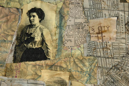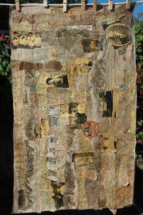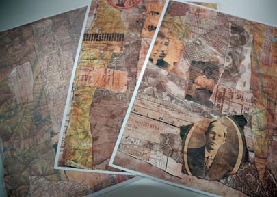
When last we met, Fabric Paper Part 1, I promised a follow up about my uses for the paper. Well, my purpose in making the paper was to cut it up and make bracelet cuffs from it. I still intend to do that, but I haven’t gotten to it yet. So this post is about art journaling.
I don’t usually decorate the cover of a journal first. To be honest, I rarely get past the first three pages of a journal so nearly no covers get done. It’s not unusual for journal makers to leave the cover for last. Perhaps the idea is that after the journal is completed there is more of a tone to bring to the cover than might have been apparent at first. Perhaps the idea is that the cover might get so monumentally messed up that nothing could fix it and it would be forever lost. Not a very good way to start a journal. My feeling is, I need to love that book to the point that I can’t leave it alone.
I don’t usually follow the market for supplies. I’ve used various mixed media sketchbooks, hardbound and spiral bound. For some reason, spiral bound journals started to bug me. I actually used to LIKE spiral bindings, so I have no idea what that is about. And, the hardbound journals I had would not stay open or lie flat. That started to bother me, too. Wet pages had a mind of their own and would flip closed to the other side. (Don’t write to me about clips). Anyhow, I saw a few videos by Ranger for the Dylusions Creative Journal. It is a bound journal that opens and stays perfectly flat on it’s own with No Clip. The paper is heavyweight and suitable for wet applications; the cover is heavy chipboard. The 8.5×11 journal retails for $25 at Michaels, so I wait for a 50% off coupon and buy it; at $12.50 this 64 page journal is an excellent buy.
If you’ve been keeping up with my Mythos blog, you know I’ve developed an obsession with Little Red Riding Hood. Since I posted over there about Red last week, I’ve gotten an obsession with all the Grimm Bros. tales, and the Grimm Bros. themselves. I plan next week to get an obsession with Hans Christian Anderson, to be followed by Charles Perrault. Ultimately Mother Goose will be involved, at which time if I’m decorating my bedroom as a nursery I expect professionals will be called in.
So, I procured me a new journal: hope springs eternal. And I decided to tackle the cover first. Mother of Pearl, what a confunction. I have no hand-lettering skills. (Could this be at the base of why I am a journal writer that does not write journals?) How was I going to get the text on? Was I going to collage a cover? (Treacherous). Was I going to draw a cover? (Unlikely). Was I going to paint a cover? (Unlikeli-er). Maybe I wasn’t thinking out of the box enough, but it seemed that about covered it, technique-wise.
Finally, I considered stencils. It’s hard to imagine that I didn’t think of stencils right away, because there is a good portion of my grey matter dedicated to thinking about stencils. I have several tree stencils of the right size. Then the decision: paint or ink?
Acrylic paint has drawbacks; it creates a slick “dimensional” coat. I felt it could limit my options later, both for material and technique. Ink also has drawbacks, the first being, I don’t like the look of sprayed ink. It CAN be very inconsistent and temperamental. Like, I spritz it off-project a couple times and everything is good, then I move onto the money shot and it fires out blobby and drippy and with extreme prejudice. One time it actually blew the stencil off!
I didn’t want the cover black, and I didn’t want it colored, either. I wanted it natural, so my mind went to walnut ink crystals. I had some ink made up already. I also had one of those Mini Mister applicators. I thought the smaller mister might give a more consistent spray.
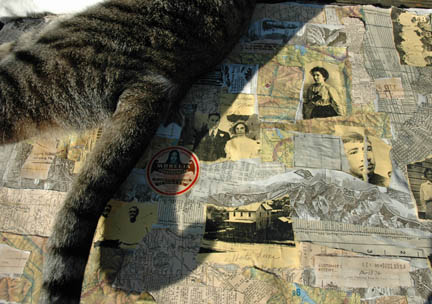
I had to take it outside because walnut ink stains just about everything. Particularly cats, and they seem to jump on my work island just as I am executing a critical treatment. My experience with spraying any ink is that it goes all over the place, even though you think it couldn’t possibly. (A good idea for you is to put the ink-ee into a box; that is, if you, as a well-prepared artist, can put your hands on a box that doesn’t have black widow spiders inside it. I am not so lucky. I am not making that up.)
Outside I went. I had applied TAPE to keep the stencil laying down. I tell you, I was firing on all cylinders. I got the mister going and I was right, the Mini-Mister did a good job with a fine spray, consistent and very much enhancing the detailed stencil. However, mysteriously I did produce two large drips. The biggest one ended up spreading out and isn’t too noticeable. The smaller one is at the bottom. While I was out there I sprayed the edges of the journal all the way around. The edges always get messed up on my journals anyway, so I figured I’d grunge them up from the beginning. 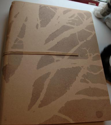
I left off working on it last night to let it dry properly.Today I was faced with Now What? There were many options. I considered collage for the tree trunk and limbs with small pieces of paper. That’s why I copied the fabric paper–some of the designs worked for tree bark and texture. I tore a couple pieces up and tried it and I didn’t like it. Not One Bit. I tried a teeny dictionary with tiny type to collage the trees. That was better, but with the busy all-over stencil design I was concerned the collage would be overwhelming and make the tree look stiff and clunky.
I decided to take a break so I sat down and outlined the tree with a fine line black marker (Artline) and that created considerable depth to the image. At this point I considered doing very very very small handwritten text along the tree trunk and limbs. I was very tempted to do it, being that it is one of my favorite activities, but it might be even busier than the collage. No go.
It’s not possible for me to hand-letter the journal title. I considered transferring toner or inkjet computer text to the cover. (Treacherous). I thought maybe I’d do a packing tape or Contact Paper transfer. (Easier, but the stickers can look clunky). I did not want to stencil again, even I know when to stop. So I went into the stamp hoard and found this alphabet (I cannot tell you who made it, the packaging is long gone). It was amazing that I bought both the capital and lowercase set of this font. I must have realized 15 years ago that This Day Would Come-And It Did.
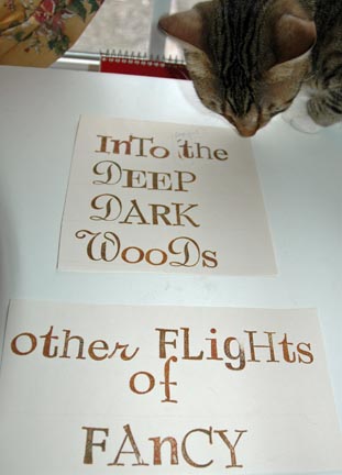
Isn’t it nice? You can see that I had to do a pre-stamp trial run…better safe than sorry. I have been sorry SO many times. I loved the font and the color (StazOn Saddle Brown). I took the plunge….wait for it…
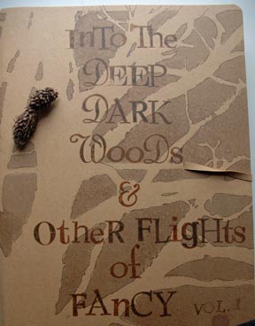
This is where I stopped. You will notice that I optimistically added the “Vol. 1” notation as an afterthought. I’m pulling out the stops to get this journal on a good trajectory. I Winter Solstice-ed it up for you by adding a cheery pine cone. I know how you appreciate that Martha touch. (I reread this post and see I’ve mentioned two Ranger products. I do not receive any compensation from them and actually use very few of their products).
The cat is Peter Pan. During the above process, I listened to Dr. Clarissa Pinkola-Estes, “The Theater of the Imagination”. Today it was Bluebeard. Her telling and analysis is a must hear for women.